Introduction
I have started by choosing the topic 'Disguise'. I chose this topic because I thought that it would be very artistic yet interesting way to edit a photo.
Set: 1
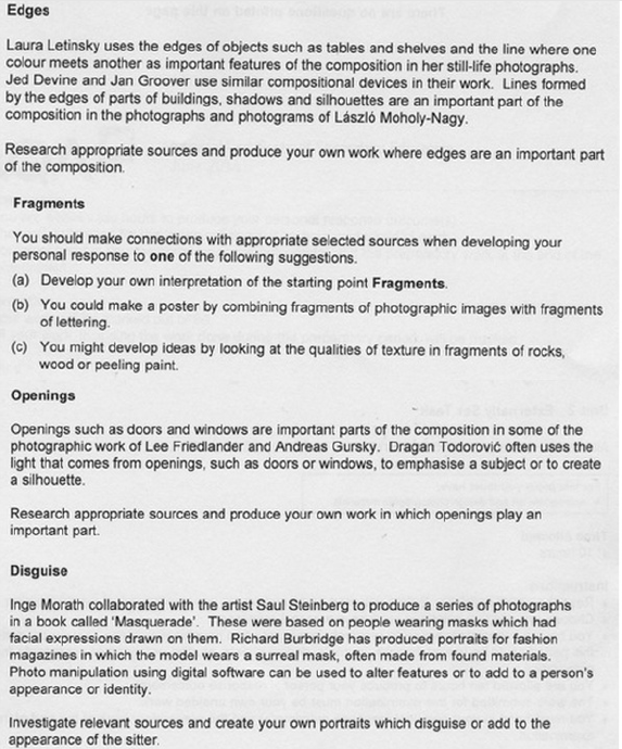
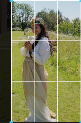
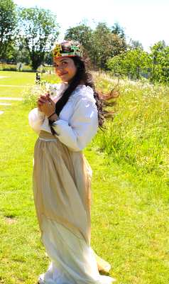
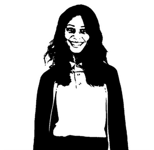
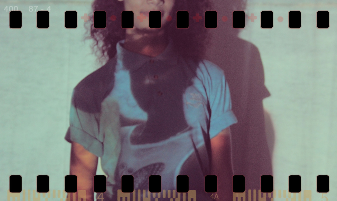
Here are some photos I took in school with my model wearing a princess dress, the theme being victorian times.
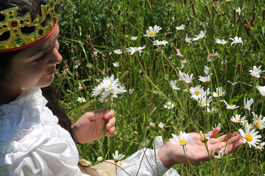


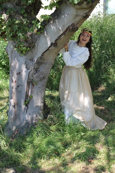
WWWI think that the dress and crown that my model is wearing suits the background , where these photos were taken. I tried to get the sun in most pictures so I wouldn't have to edit it, however it didn't work for most so I did have to do some editing. I think that the flowers where a good touch even though I didn't plan on using them. They add more substance to the Victorian look that I was going for. Taking these pictures outside made a bigger difference than the ones I done inside because there was more lighting.
|
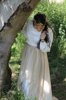
EBII think all the dark ones with shadows are not as good as the ones in the sun because you can not see all the features on my model. I would have perferred to take more pictures at differrent locations to help give my victorian theme a more authentic feel.Even though it is a Victorian theme you can still see some 'twenty-first century' buildings and poles in most of them. I could improve all of these by editing them.
|
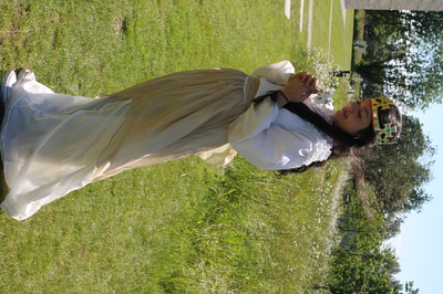
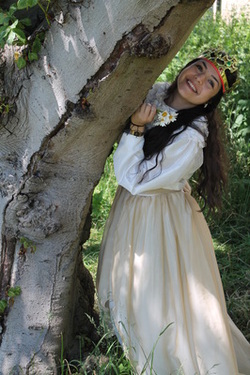
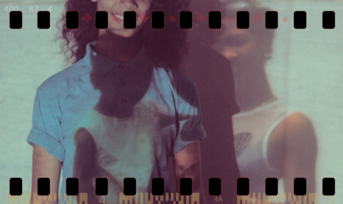
My favourite photo

|
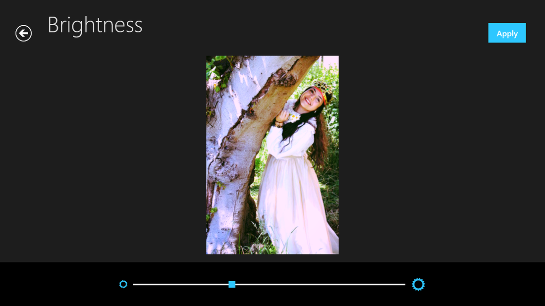
I think that this is the best photo because the way the model is positioned next to the tree, giving the impression that she is playing ' hide - and - seek' while holding a bunch of flowers.
I like the setting (background) of this photo because it gets some effect on the model, having the sun shine through the leaves to the side of her dress, however I think this picture is a bit to dark, so I will edit it. |
On my computer, I just fiddled with an editing application to see what the out come would be like. I edited all three.
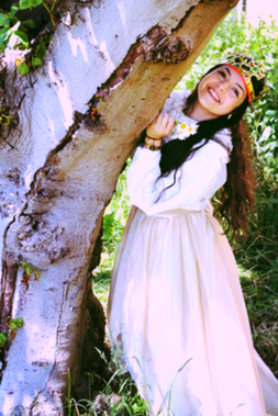
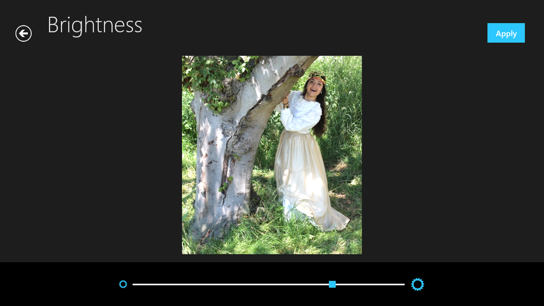
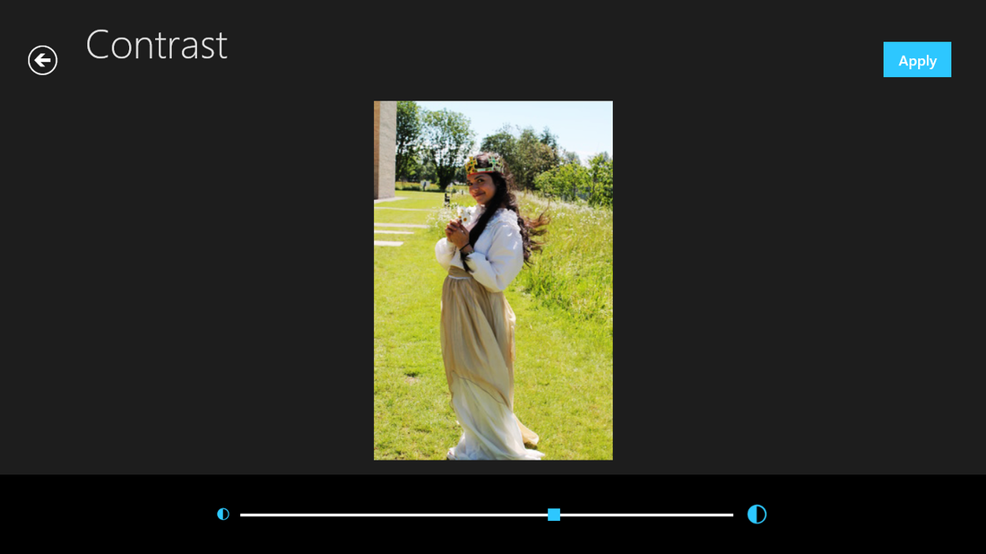
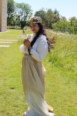
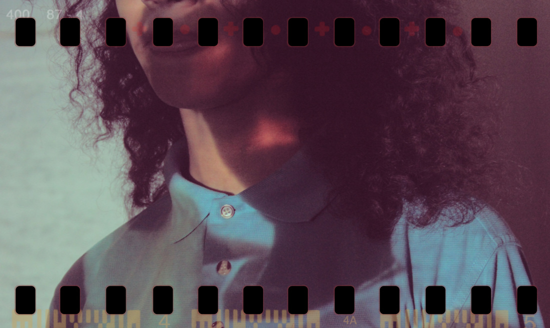
This is the first photo I picked, I didn't crop anything because there wasn't anything that looked from the 'twenty first-century'
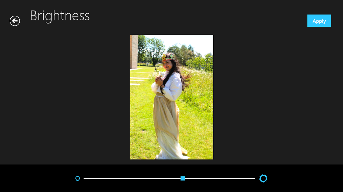
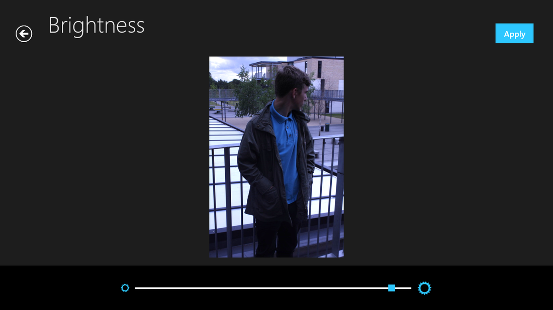
Firstly, I brightened the picture because I thought that the main problem was that it was to dark and the purpose of the photo is to make people more happy.
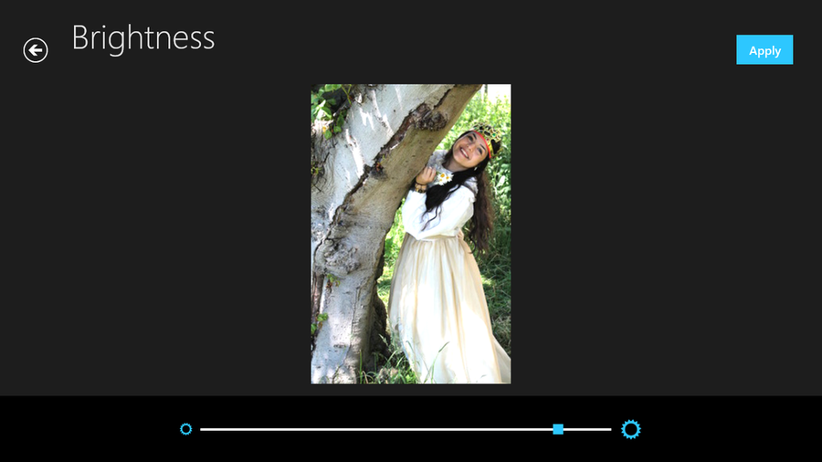
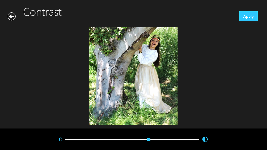
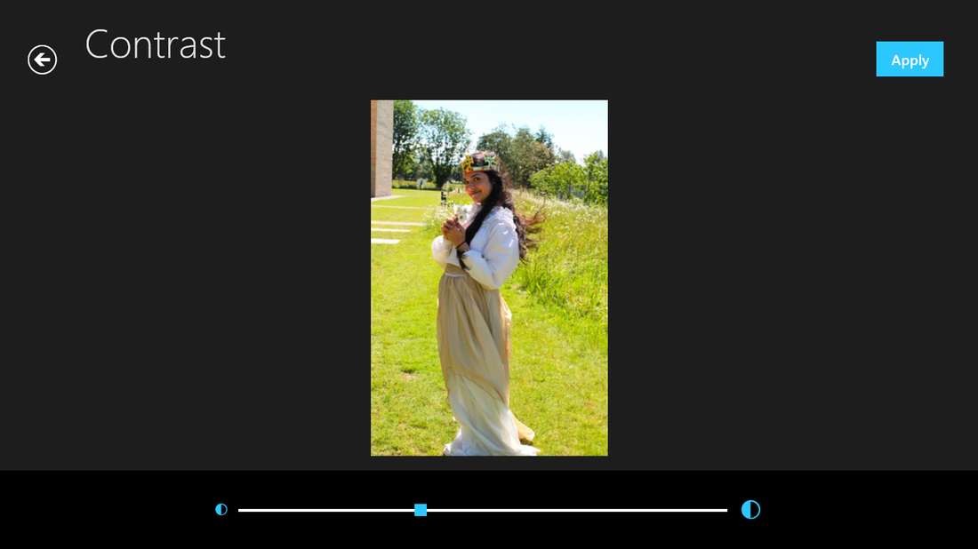
After brightening the picture I made the contrast higher this enhanced all the the main features I wanted.(The leaves, hair and flowers.)

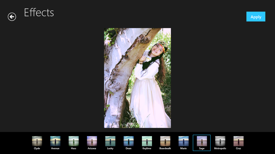
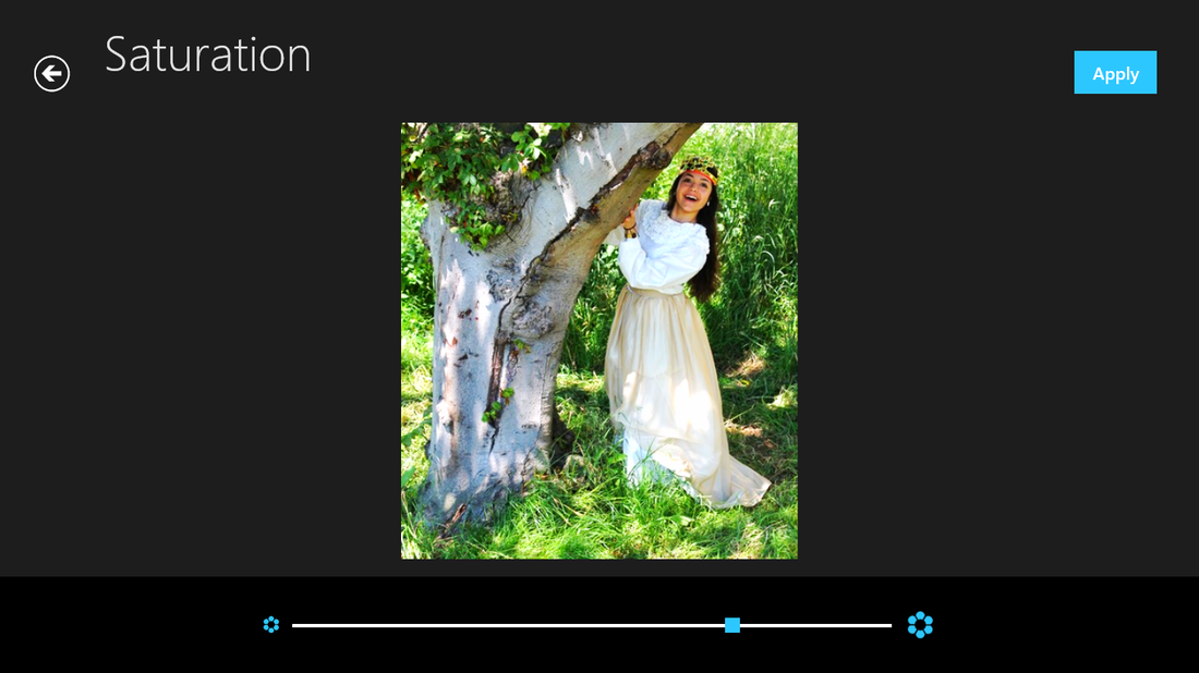
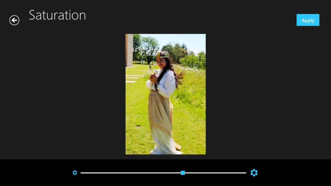
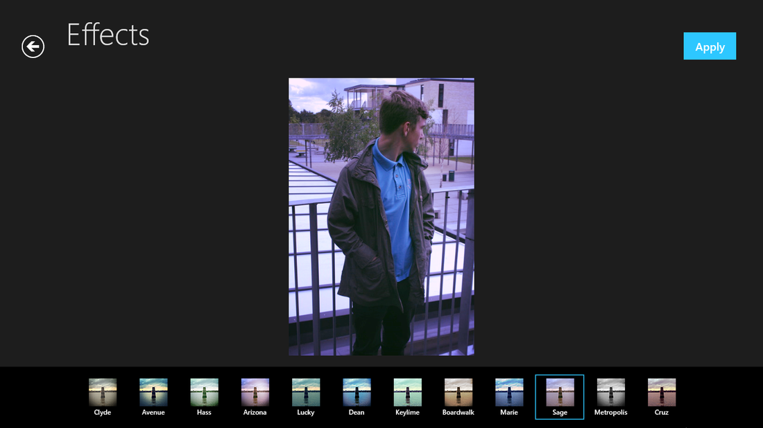
Although I could have stopped when I made the contrast higher, I decided to carry on editing and see how the photos come out. This lead me to add an effect called ' Sage' this brightened the picture more , but added a more 'cooler' effect.
However the effect made the picture too bright, therefore I made the saturation a little higher to see if it would bring more effect back to the main features that I wanted.
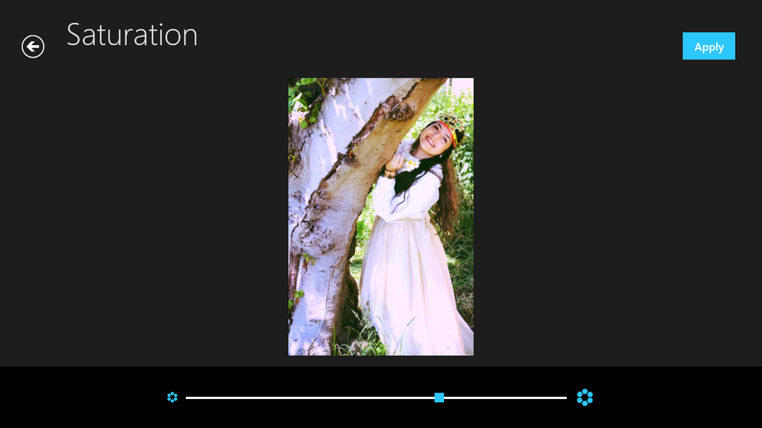
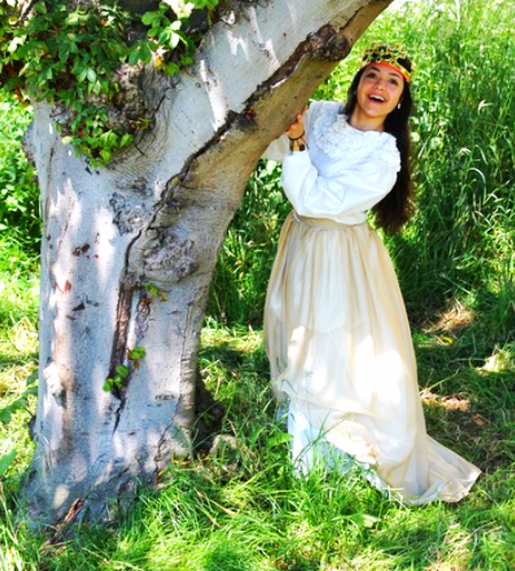
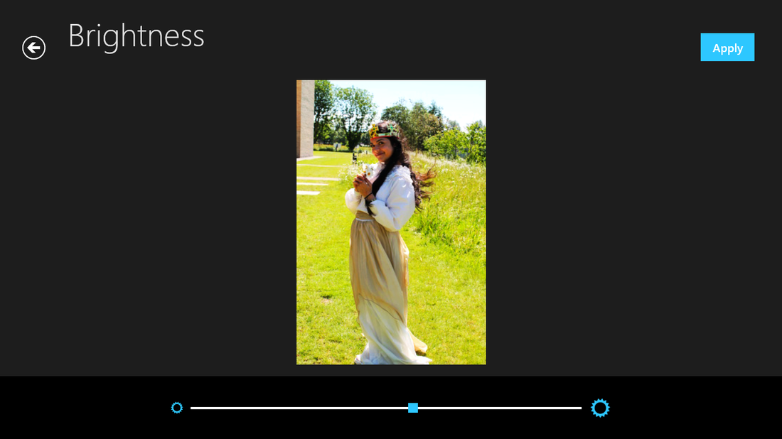
Finally I lowered the brightness to make it a tiny bit darker, again to make the flowers hair and leaves more enhance and I think this looks better than the original.
Final edit

|
|
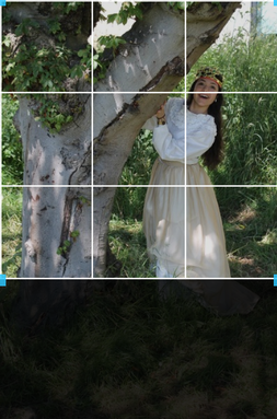
Here is my second photo, by the same tree but a different pose, I have also cropped it because, I didn't like the dry patches of grass that were there.

|
|
After cropping this picture I immediately turned the brightness, this showed the sunlight shining through the tree a lot more obvious.
Again, to enhance most of this picture I made the contrast higher , this made the grass greener and the dress a little more whiter.
Turning up the saturation added more an effect to this picture, by brightening all the colours in this photo, especially my models hair, this effectively made the grass more greener than enhancing the contrast.
Final edit

|
|
My last photo to edit, I cropped this photo because I wanted no ' twenty first- century' objects in it, therefore I cropped out the building

|
|
I made the contrast higher because it had enhanced the rest of my photos, therefore I thought it would work for this one. However I did not like it, but I never undone my action.
I then made the saturation a little tenser because I wanted the grass greener, however it did not make my models skin tone get light, but darker which I didn't like. Again I didn't undo it.
The saturation made it look darker therefore I adjusted the brightness tool to brighten the whole body which didn't work, only the background had brightened.
Because I thought that the picture was a bit too ' fake' I turned down the contrast because that was what caused me the biggest problems
I done the same with the brightness, turned it down, luckily turning down the contrast and the brightness did make a hue difference but I am still not happy with the result I came out with using this picture.
Final edit
|
|

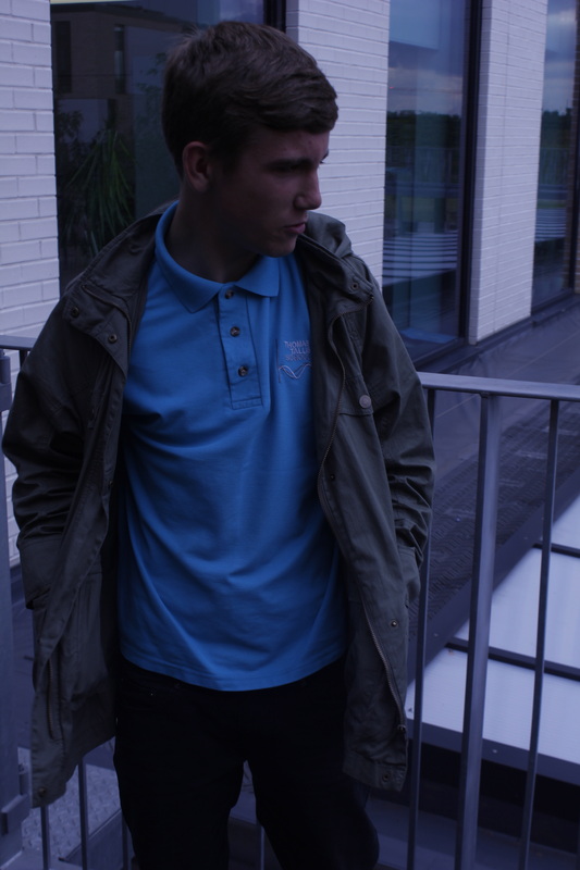
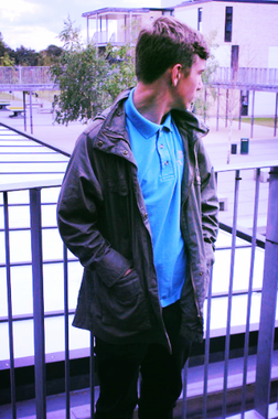
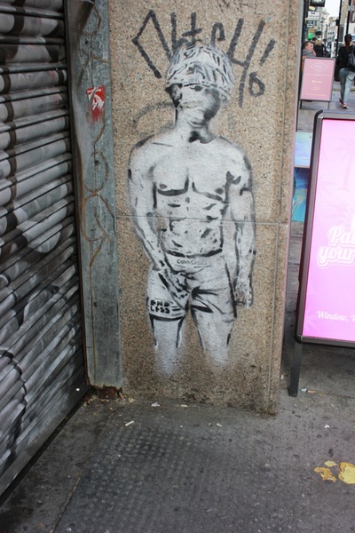
wwwI think these photos are quite interesting because there are the opposite to the previous ones, with the princess and this model looks like he is looking for something. These photos look more 21st century. Having this model in our school uniform makes him look more interesting.
|
EBII think they would look better if there was some sort of lighting in the photo showing more features of the face. And I could have taken the photos in a different background, which could have made some sort of difference in what the image tells you.
|
My favorite photo

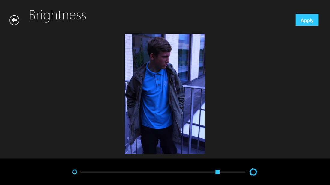
This is my favorite picture because the model almost looks like he is searching for something. I think that this photo is more ' twenty- first century' because you can see a building in the background, and the clothing is different compared to the previous photo, I would say it's more 'updated'.
I think having this model look to the side rather than looking straight through the camera, tells a different story. It almost seems like 'Street photography'

To start off I turned up the brightness of the photo because this was an obvious problem with the photo. However this hadn't made any difference to the model, it just made an impact on the roof in the background.
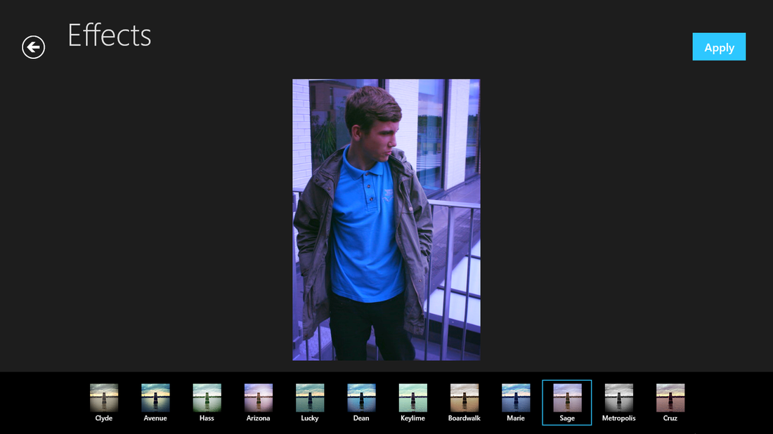
This resulted to me adding an effect because this would give the photo more color and it did show more or the features, such as the way his hair looks and how the shirt almost looks creased.
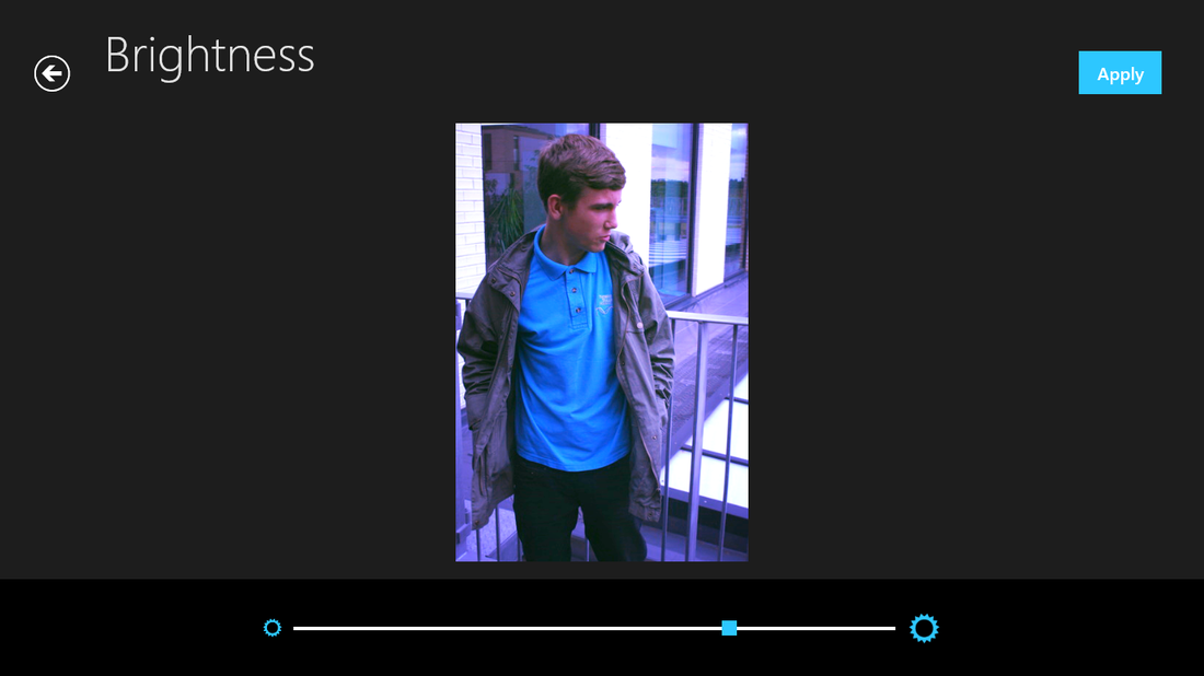
After adding an effect I tried to enhance it by putting it to night mode on, this will take all the dark areas and lighten them. I was pretty happy with how this changed the picture therefore I was going to leave it, however I wanted to see how else I could change the photo some way.
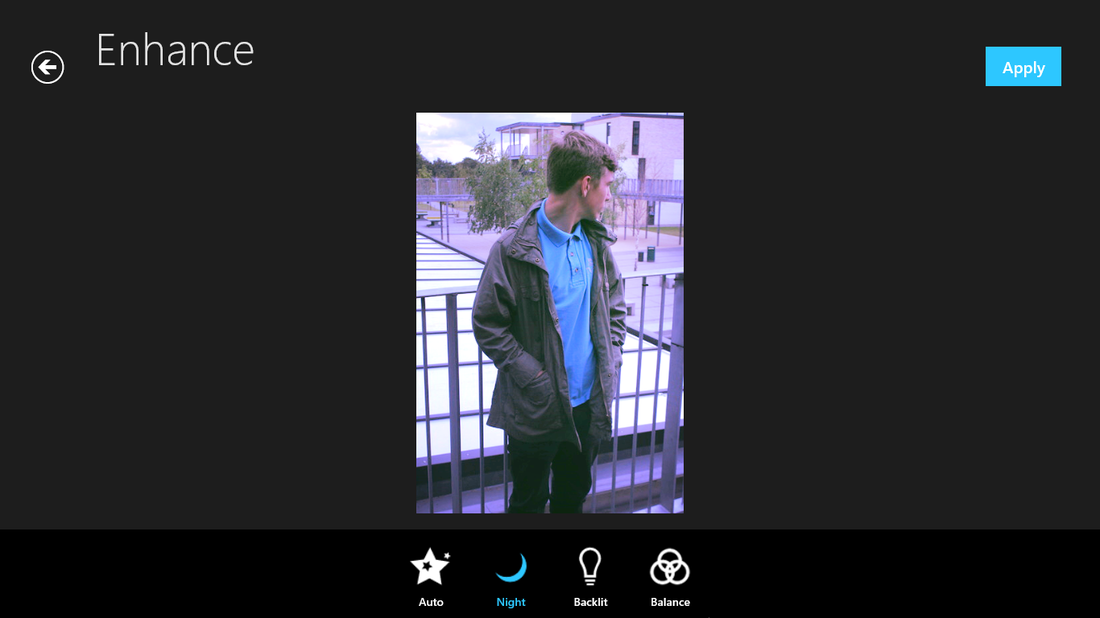
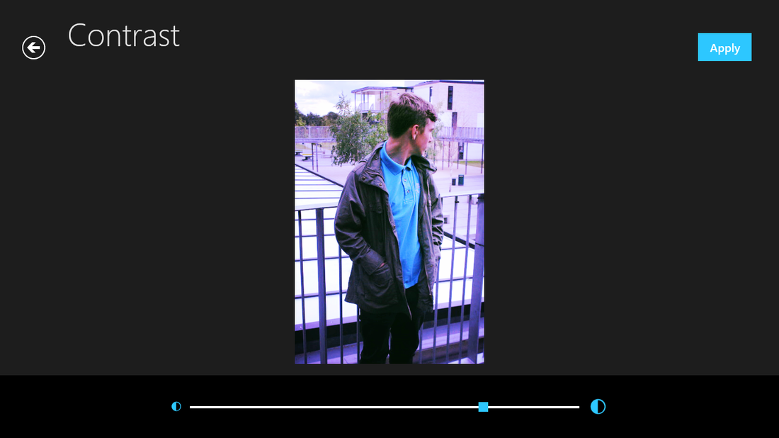
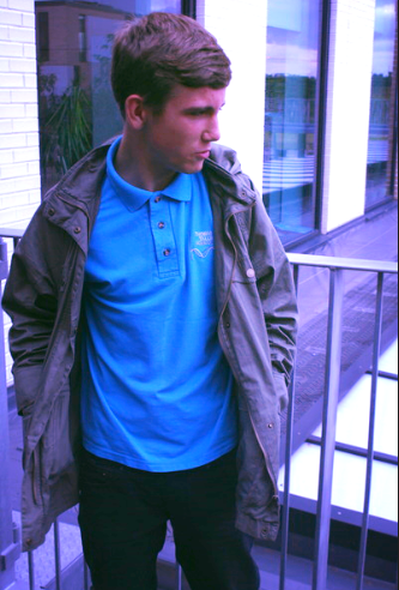
Finally I added some contrast to see what kind of effect it has on this photo. I t did exaggerate all the dark areas of his body such as: the back of his head and his jacket. I still like the way this photo looks because now it looks like it was sunny, which is what I was going for.
Final edit
|

|
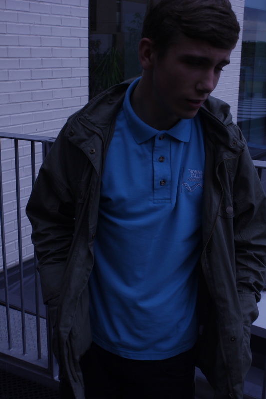
Here is the second photo I took, still around the same area but in a different position.

First of all I had adjusted the saturation simply because I thought it would make certain areas darker, so when I come to brighten it, it wouldn't look as bad.
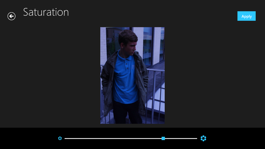
Because the photos I took of this model were very dark, which isn't bad, but you cant see certain features that I want so I had adjusting the brightness realizing that the background lightened a lot more than the body and facial features.
After turning up the brightness I had added an effect, again this showed the features I wanted yet gave it a cold looking effect at the same time. However I still feel like it was quite dark.
This led to to make the brightness higher, which improved the quality of the picture.
Final edit

|
|
Main Idea

|
|
For my main idea for these photos, I am going to be using the one on the left because it shows more of facial features whereas the one on the right shows the back of his neck and most of his body. I will be doing the same idea I used for my first final piece but using different shapes.
|
Tom Hunter
Hunter's photographs often refer to and re-imagine classical paintings.
This series of photographs were taken in a street in Hackney, 1997. The residents who made up this community were fighting eviction as squatters. The title for his series of paintings comes from the wording used in our eviction orders. The postures and gestures reference Vermeer's paintings and give more of a dignity feeling to our community.
His work has inspired me, because of the different ways he takes his pictures. For example he takes the photos to make it look like the people in the image don't realize that he is taking a picture of them. I like the way the colours in certain pictures can tell a story, for instance the photo with the woman the letter in her hand staring at the window with her baby laying next to her shows that she is worried and the colours in the background also adds the effect that something bad has happened, almost like its a depressing scenery.
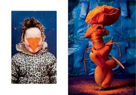
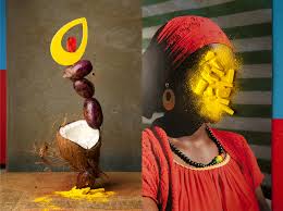
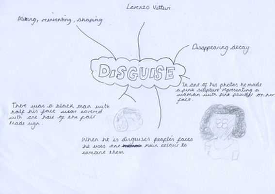
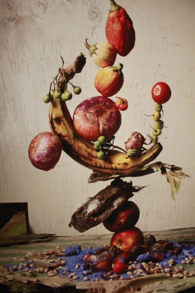
Lorenzo Vitturi
For inspiration Lorrenzo went to different markets, so he could start creating his make-shift sculptures. When he did go to the market he used all different things he could get his hands on, this includes: fruits, vegetables, fabrics, miscellaneous tokens and trinkets. In most of his images he either uses the objects as he bought them, or even wait for them to rot and some doused with pigment. You can tell that in his sculptures, he positions the objects he bought into various different compositions and uses a blanket, sheet or any type of materials he got from the market. He photographs his sculptures either before or after they collapse. Him using all these different types of cultural materials and foods make his sculptures more interesting than if he was to use the same materials and object over and over again.
In lesson we watched Lerrenzo talk about why he likes doing what he does, why he uses those kinds of materials and objects, why he chooses to get his objects from the market. While we watched this we made a brain storm on how our personal projects relates to what he does and how his sculptures come out and what the replicate.
I have signed up to Pinterest to make a mood board of all the different kind of photos that have to do disguise
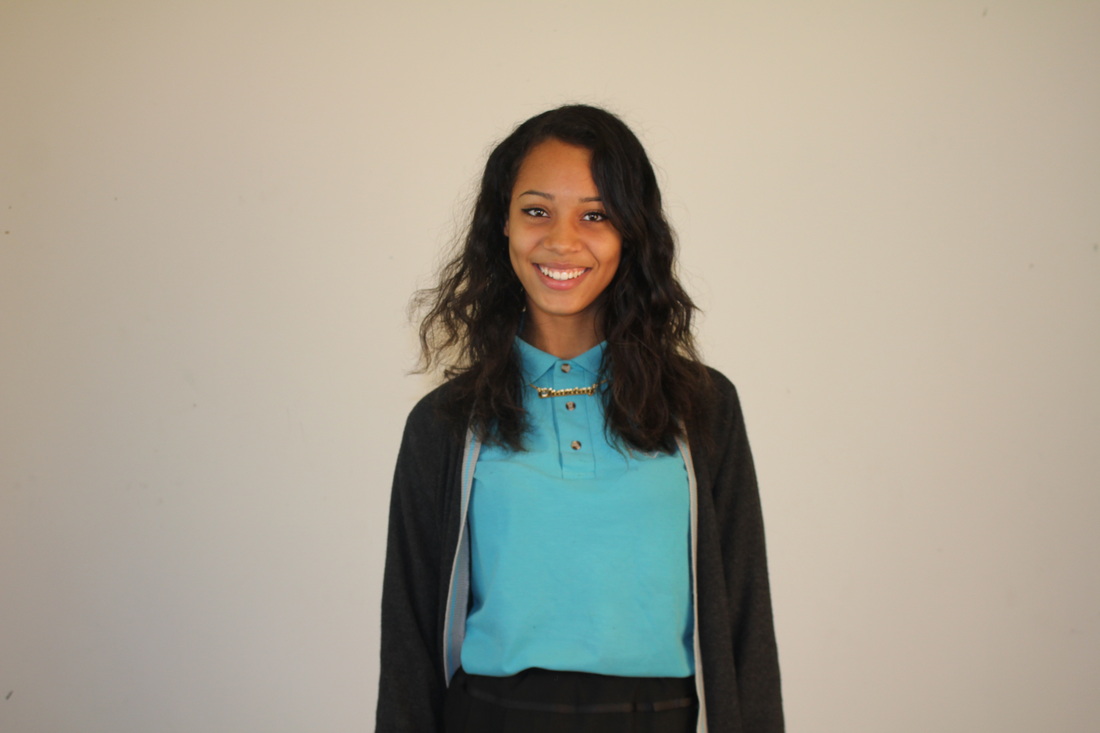
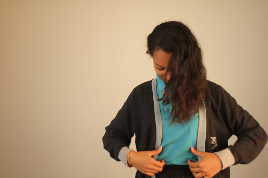
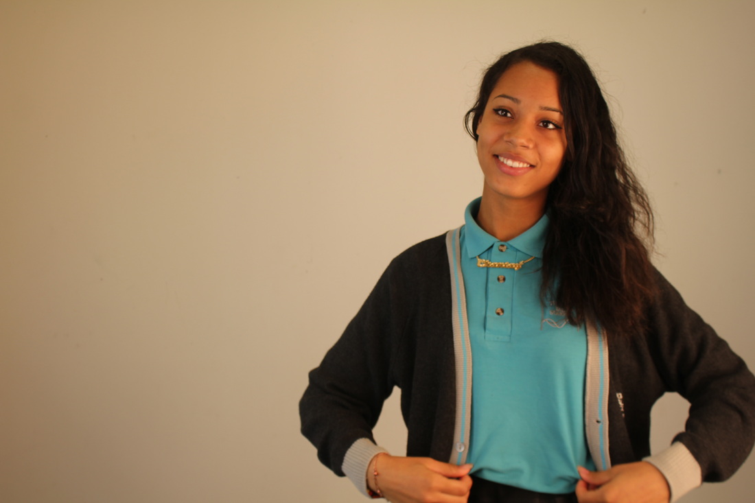
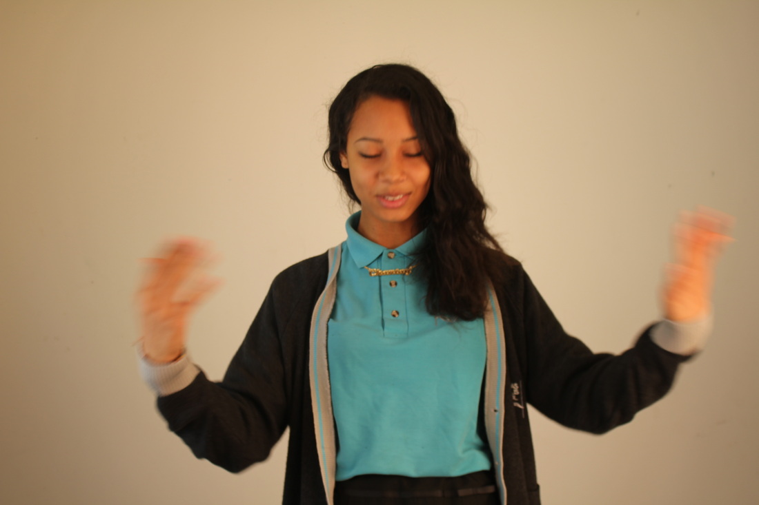
Second set of images
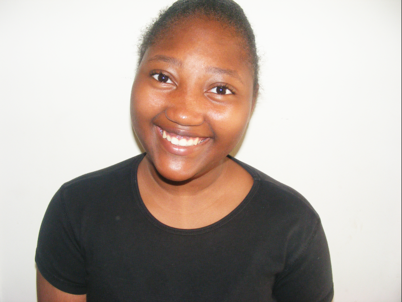
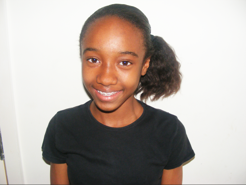
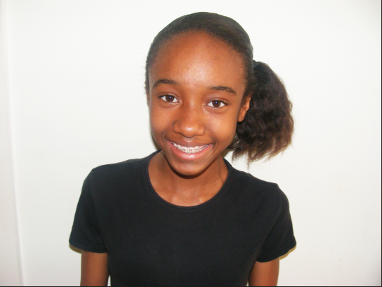
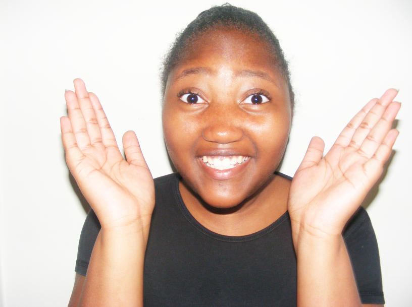
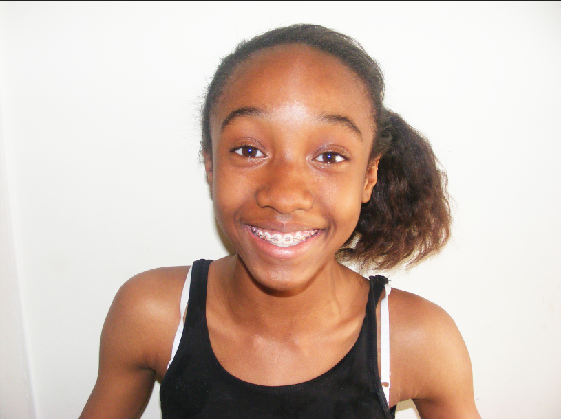
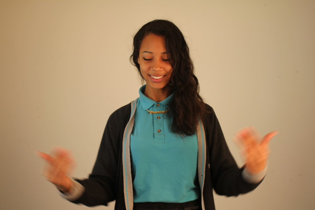
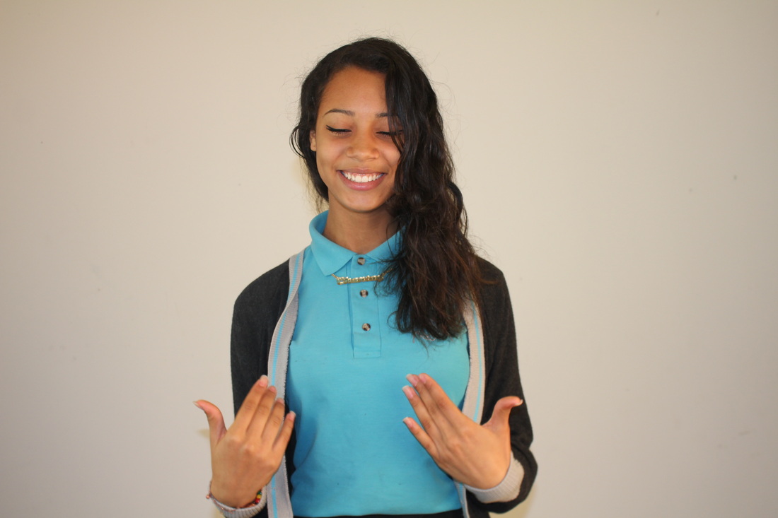
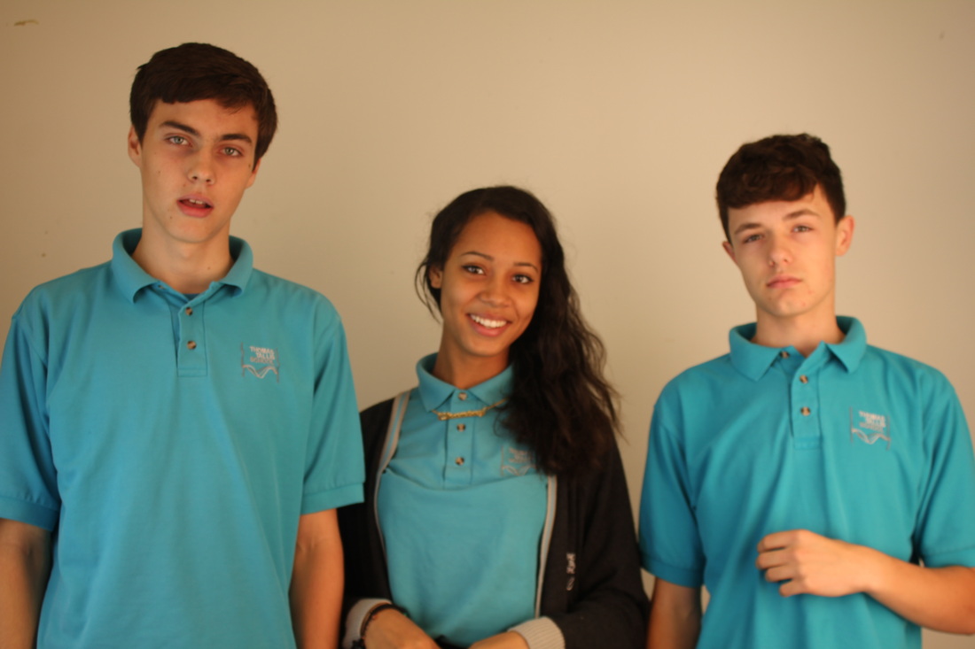
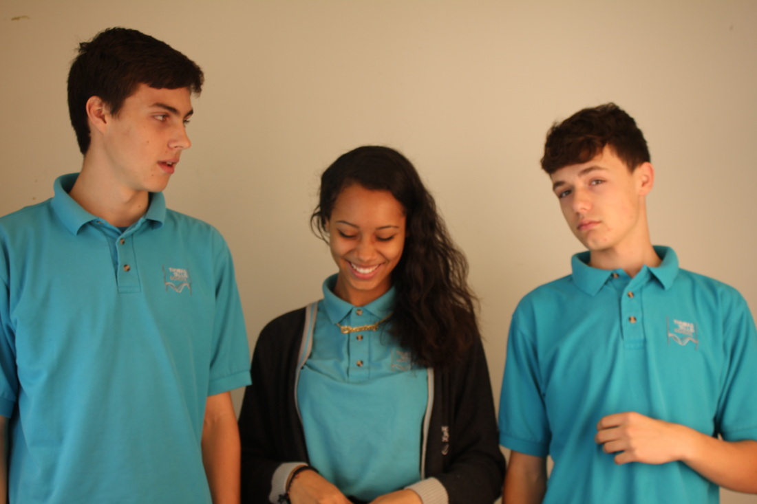
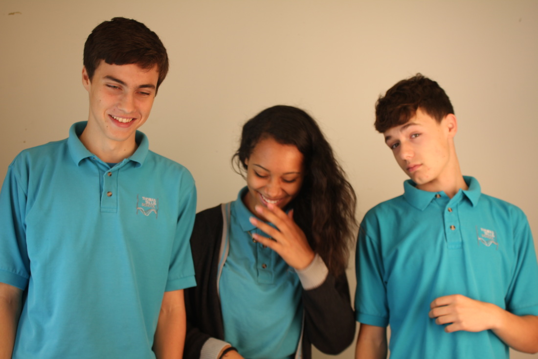
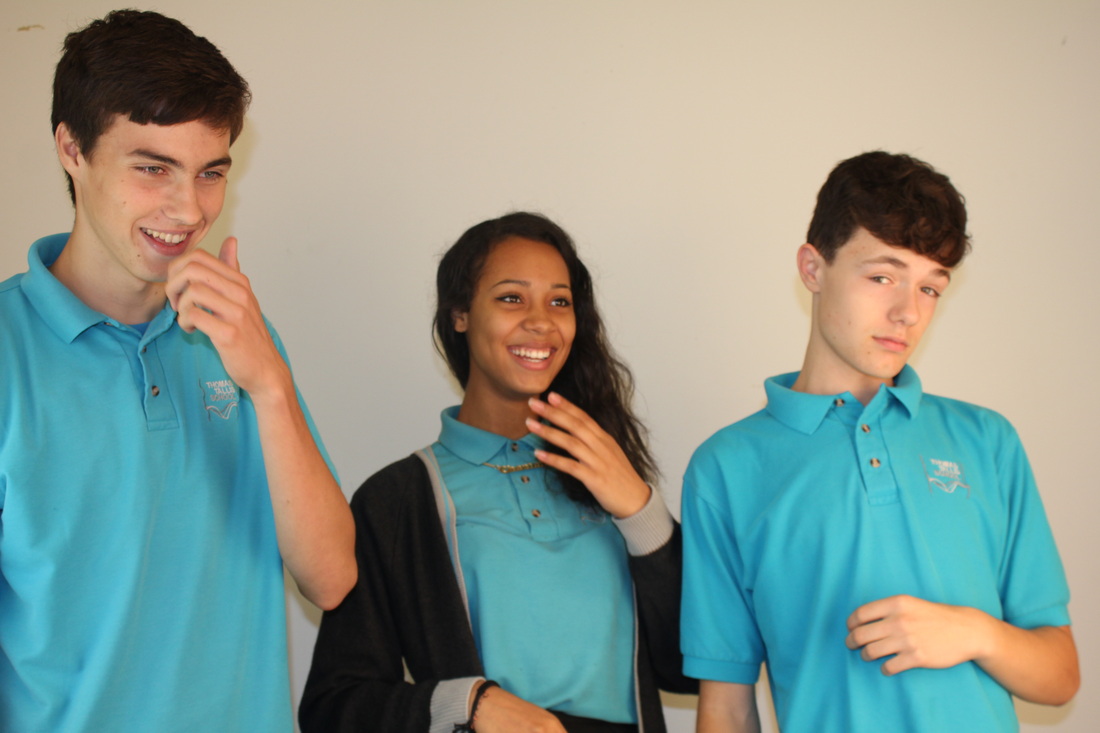
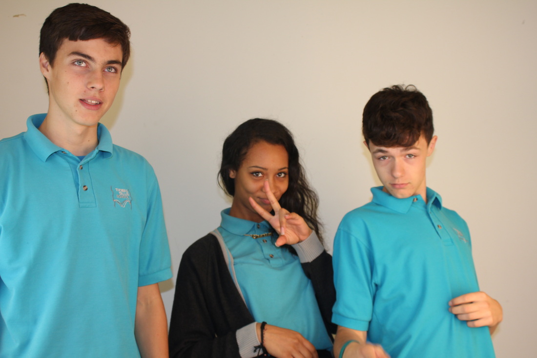
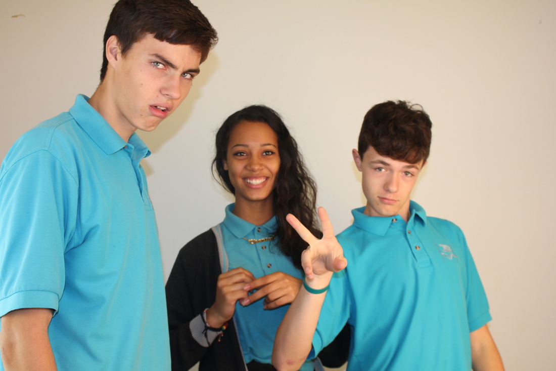
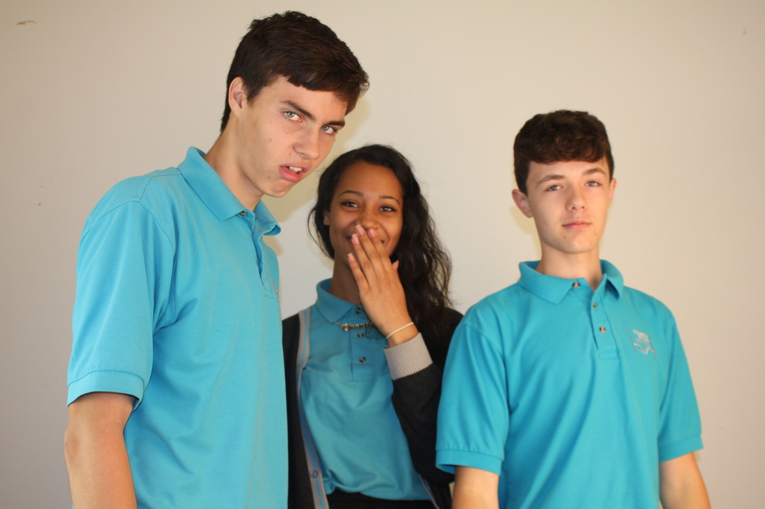
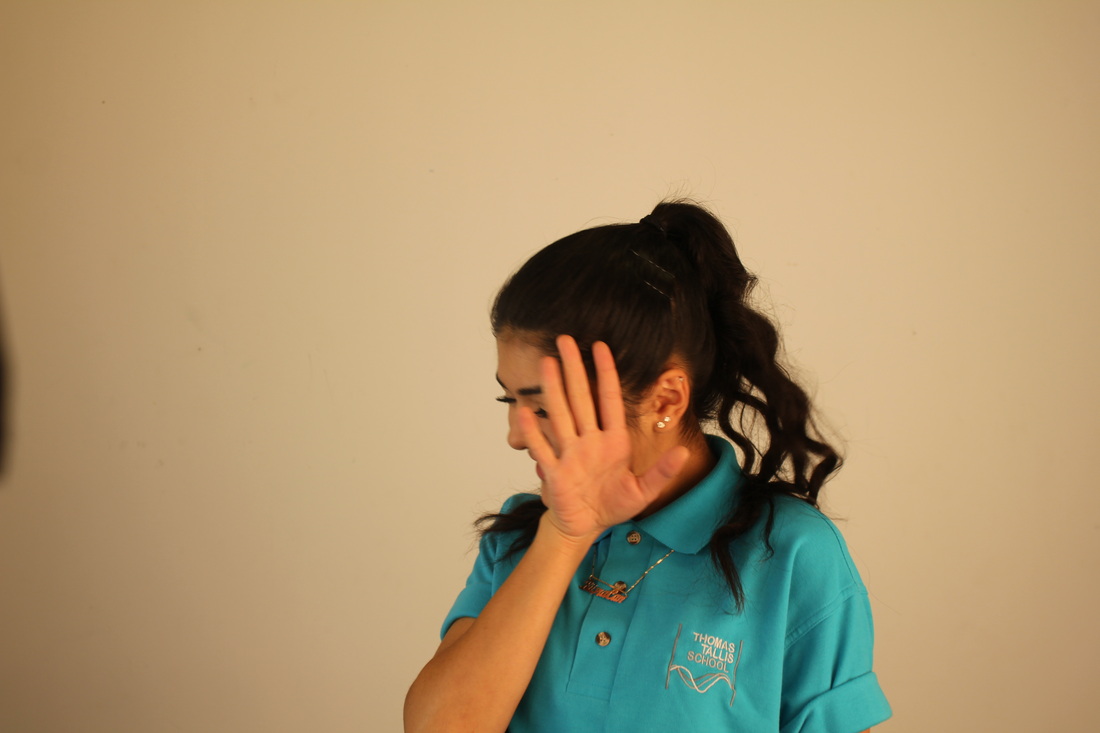
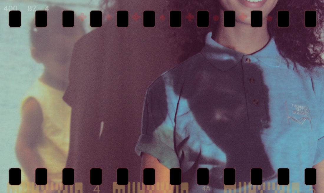
WWWI think that these photos are good but not as good as my first set. There was good lighting which I am happy about because I had to use the flash that is on my camera. They are both wearing the same black shirt in four of the photos because when I combine them together, there wouldn't be any distractions with the clothing but more attention towards the face.
|
EBII could have improved this by standing in the same position while taking the pictures because there are all at different heights. Also the lightning on two pictures are more brighter than the rest. To do this I could have used studio lights and put them on either side of each other. Another way I can improve it is by standing the same distance from the models each time I took the photo.
|
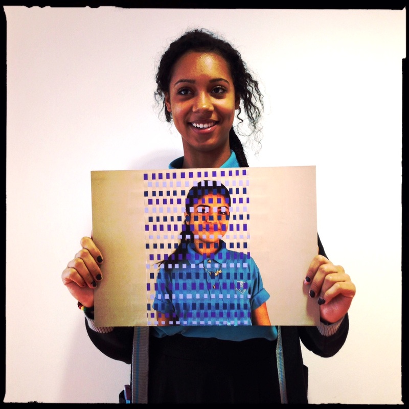
Final piece
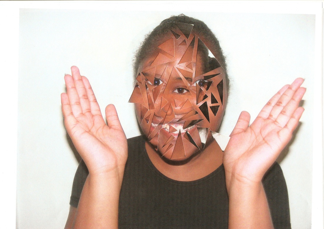
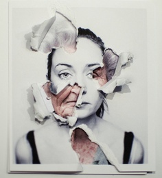
To do this final piece I have cut out random triangles in the second models face, and only around the facial area to show the first models face underneath.
WWWI think that the 'disguise' I used, to me, was weird and interesting. I wanted to use something different. The different sized triangles made it a more interesting and creative way to show the other face that lies underneath. I also like the shadows created by my models hands, it made the entire piece look even more realistic.
|
EBII could of improved it but making more triangles around most of the image instead of just her face. I also think that I could have used the image that is in the back as the front, because the image in the back is taken further back therefore the face is smaller. The ink of the shirt is also a bit faded when I had printed it.
|
Before I got the idea to weave my photos I looked for a photographer that does something similar. I found a photographer called Seung Hoon Park, who creates photos by threading film to mimic the look of woven tiles.
Third set of images
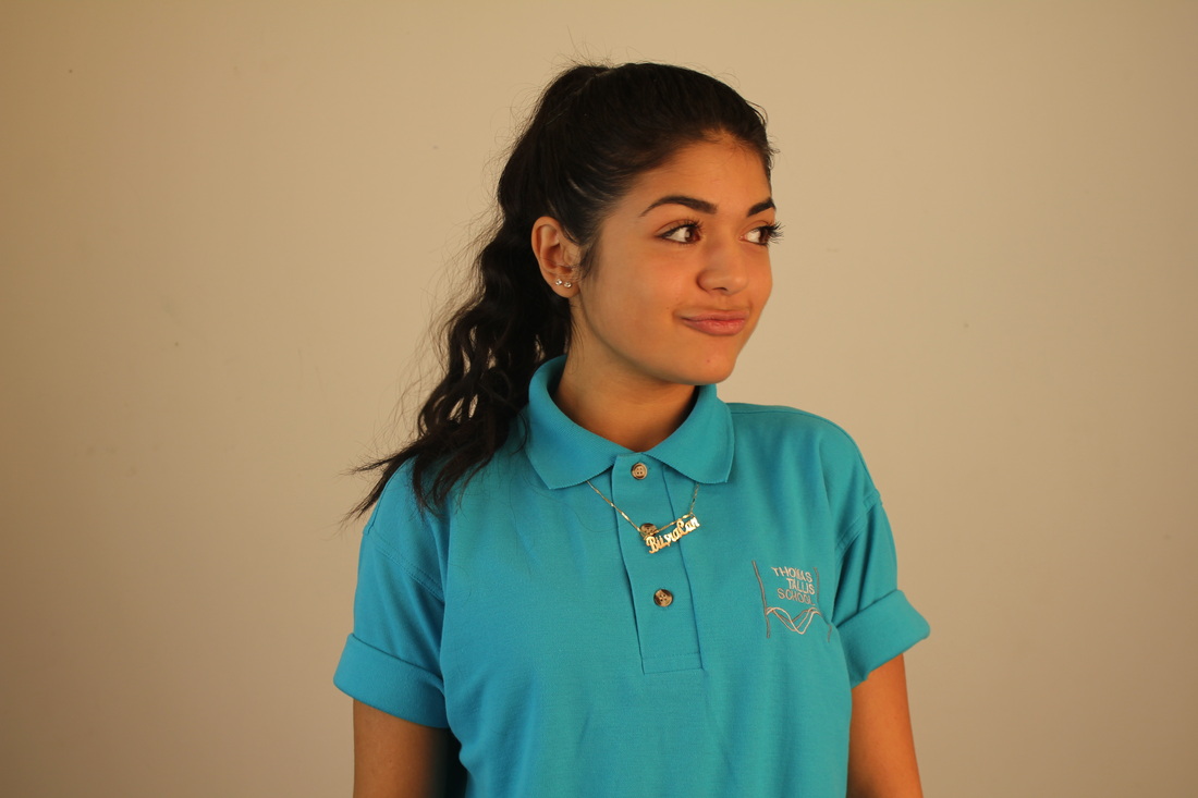
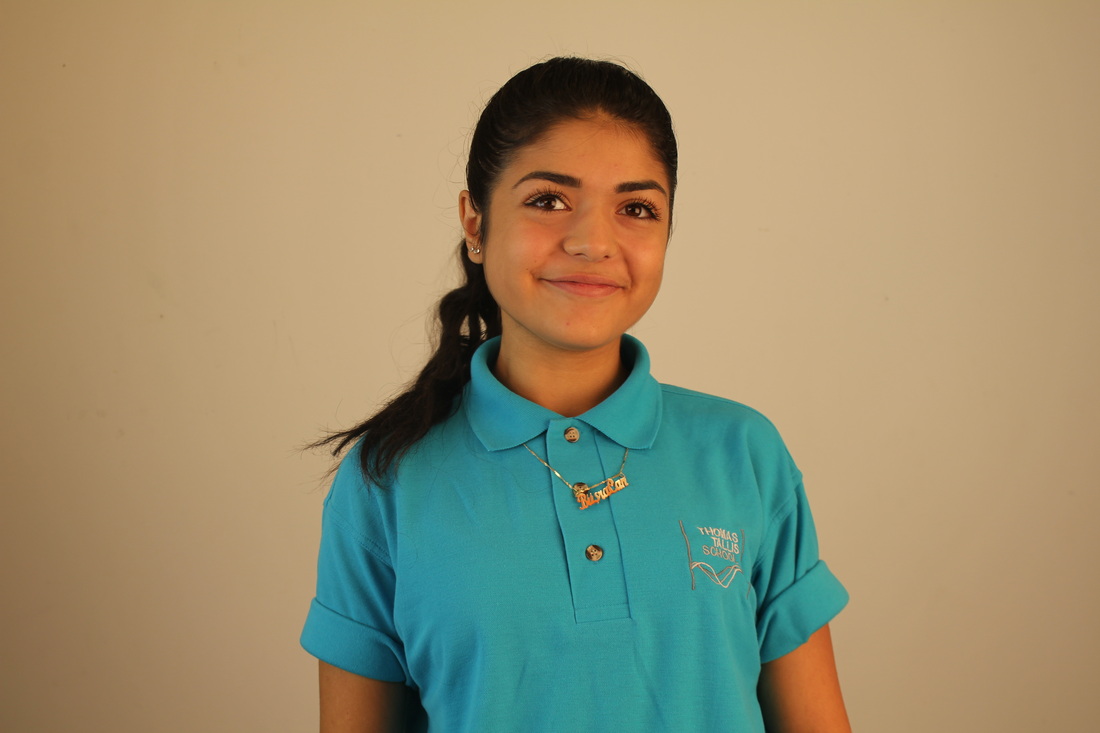
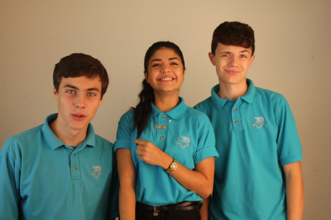
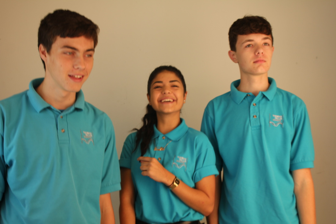
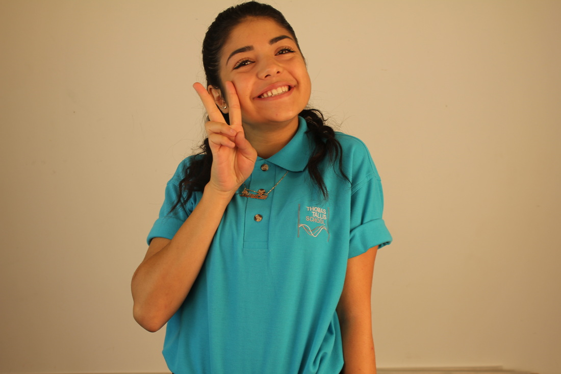
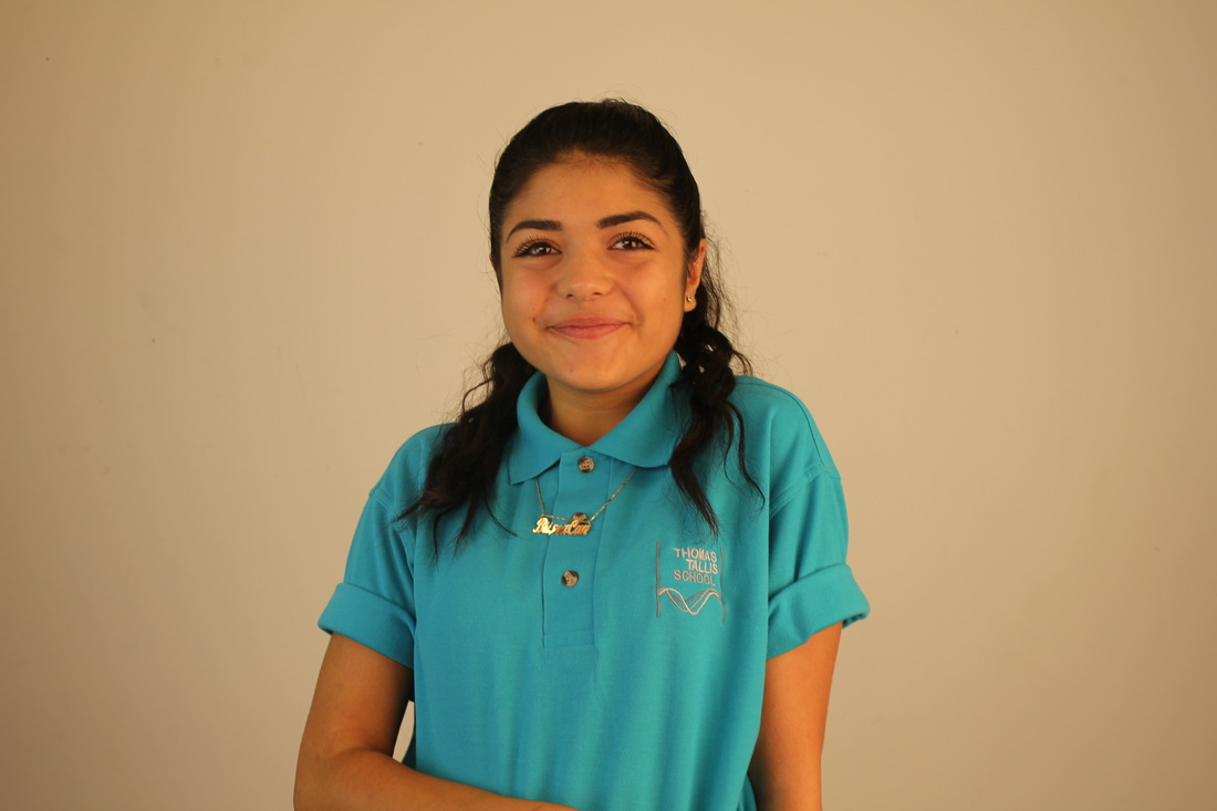
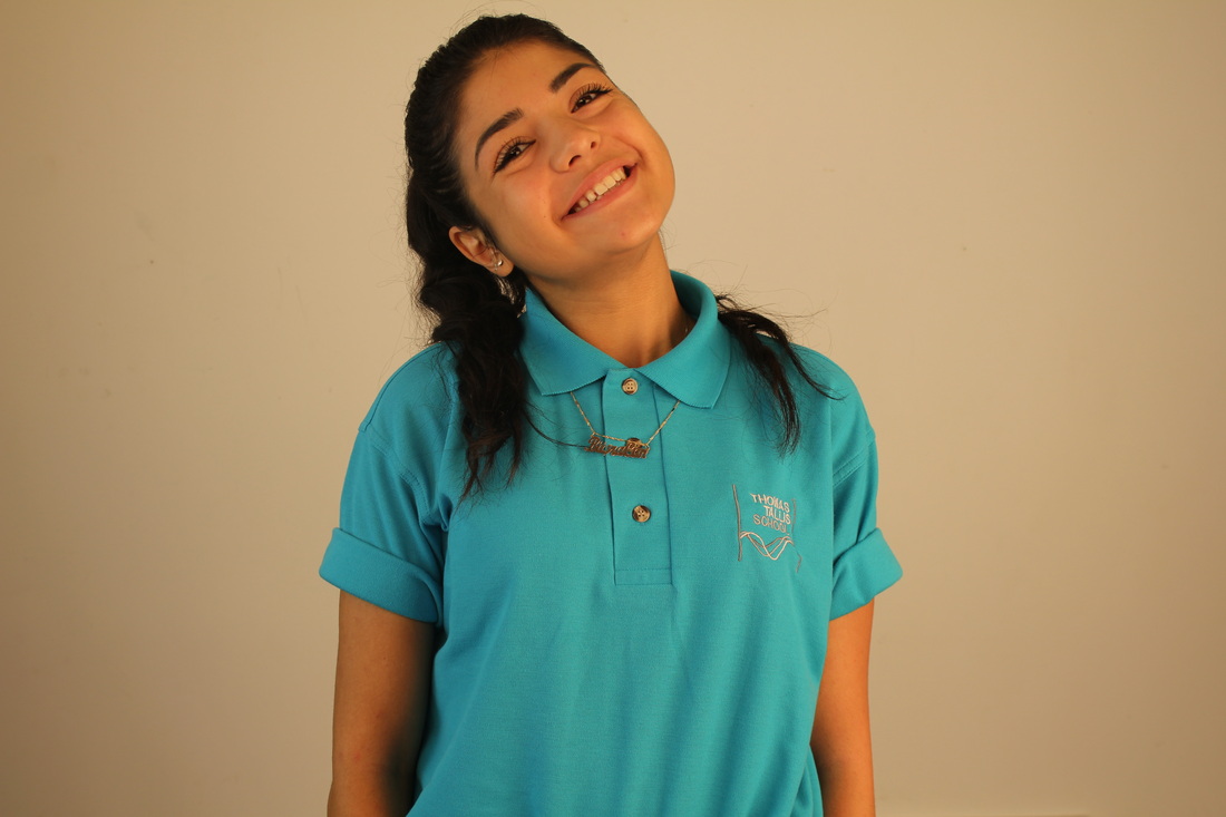
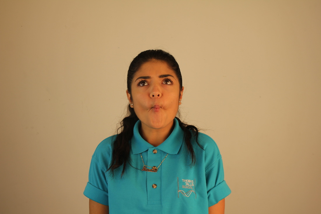
WWWI think that the lighting in most of the pictures were very good seeing how there was no hidden features and I didn't need to edit it. Although there was no objective for taking these photos, and most of them were unplanned or random, they came out quite funny. I didn't need to edit these photos because I felt that they were fine as they were.
|
EBII could have used flash in the pictures that had the yellow background because the audio lights had a creamish colour to it making the models look more orangey. I could have also kept the camera in the same place because at the bottom of some of the pictures you can see that there a objects there, whereas the rest are too high, or the person has moved too fast.
|
Final Piece(S)
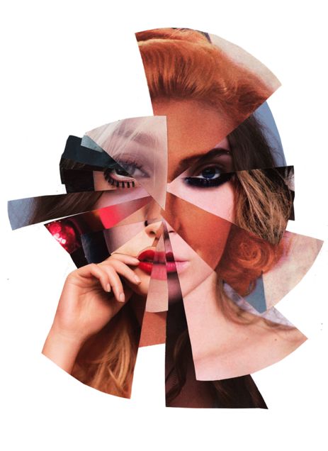
With these set of images I have made many final pieces some that I have finished some that i haven't. For the fist image I used one of the images with just one model and weaved 3 different colored paper into her face to make it look like a glitch.
WWWI think that having the 3 different colours weaved into this photo was very interesting because you can see what the actual image is, it looked glitched and weird at the same time because the strips are not all the same size.
|
EBITo improve upon this, I think that I could have used multiple colour strips to see how the piece would have turned out, I could have also improved on it by using a more complicated picture, for example, editing the one and adding more on top to make it look confused.
|
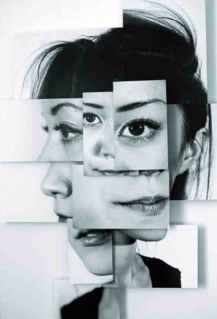
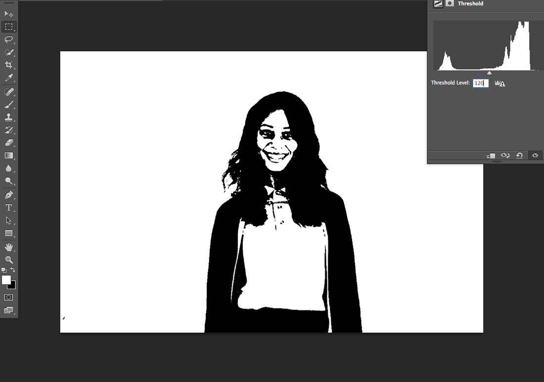
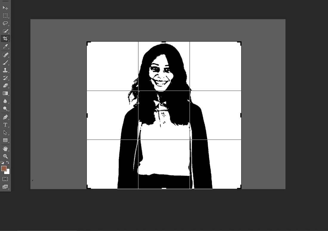
For my second and third final piece I used photo shop to edit both photos to again weave them into each other.
Firstly I had dragged this photo and photo shop and made a second layer. I then change the level of the threshold while making it black and white
I had then cropped it because I didn't need the plain white background.
Final images
WWWI think that having the black an white effect shows all the main features in the face for both pictures.
|
EBII think to improve this photo there should be a bit my color in the background rather than having it plain white I can do this by editing it on photo shop.
|
Photography trip images
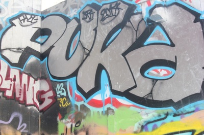
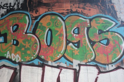
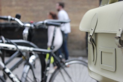
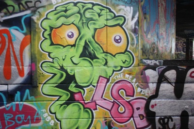
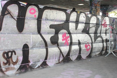
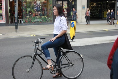
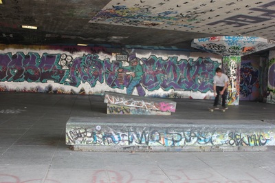
I did get a final piece out of the images I had taken in the photography trip. I used these two photos.

|

|
I had started by layering both pictures on top of each other and playing around with the opacity button, to see how i could get both the graffiti photo and the woman on a bike look clear but not too crowded.
I then stared plating with the list of effects that i could use to make each photo stand out making sure you can see everything in both photos, even the background.
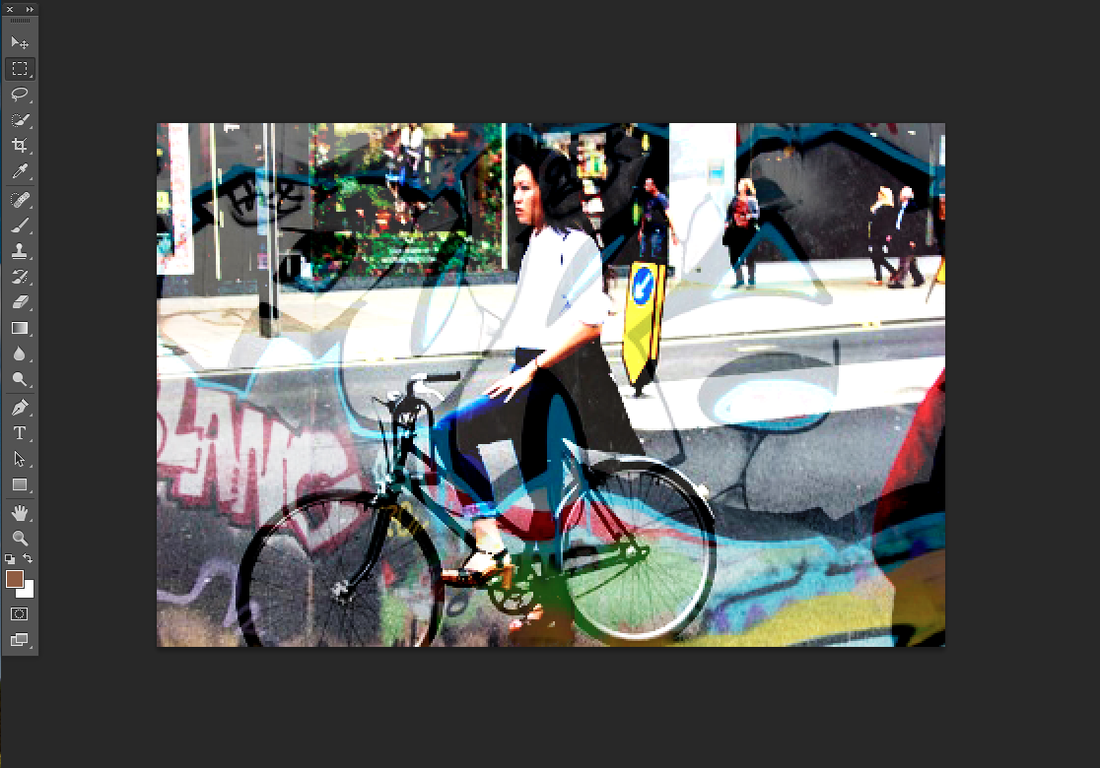
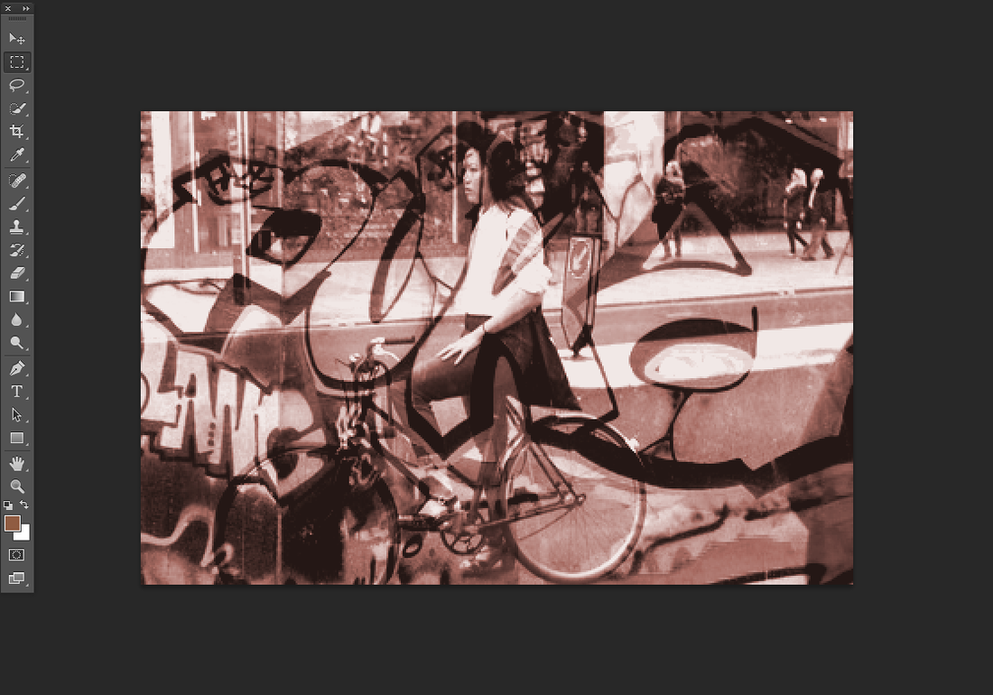
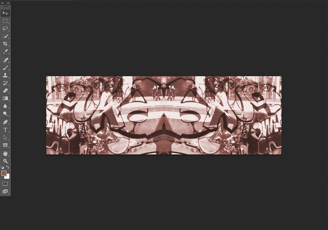
I the decided to make the images have one main color so I chose sepia, this made it look really old, which is better than having the mix of colors it was before.
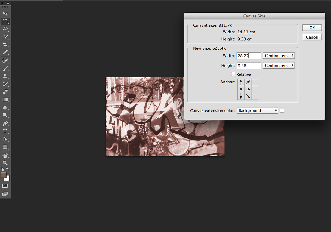
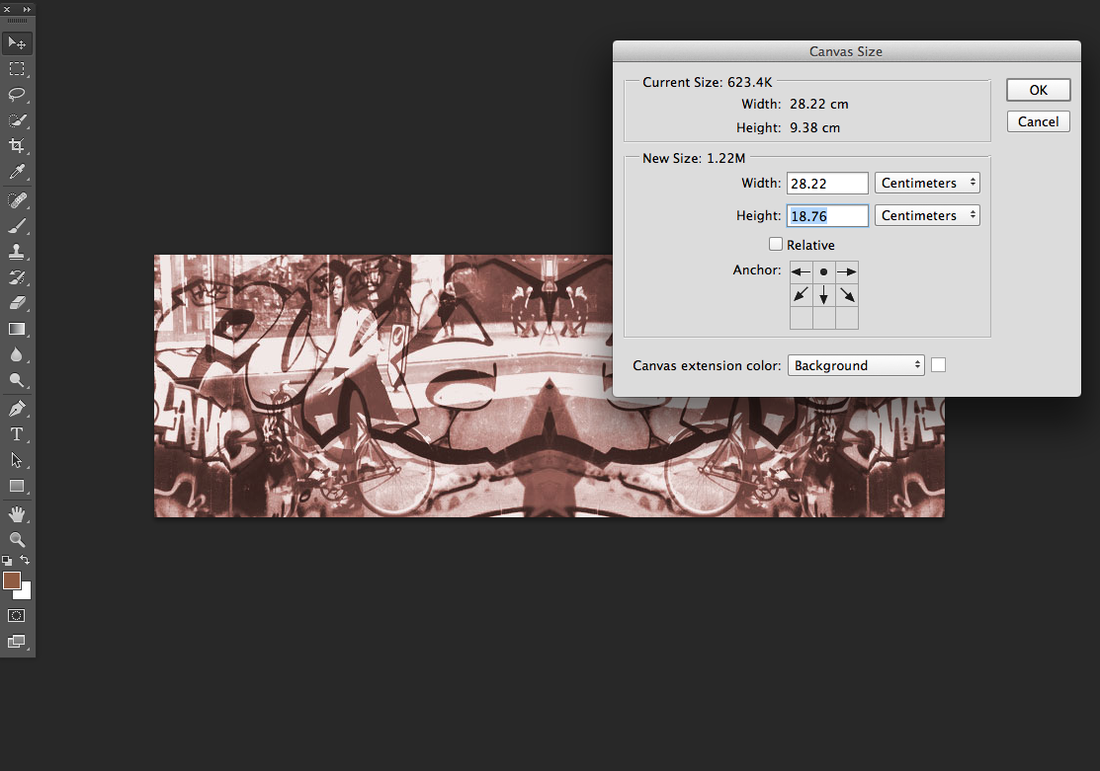
When happy with all the editing I made I then decide that I wanted to reflect the picture at least four different times but first I had to make the canvas bigger, to do this I went on to edit canvas, made the width longer and moved the anchor so that the free space will go to the correct area.
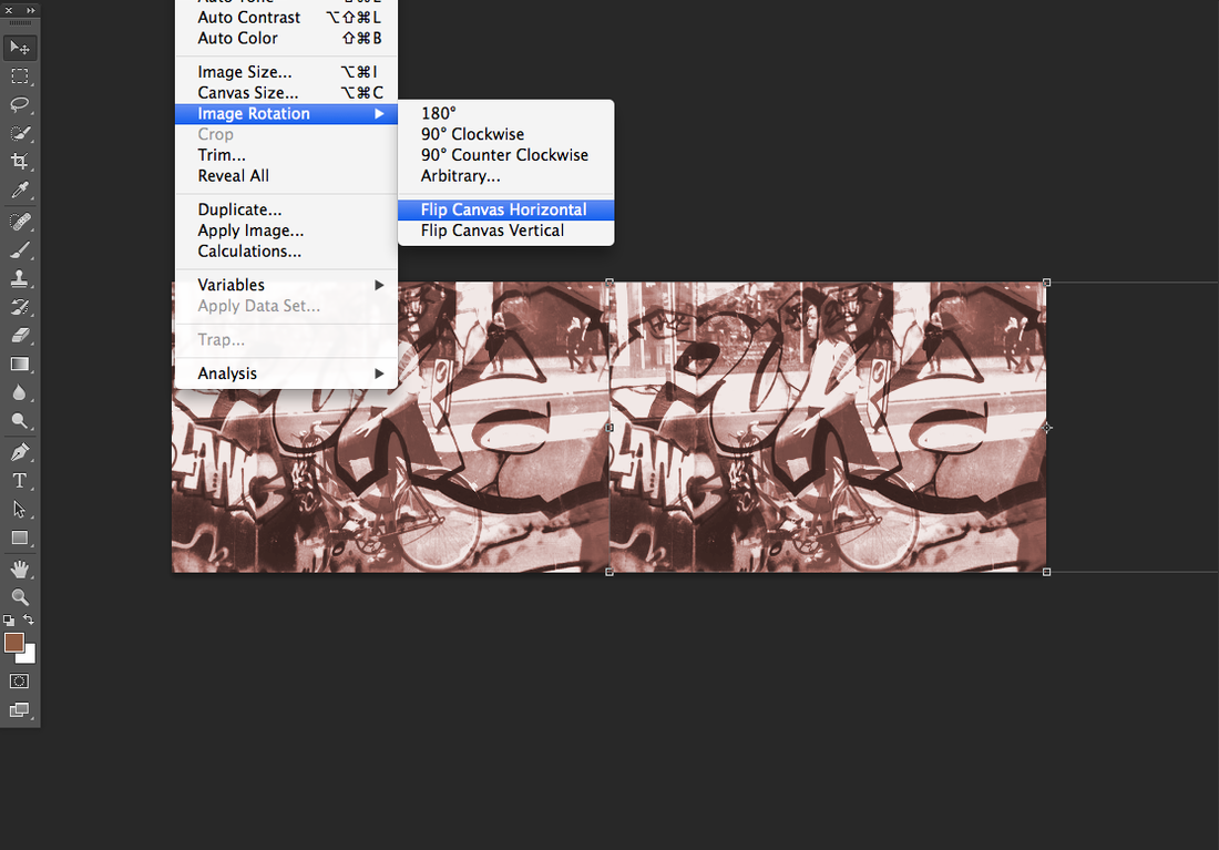
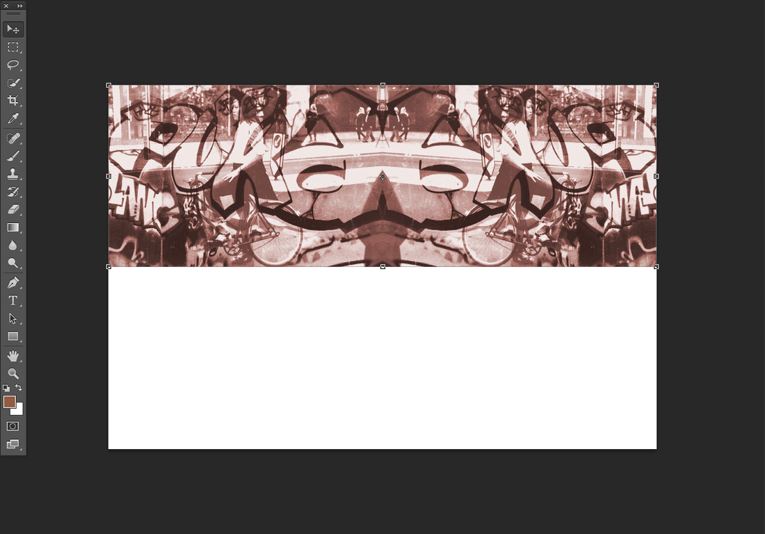
I dragged a copy of the photo and then went to; edit, image rotation and rotated it horizontally so it would look like a mirror image.
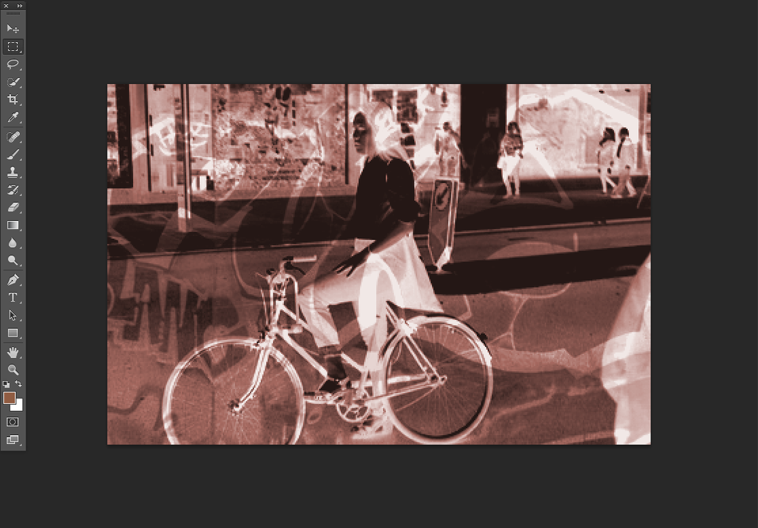
I don't exactly the same steps as I did with the first rotation however this time I am going to flip this whole image vertically
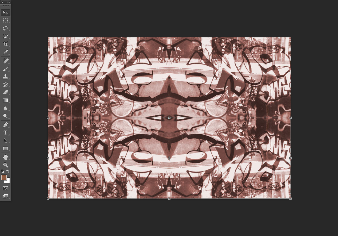
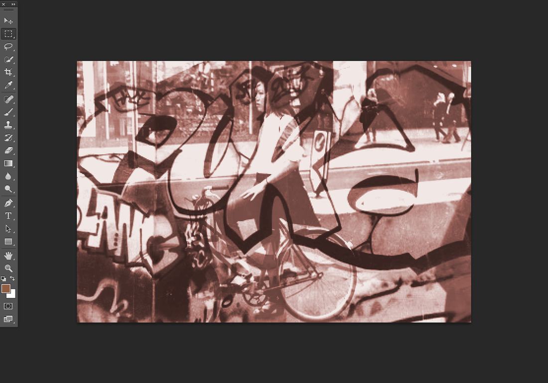
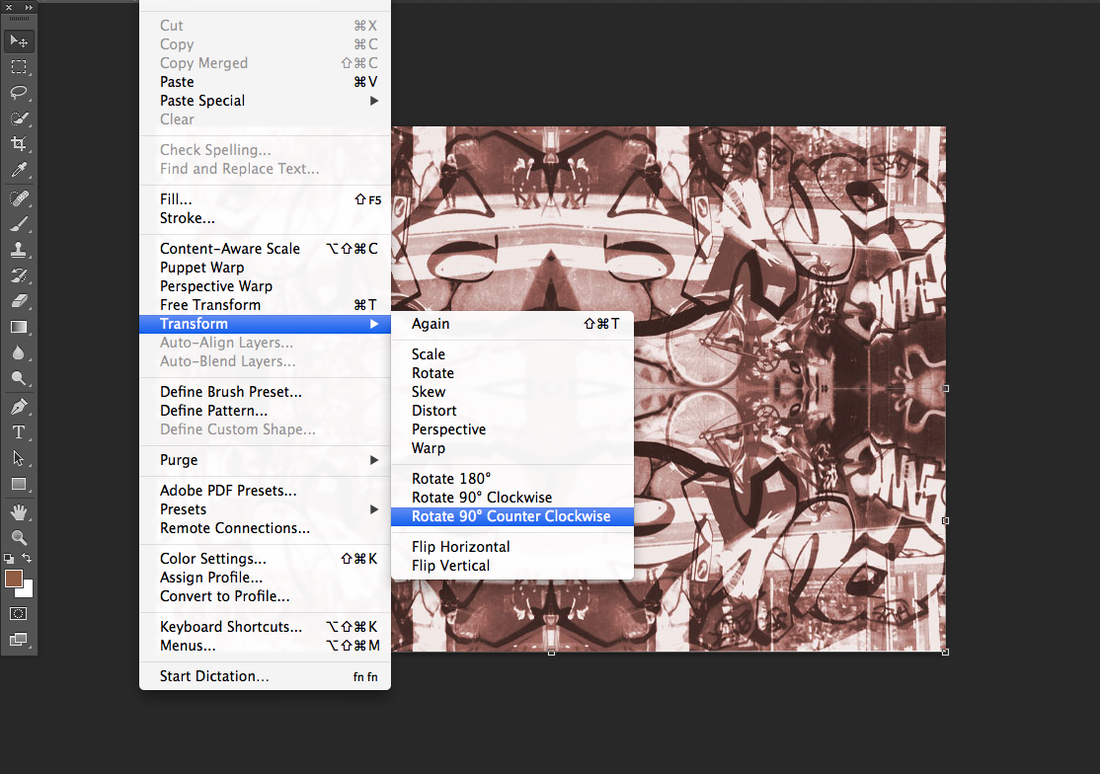
I thought this image was too plain and simple so i wanted to change it by going to edit , transform, rotate 90 counter clock wise . And this got a replica of the whole image and rotated it counter clock wise.
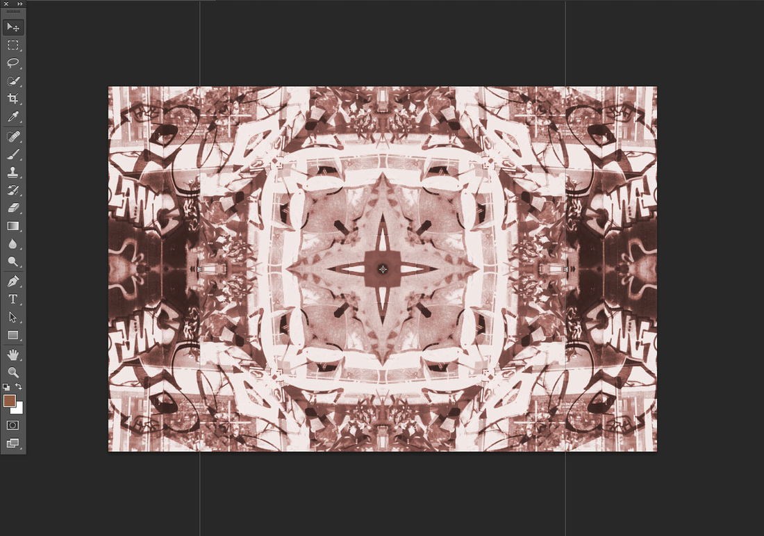
This is final image , I didn't change the color of it because I thought it still gave that vintage kind of look to it so I just kept it how it is.
Final Piece
WWWI think that this image is good because it fits into the category I'm doing, which is disguise. I like how you can't tell what pictures have been used and all the different shapes, lines and shades of brown.
|
EBITo improve this photo I think that I could have changed the color or even the theme of this picture. Also the image that I rotated 90 (degrees) counter clock wise I should have made darker or with a different color making it even more confusing than it already is.
|
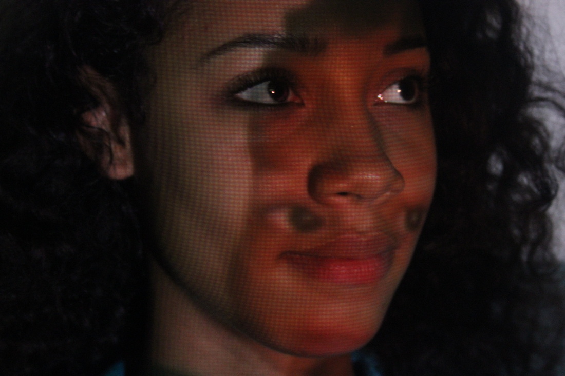
These images are from other student that was doing an exam and decided to project pictures onto someone and take the picture.'I did a Photo shoot for my photography exam. I used acetate prints and projected them on a white background then edited them.' - Caramel cream love
Forth set of images
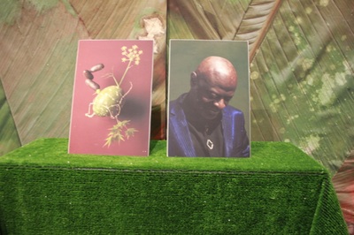
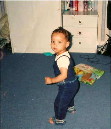
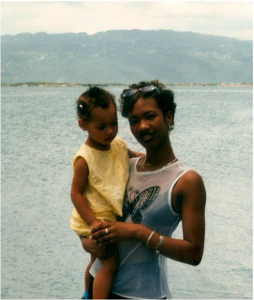
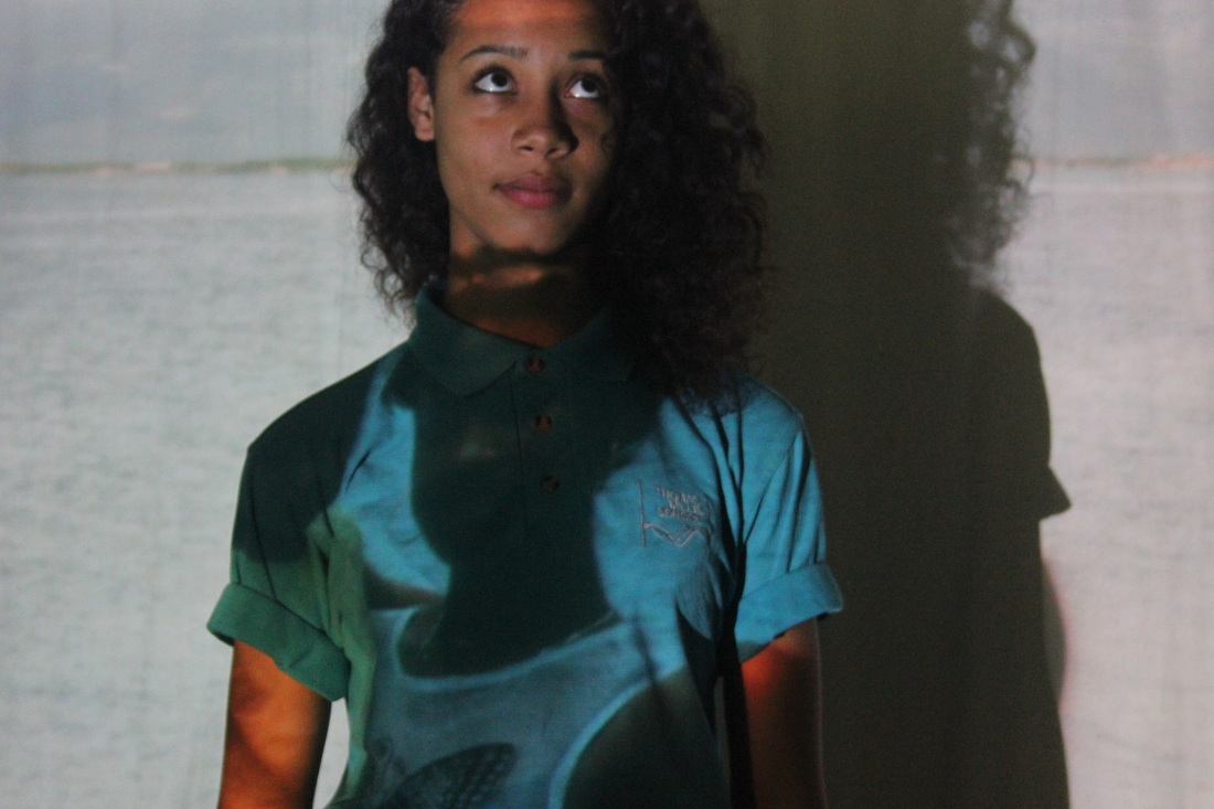
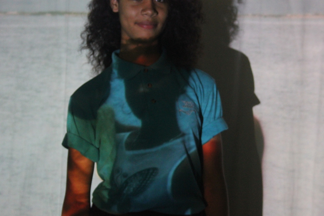
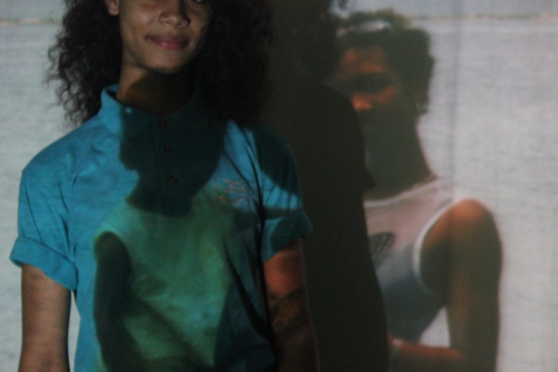
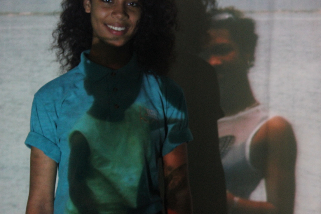
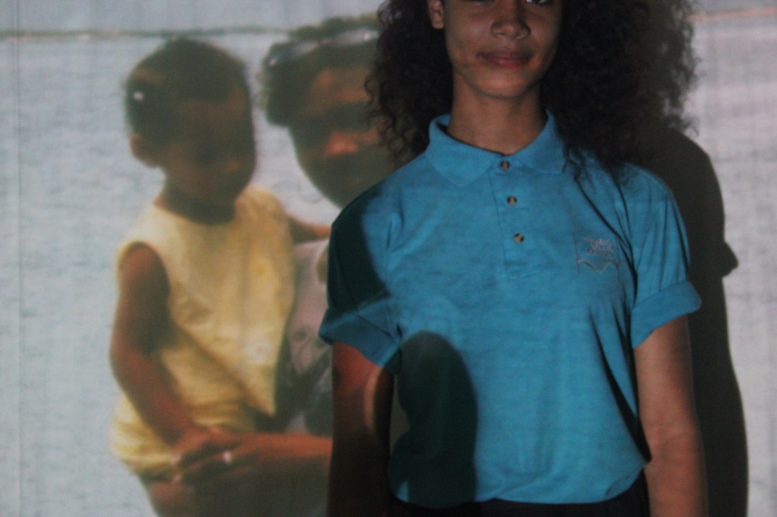
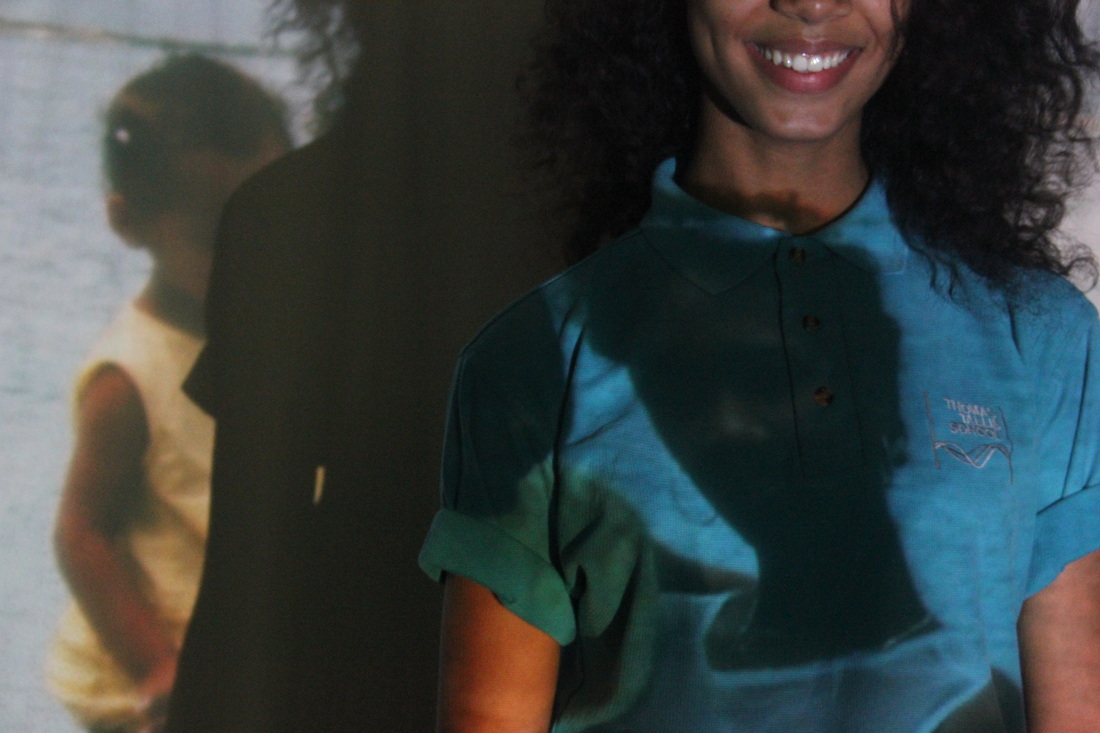
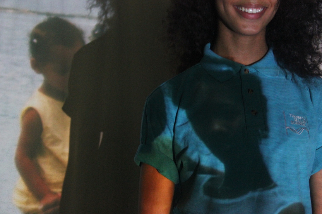
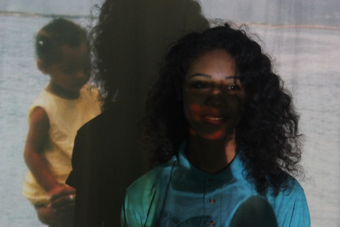
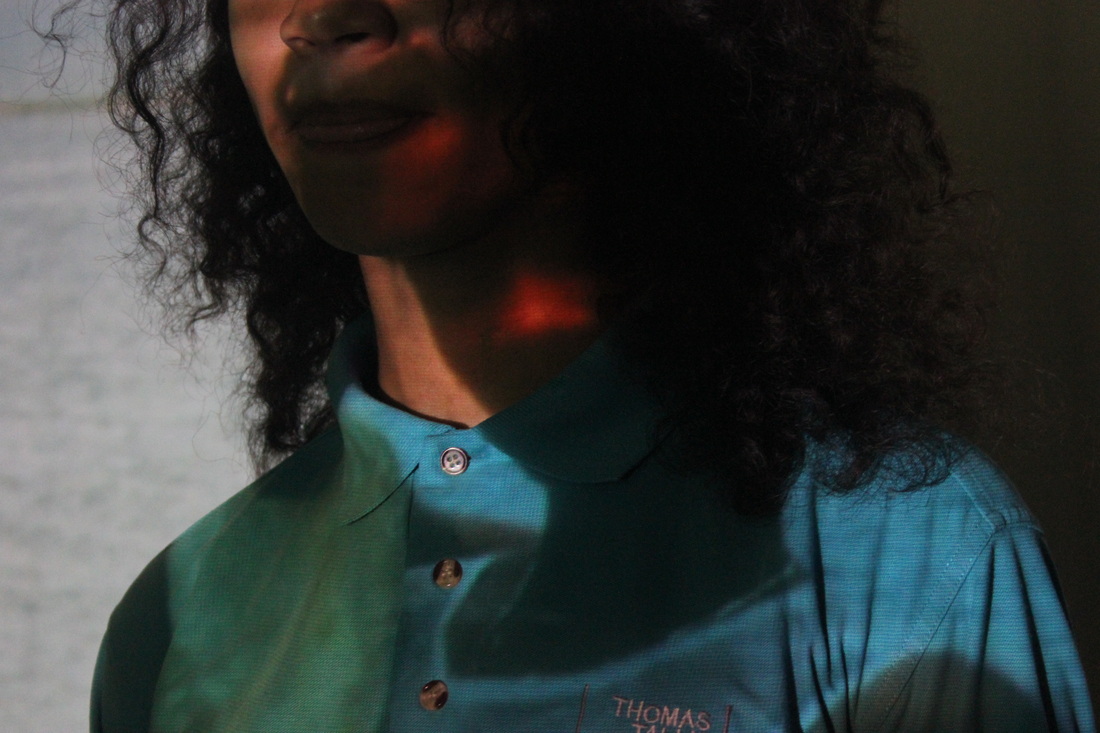
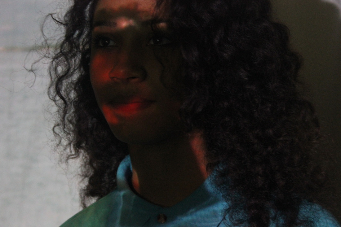
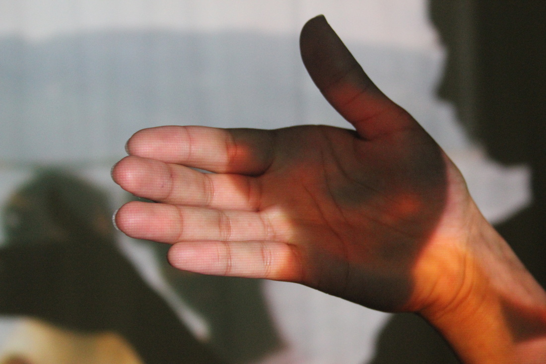
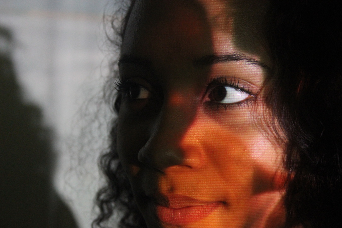
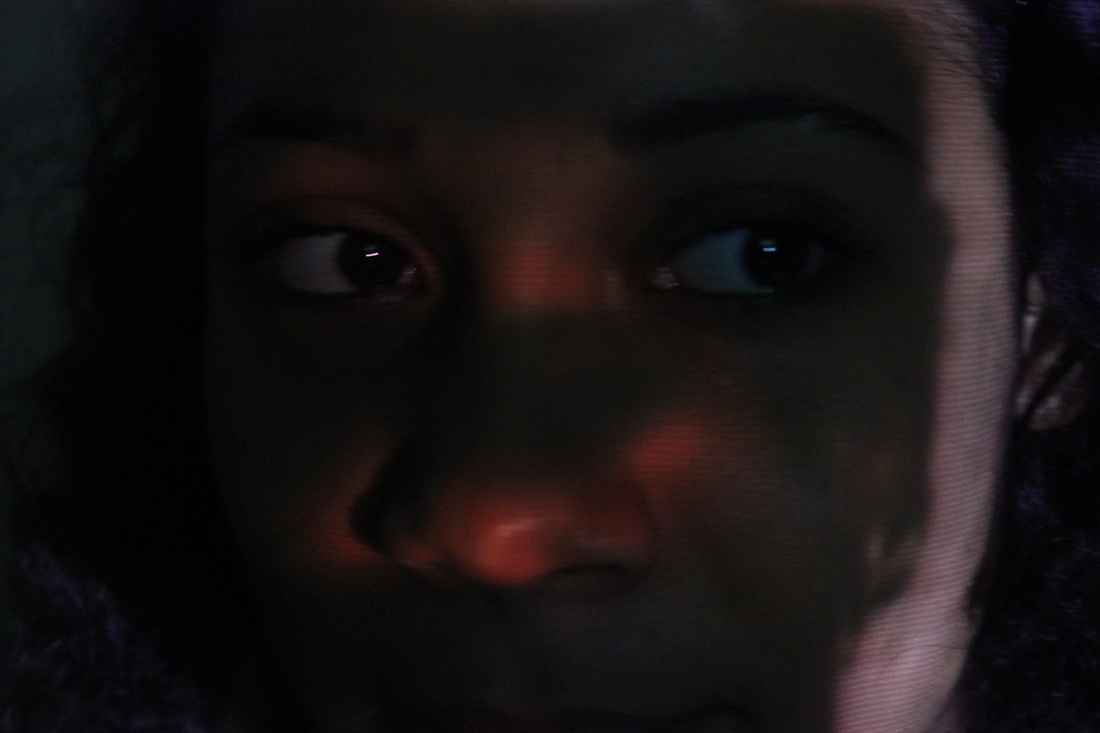
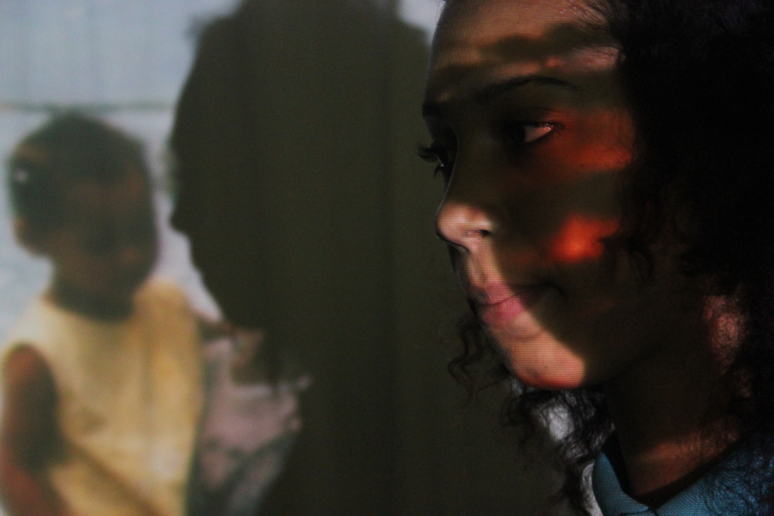
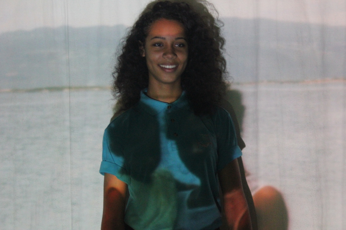
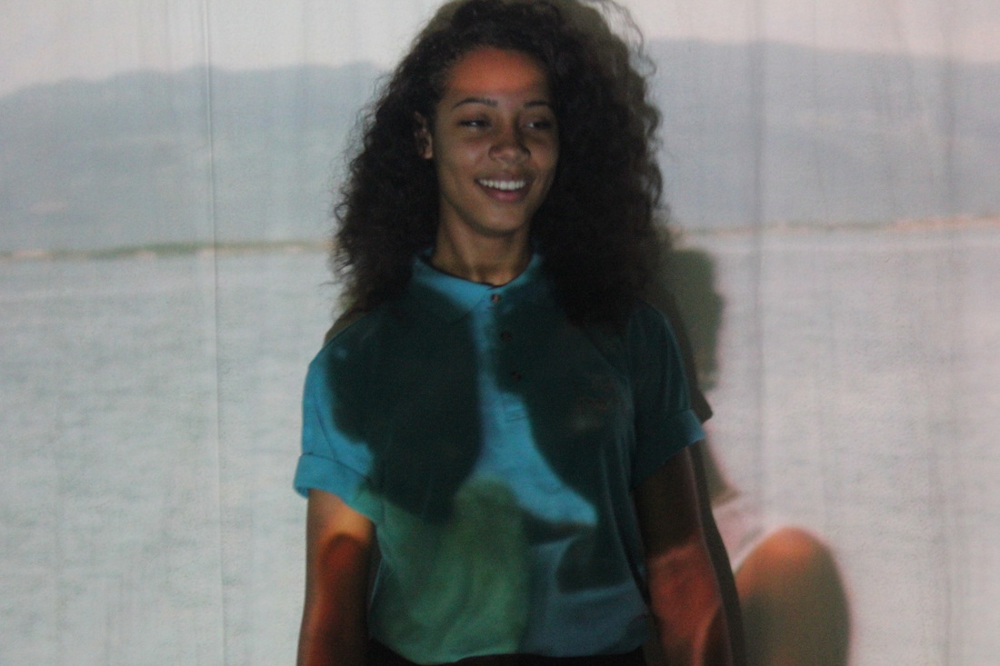
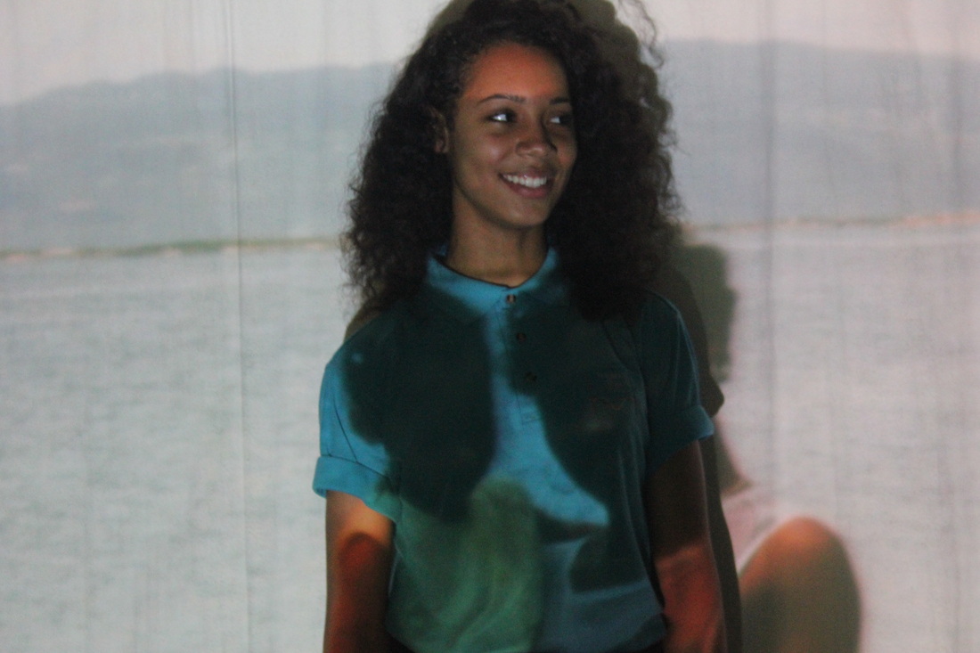
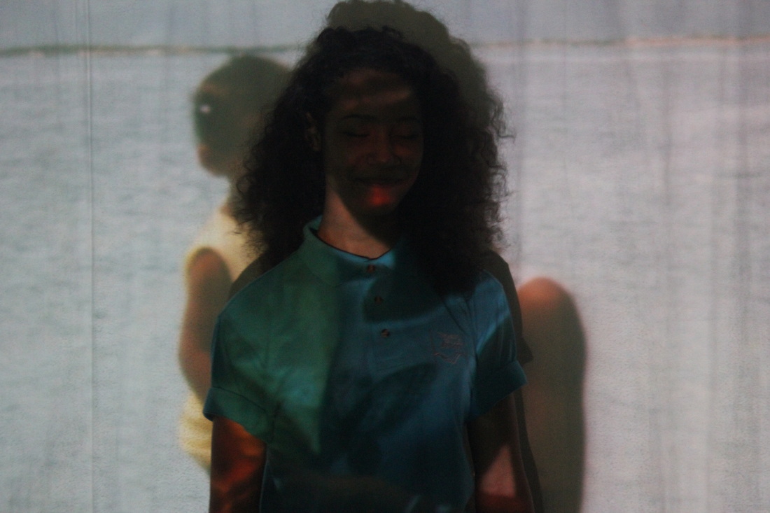
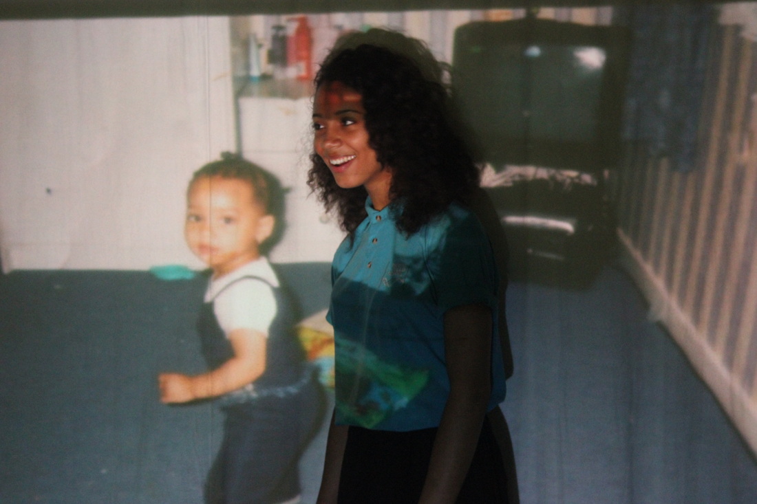
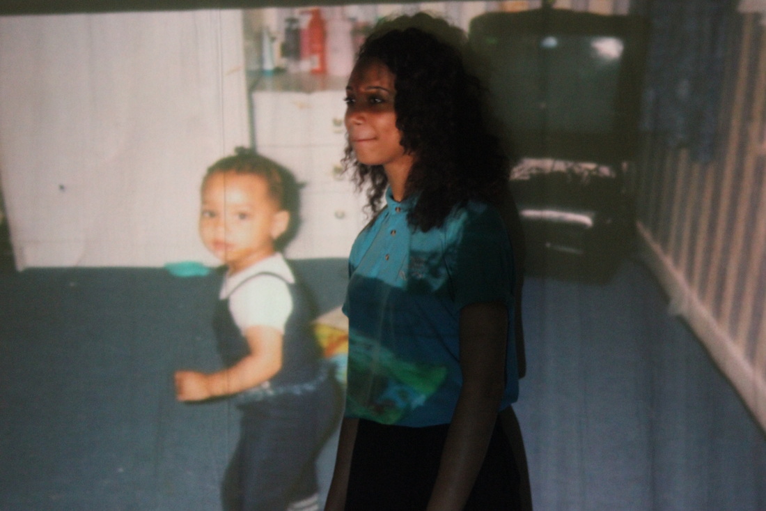
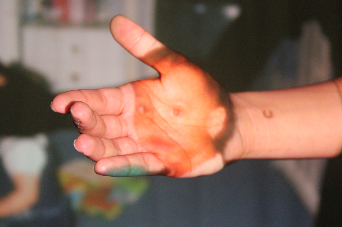
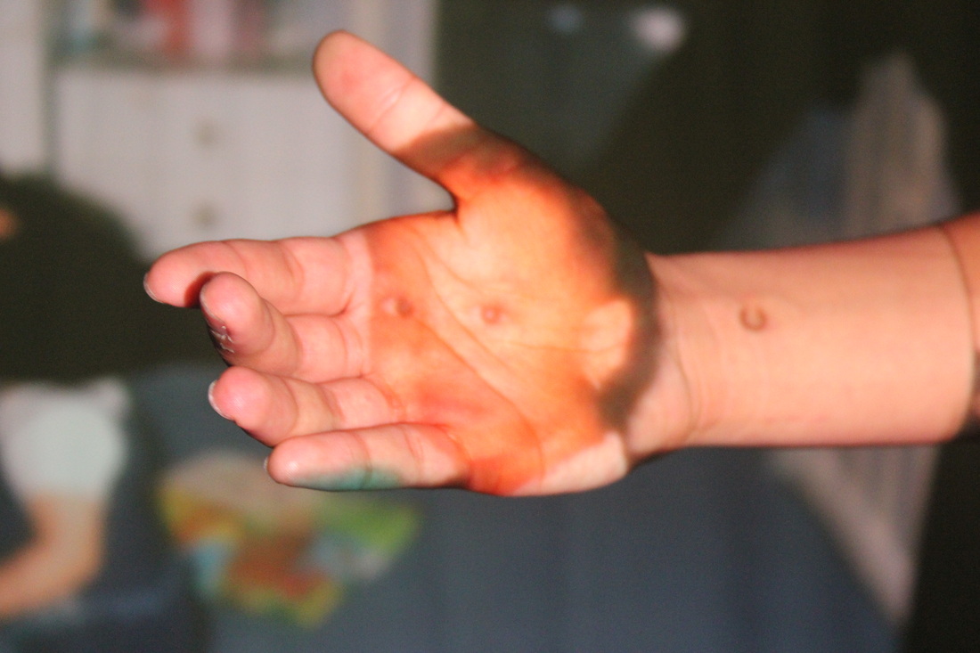
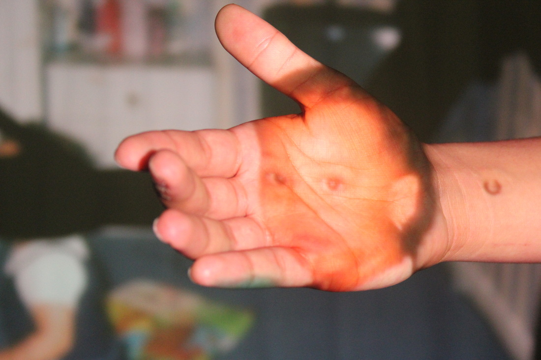
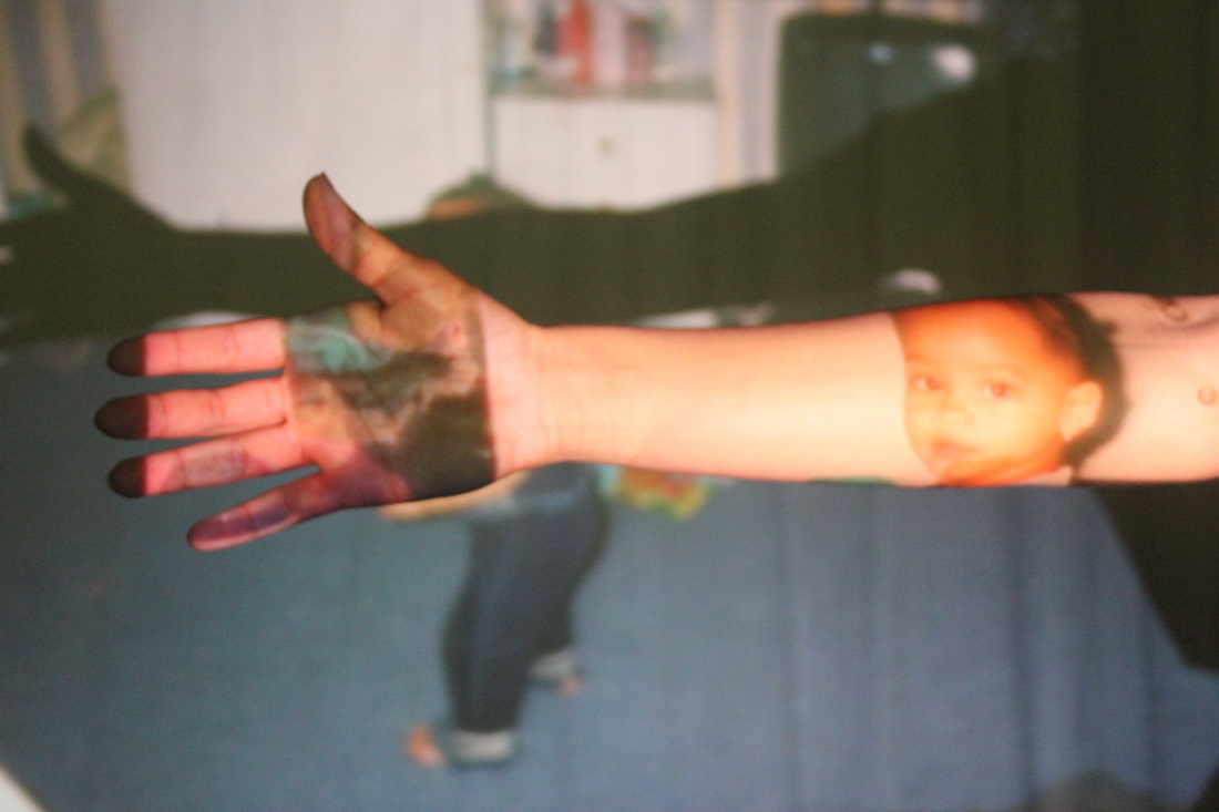
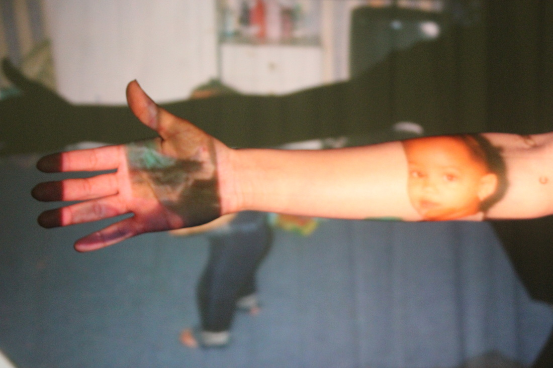
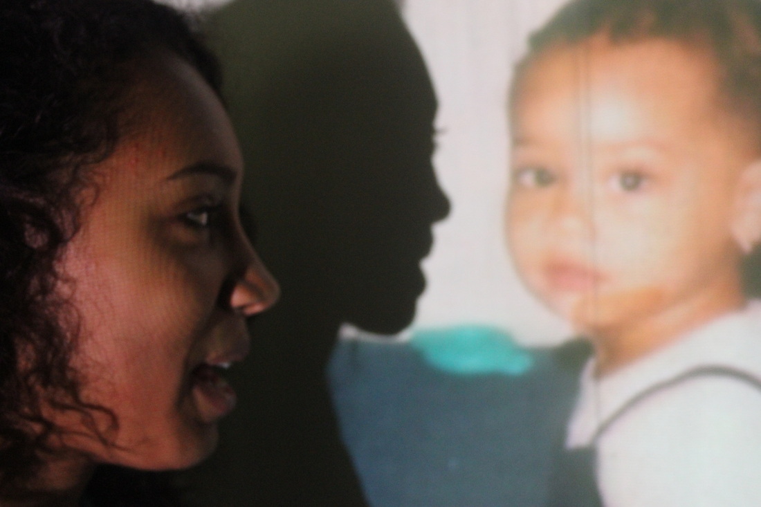
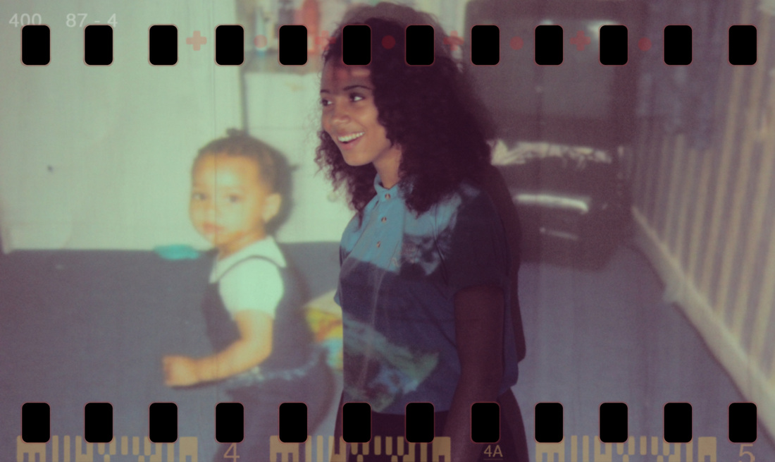
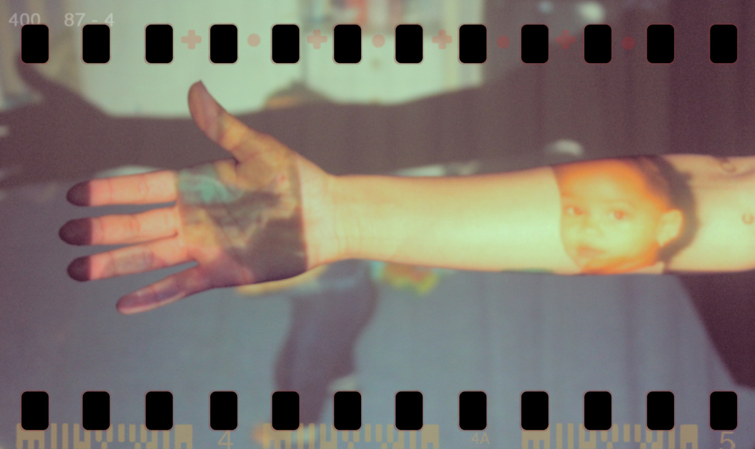
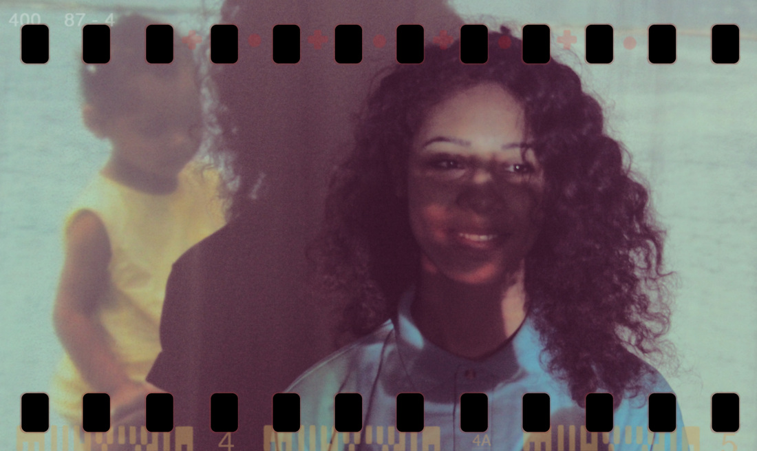
These images are photos that I have found at home from when I was little projected onto my face. At first I was going to get a photo of when my mum was in her Thomas Tallis uniform, to project on to me however she didn't have one of her therefore i had to compromise using baby pictures. I used the following two photos.
|
|
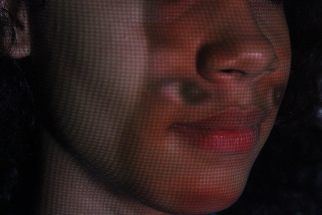
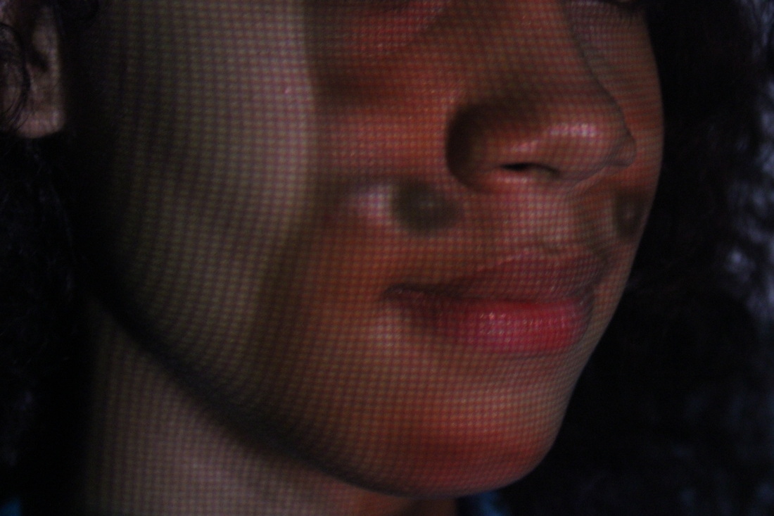
Using both photos we took these pictures from every angle that we could think of, some better than others, but I do like all of them.
Using a CAD called Camera bag 2, which through there I edited the eight photos I liked the most, then used an affect called ... then added a theme that would go with all photos. Choosing the effect was hard because it had to compliment all eight photos not just the one.

WWW |
EBI |
|
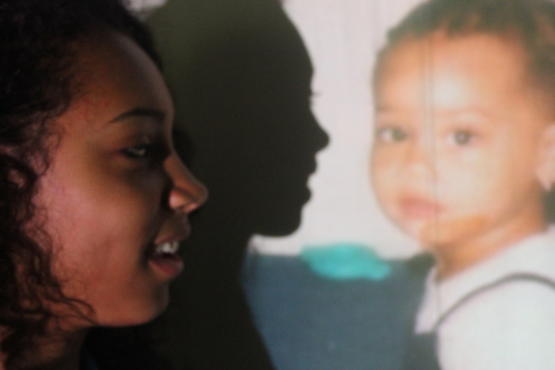
I think that having me standing in more than one place in the pictures made it more interesting to see which photo came out best. For example in one of the pictures I had stood next to the baby picture of me almost doing the same pose as I was in the picture, where as in one of the other pictures I have my baby face projected onto my face , making it look distorted and weird because the eyes of the projected photo is on my cheeks instead of my eyes.
|
To improve these pictures I could have add an effect onto it because you can't see what the picture looks like because its so dark. The second thing I could improve these photos are by experimenting more, with the different ways on how to project the photo on me or around me with out having the shadow making the photos more dark.
|
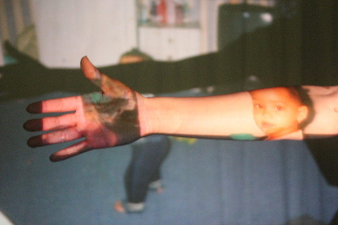
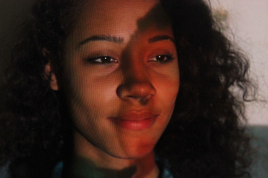
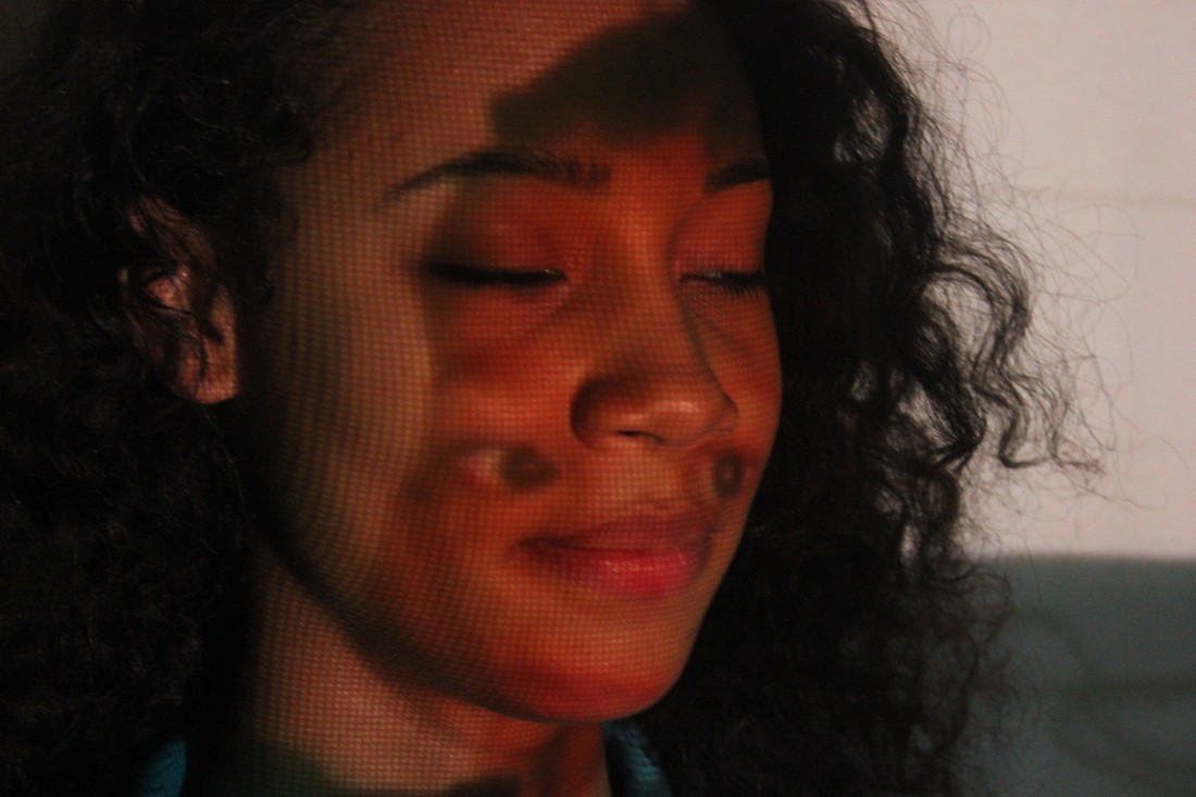
For my final piece I picked eight photos out of all forty that I thought were the best and edited on Camera bag 2. Firstly I added an effect to it making sure that it complimented all the photos not just the one and then I added a background to make it look like it was taken from a film roll.
WWWI think all the edited photos came out really good because the affect that I have put on it, makes it easier to see the projected photos, and also have the background of a film roll makes it more curious.
|
EBITo improve these photos I could of gone on photo shop and made them a bit lighter or even added 2 effects to making it look more thought - provoking.
|
Evaluation
AO1: Research & Ideas
The theme I chose was disguise, I chose this category because I thought it would be an interesting challenge and it would be fun to do because You can get any photo and change it in so many ways hat it can be counted as disguise. I began my research by going onto pinterest and looking for ideas, making a mood board of everything that I liked, I then came up with my first idea, which was to dress up a model in Victorian clothes and print out those image in black-white and colored and stick them on top of each other in different shapes. Almost like fragments, however the photo I was using came out blurry therefore they couldn't be used and I needed a new idea. The first idea I had was to take multiple pictures edit them and layer them all on top of each other in photo shop (my first and second set of images) However they came out blurry when I printed them in A3 therefore I couldn't carry on with that idea. I developed my research by looking at other ways disguise can come across in photography and I found a photographer that weaves his photos called Seung Hoon Park. This is were I got my first/ second idea. From there I just wanted to edit photos on Photoshop and that is what I did, no photographer inspired me for that idea. I don't really have a best idea but I have two favorites. The first one is my first final piece with the weaving and my second is The first edited photo from the projected photos. These are my favorites because they catch peoples eye and I am very pleased with they way they came out.
AO2: Experimenting, Developing & Refining
Overall I have decided to try and used different techniques in taking my images and editing them, such as: photo shop, the studio, a projector and film lights. the things that went well during this process was, the fact that I had a range of equipment to use such as a white back drop with lights and the camera, I used this method for my third set of images and I liked how they came out, however because the lights weren't as bright as they seemed the background of the images came out yellow. Another thing that went well was using photo shop. Photo shop is complicated to use however once I got use to it I understood what changes I needed to make to my images. My work had developed over time because of the amount of research I was doing about other photographers, their images and how it relates to my topic. After every research I would get a new idea with my images and keep changing until I was happy with the outcome. Iv'e refined the quality of my work my removing objects or things I disliked in the image (s), for example if I didn't like how a image came out because it was either to dark or boring I would edit it on photo shop to something that interests me and, what I think wold catch someones eye.
AO4: Evaluating Final Outcomes
In response to my chosen theme I have made a couple of good final pieces, although I didn't carry out all of them but still edited them. This caused me to use many different techniques and processes to achieve my final piece (s). Over all I have chosen to mount all my final pieces onto mount board after designing them. The things that went really well was actually taking the images editing and looking for photographers that could influence me, on the other hand it was quite difficult because of the printing, making the images look faded, the organisation of most of the final pieces and how I was going to turn an image into a disguise without always relying on electronic devices.
