Unit two - Collections

|

|

|
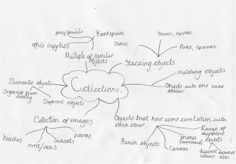
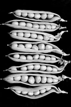
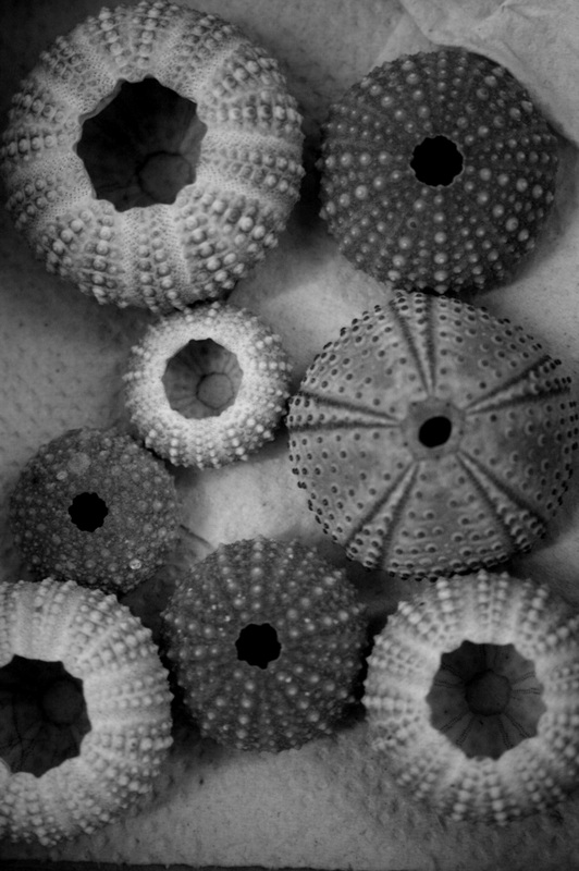
My starting point: Collections
I had started doing research through pinterest on my chosen topics, and I successfully found a range of interesting images that I suggest that go with the topic of collections. I will then carry on doing research on different photographers such as Olivia Parker and Todd McLellan.
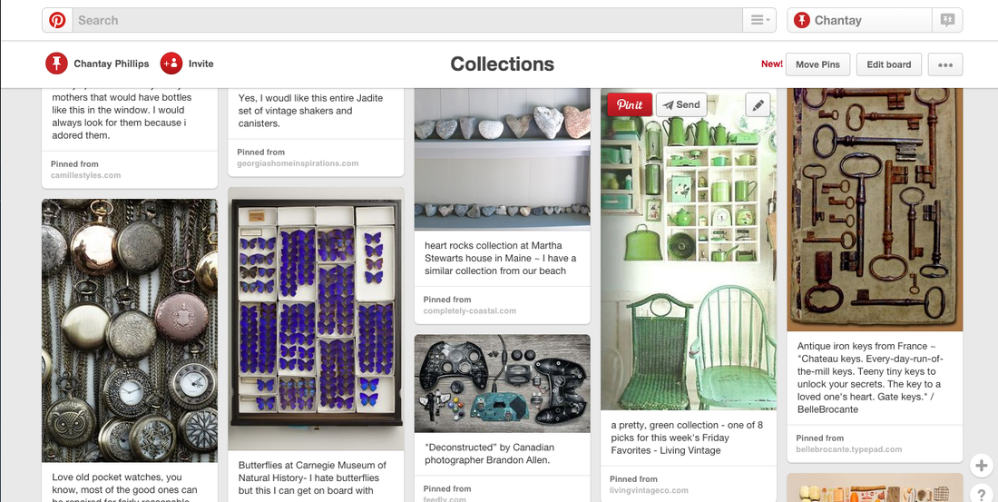
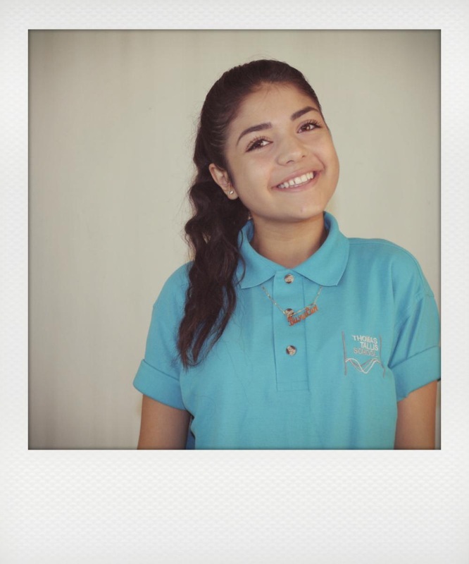
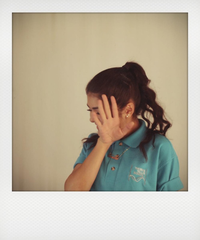
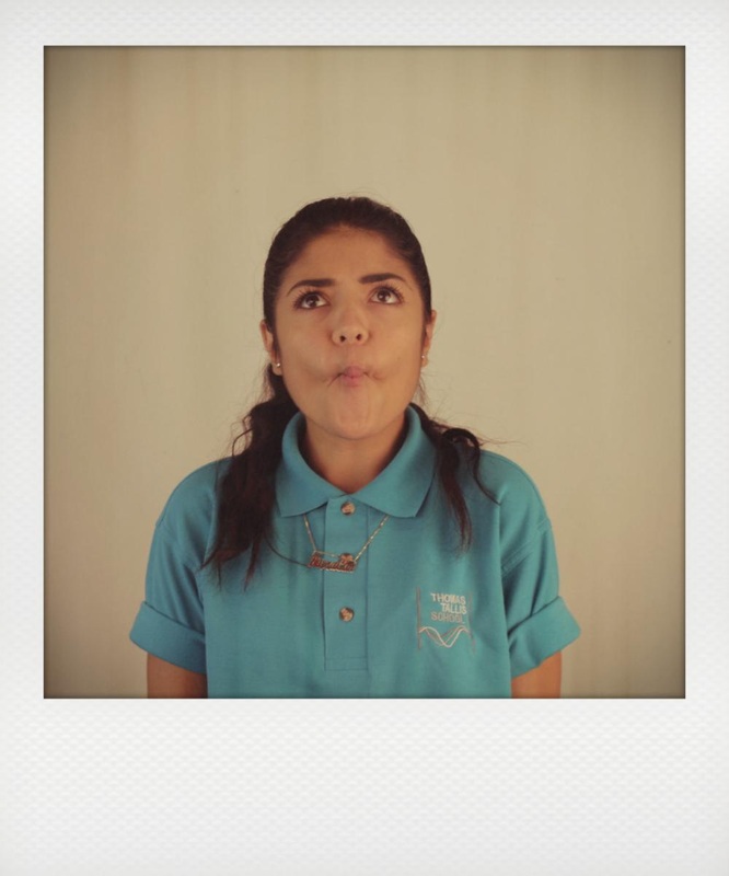
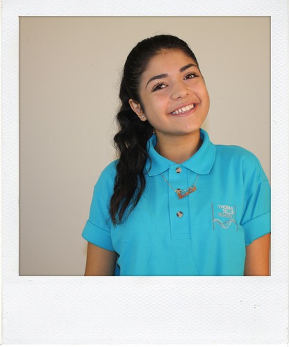
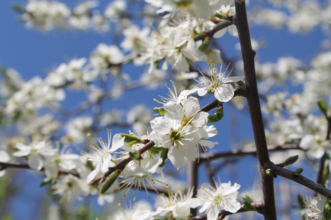
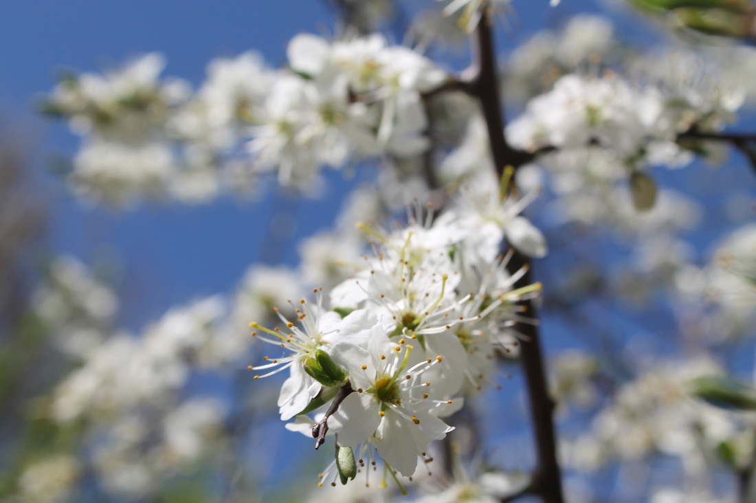
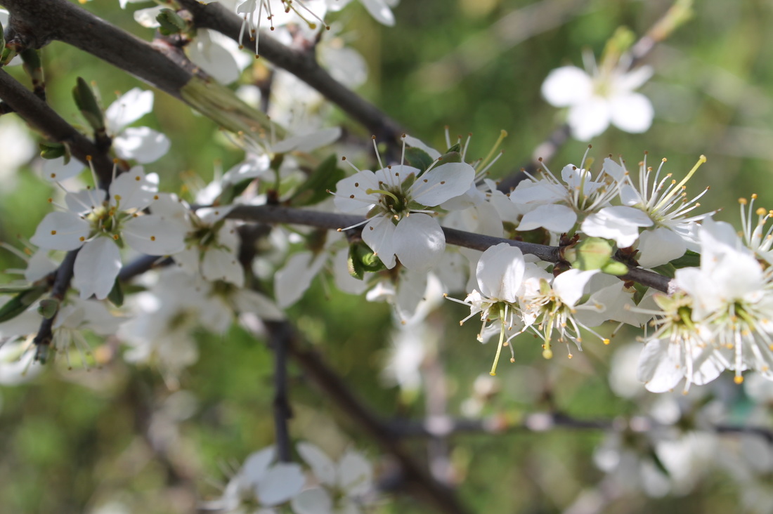
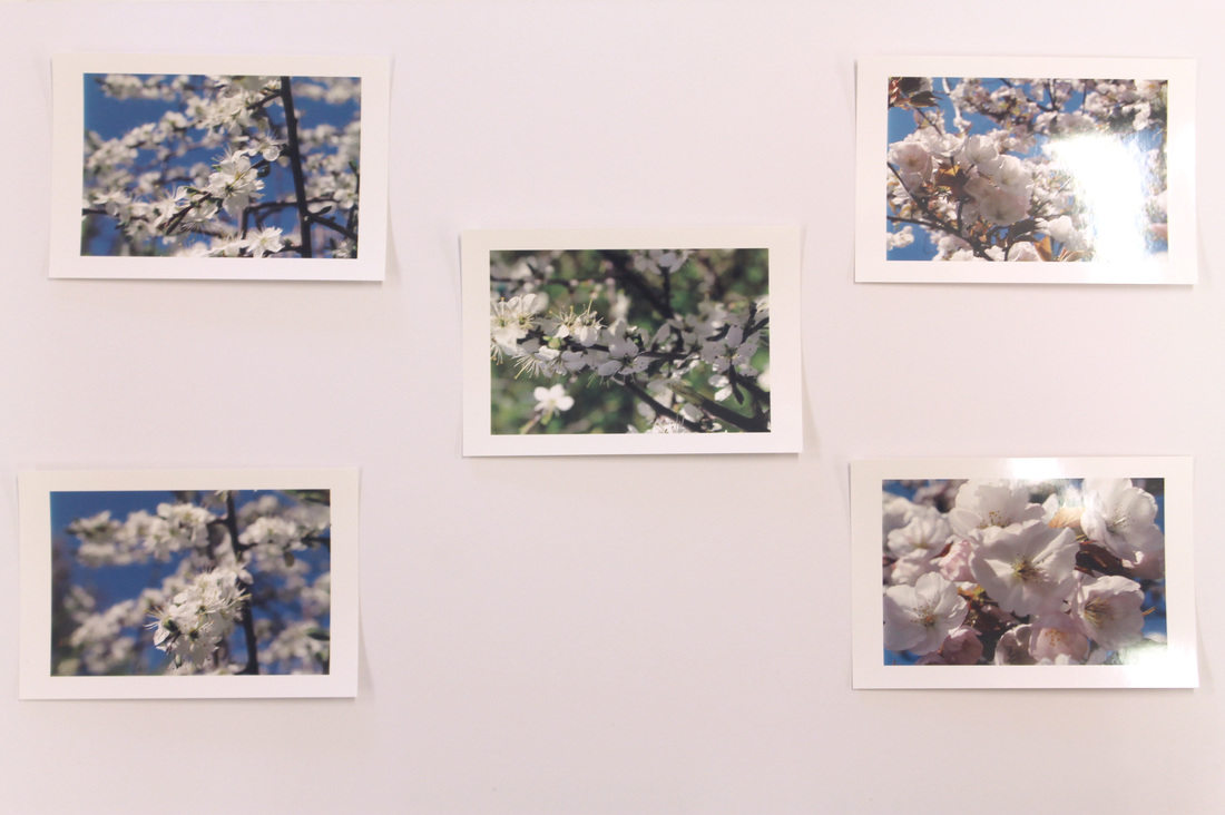
First set of images
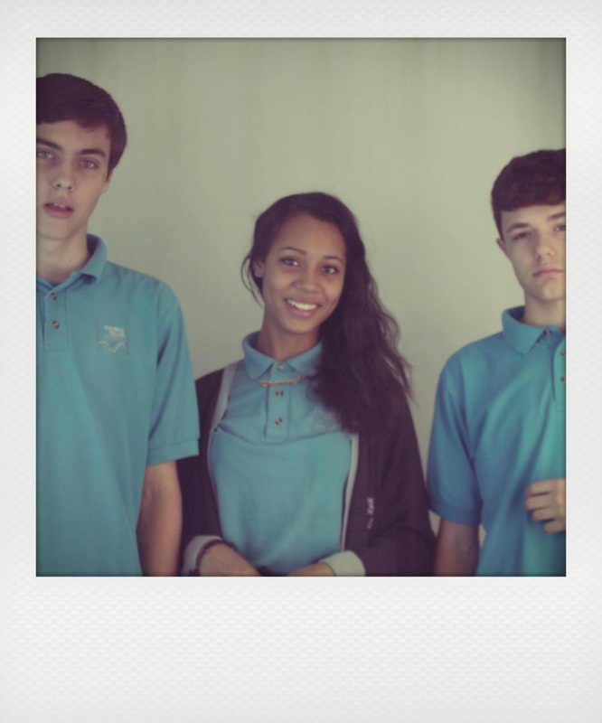
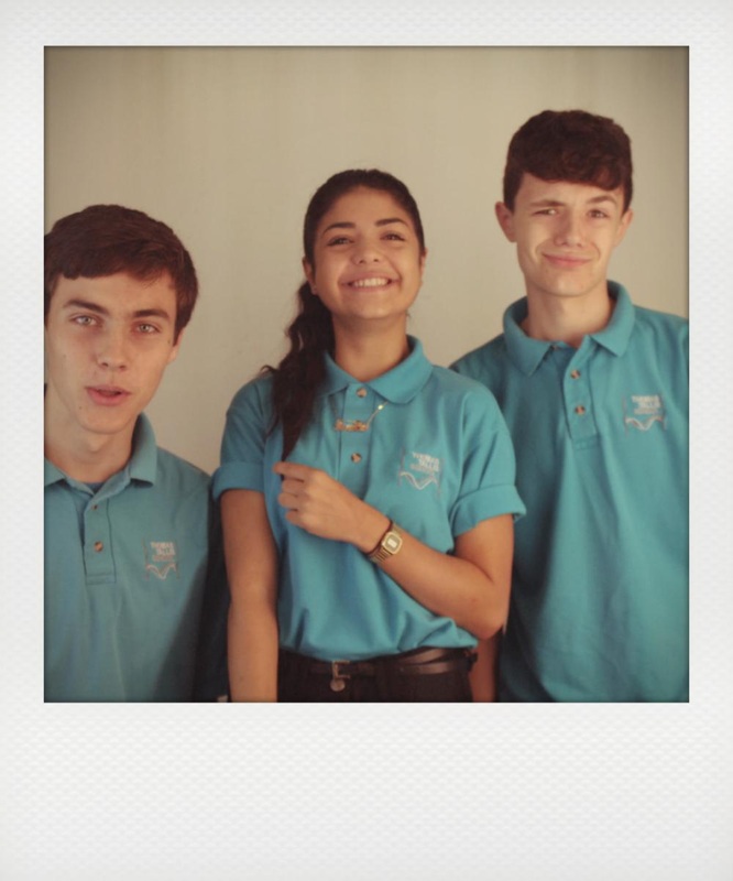
Firstly I started off with the idea of having a set of images with friends using a polaroid camera, however I don't own a polaroid camera therefore I had to result to using a application on the mac called instant. Instant converts your chosen image into a polaroid picture, it also adds a vintage effect to make it look like it has come from the actual camera. I used images from my previous project disguise.
WWW |
EBI |
|
I think all of these images went well because they did come out with the polaroid vintage effect, which was one of the objectives I was trying to achieve with these set of photos. I am also happy that they images all fit with the limit size, because they where either too big or too small.
|
I could improve them by using a range of images instead of the same ones from the previous, I could also of experimented with the different effects that the application instead of sticking with 1-2 of them.
|
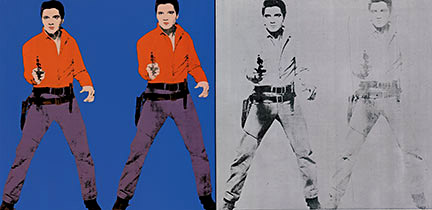
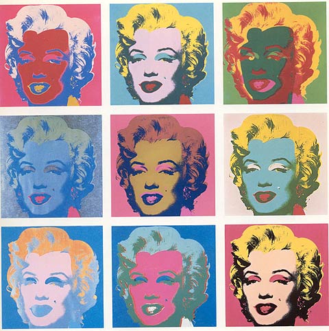
Andy Warhol
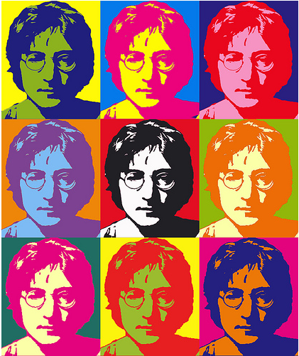
Second set of images
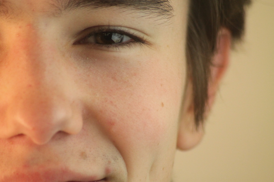
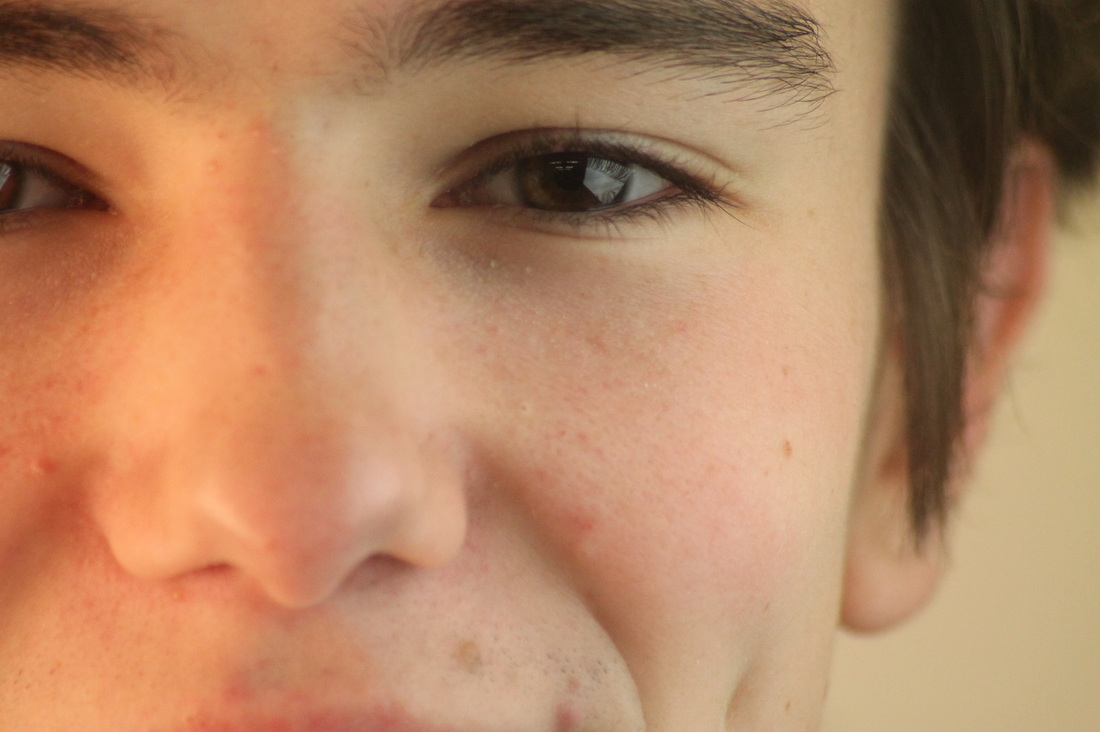
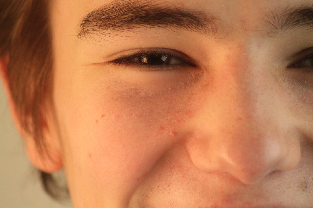
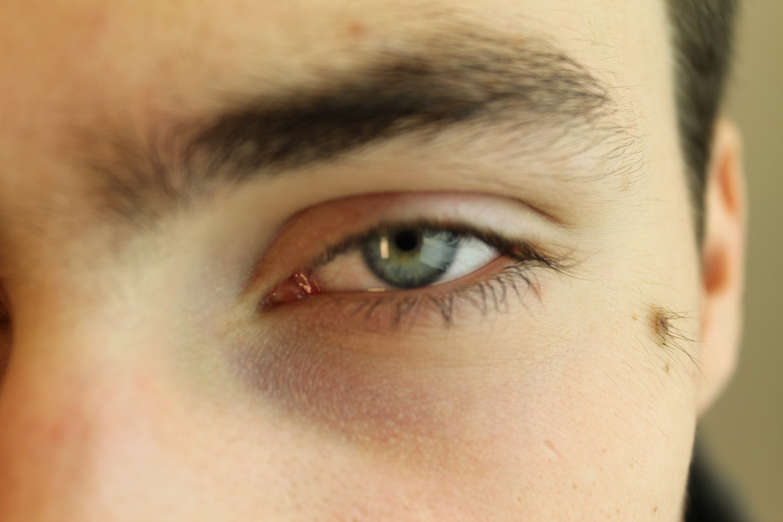
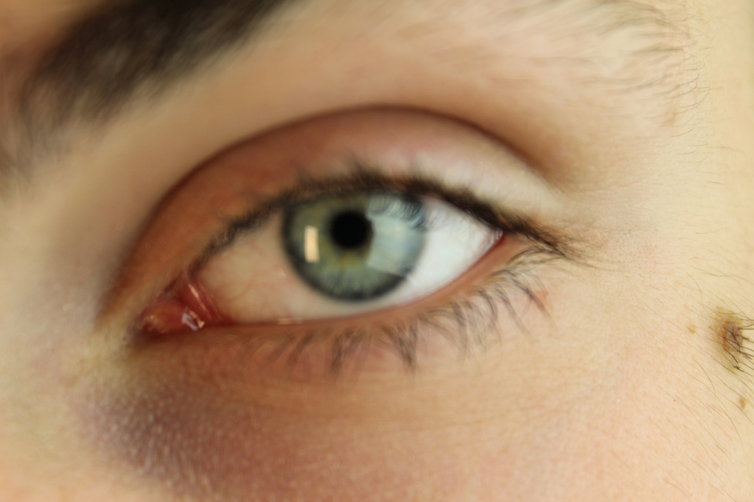

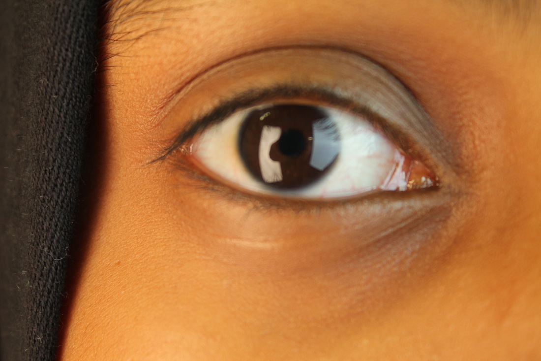

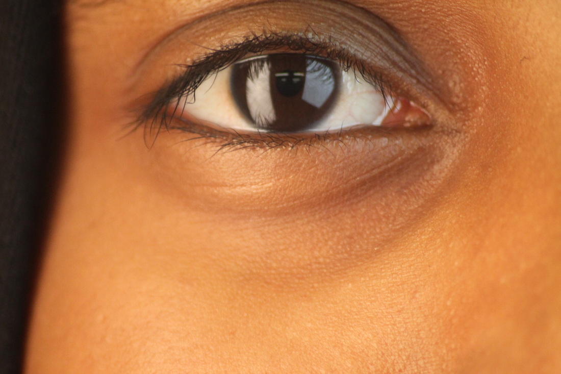
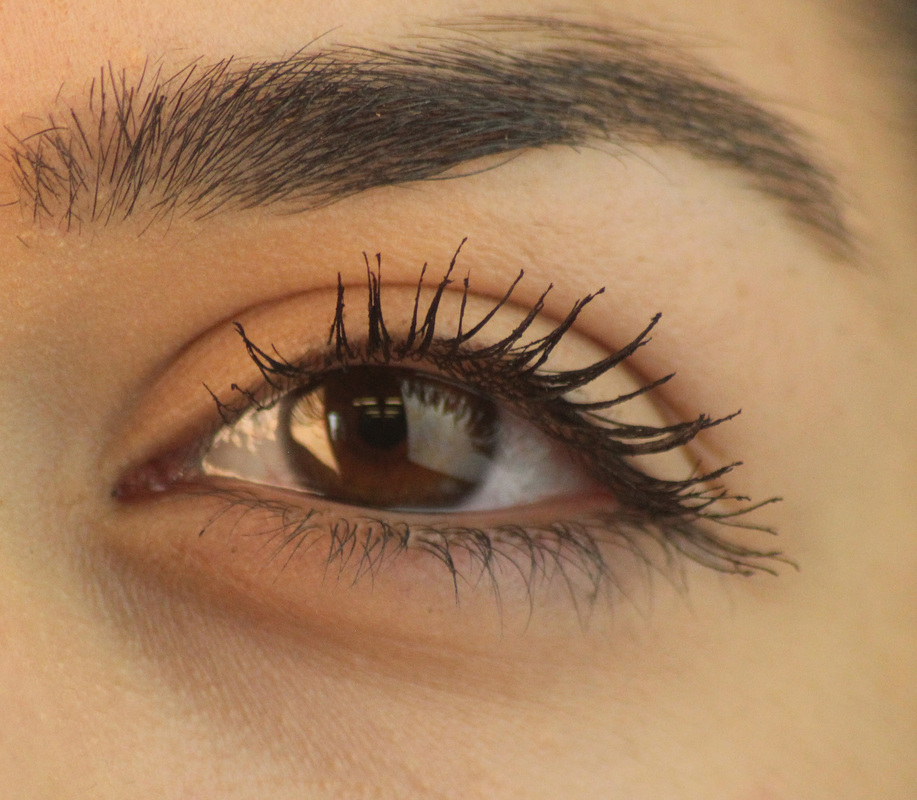

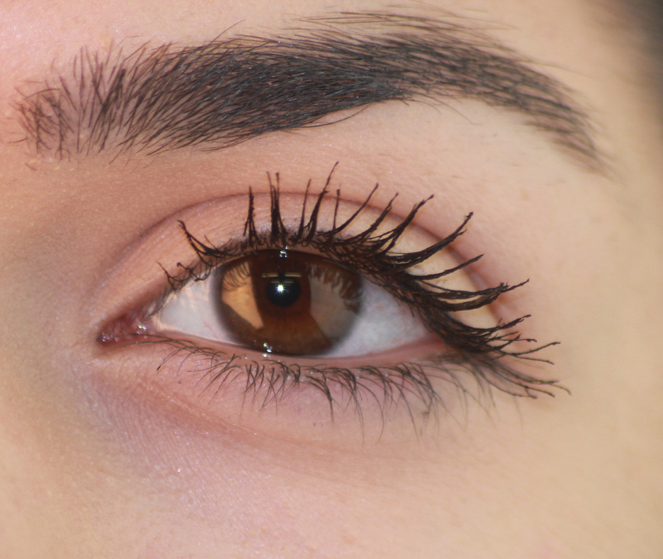


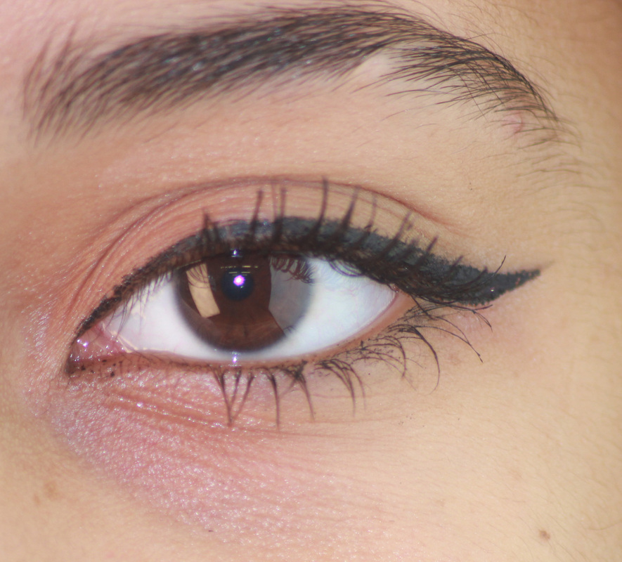
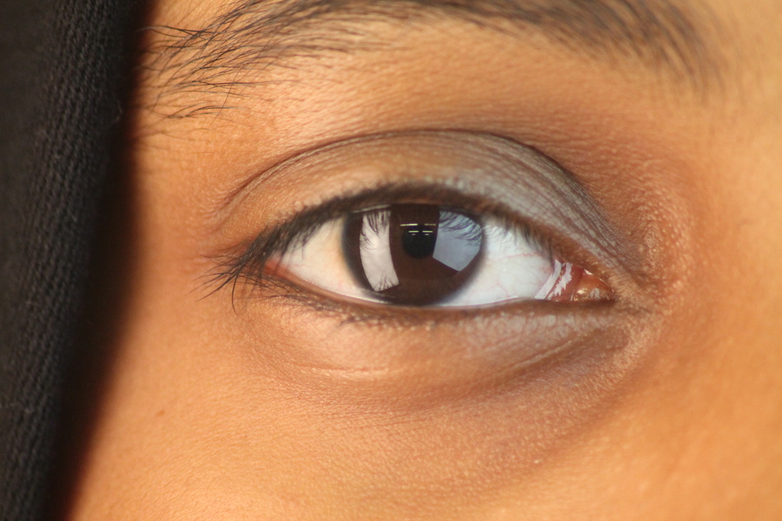
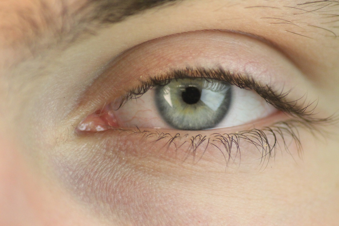
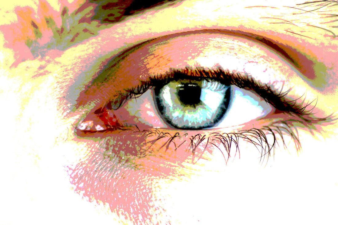
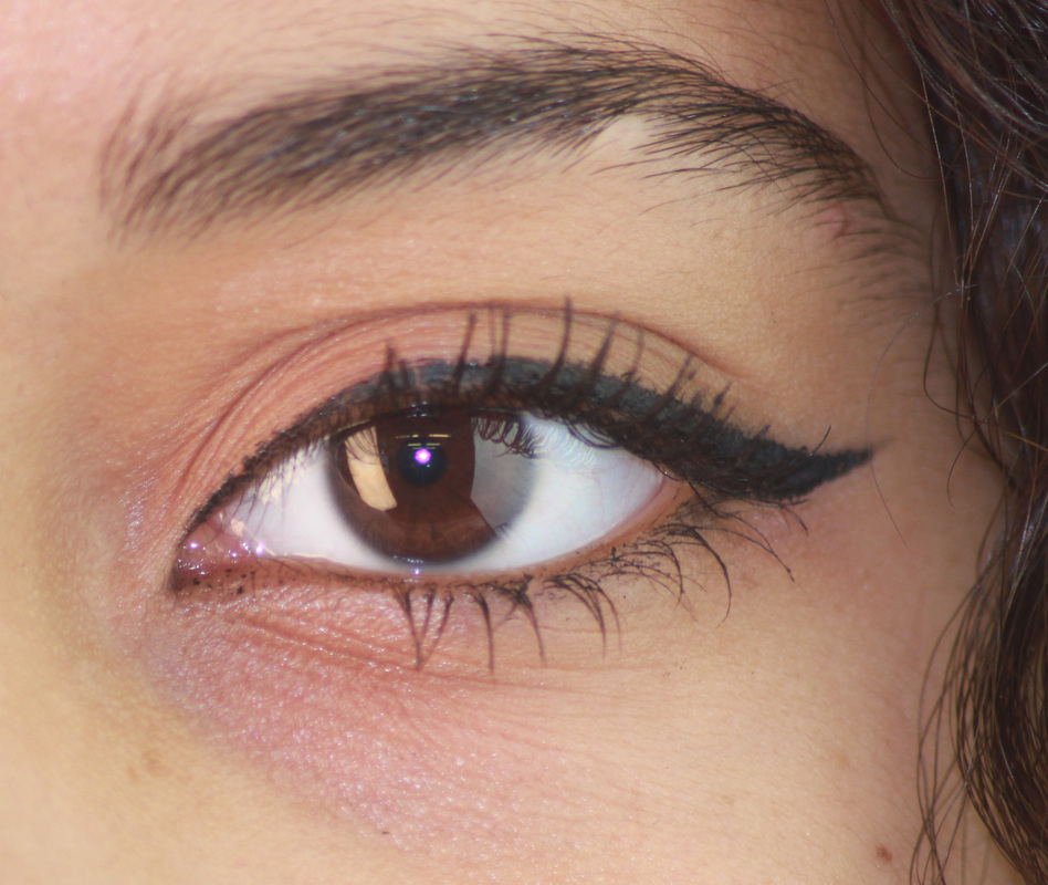
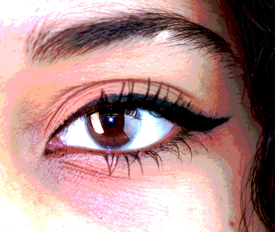
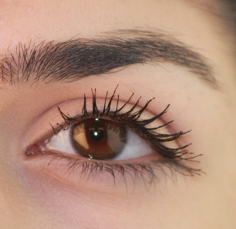
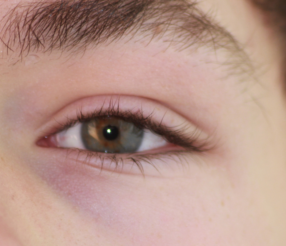
I wanted to do something similar to Andy Warhol because he had created some of his images using pop art and put them into collages. I'm doing the theme collections and thought this would be a good way to start, I also wanted to do something different so I took a collection of images of eyes. I started by adding a cooling filter to make the eye look a lot more bold and for the pupil to be seen more.
WWW |
EBI |
|
What went well was that I got a range of eyes. They all have different features to them, such as different shapes, eye colour and eyelashes. And they all are from different people therefore I have more to work with than if I was to use just one eye.
|
I could of improved these images by having them at the same angle, most are tilted at an angle of too far. I could have also used whiter lights because the ones I used were dull and made the image look yellowy.
|
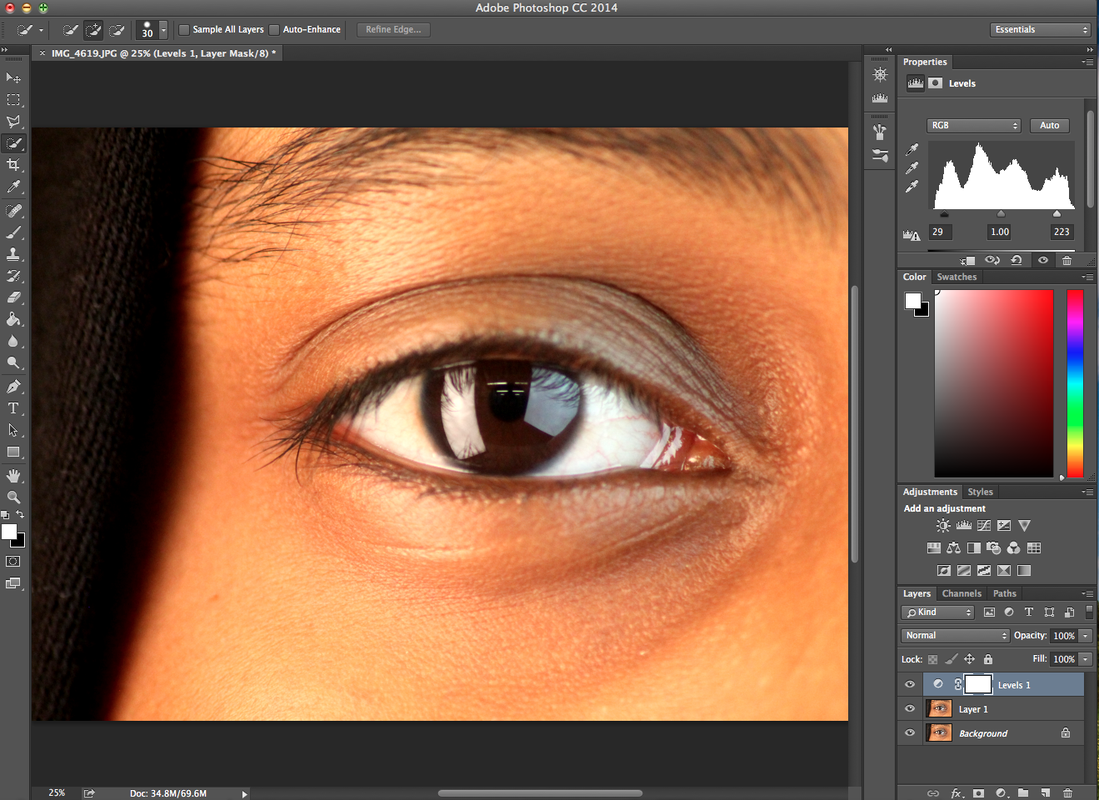
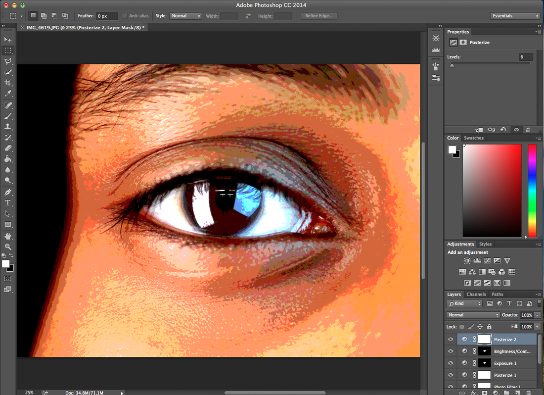
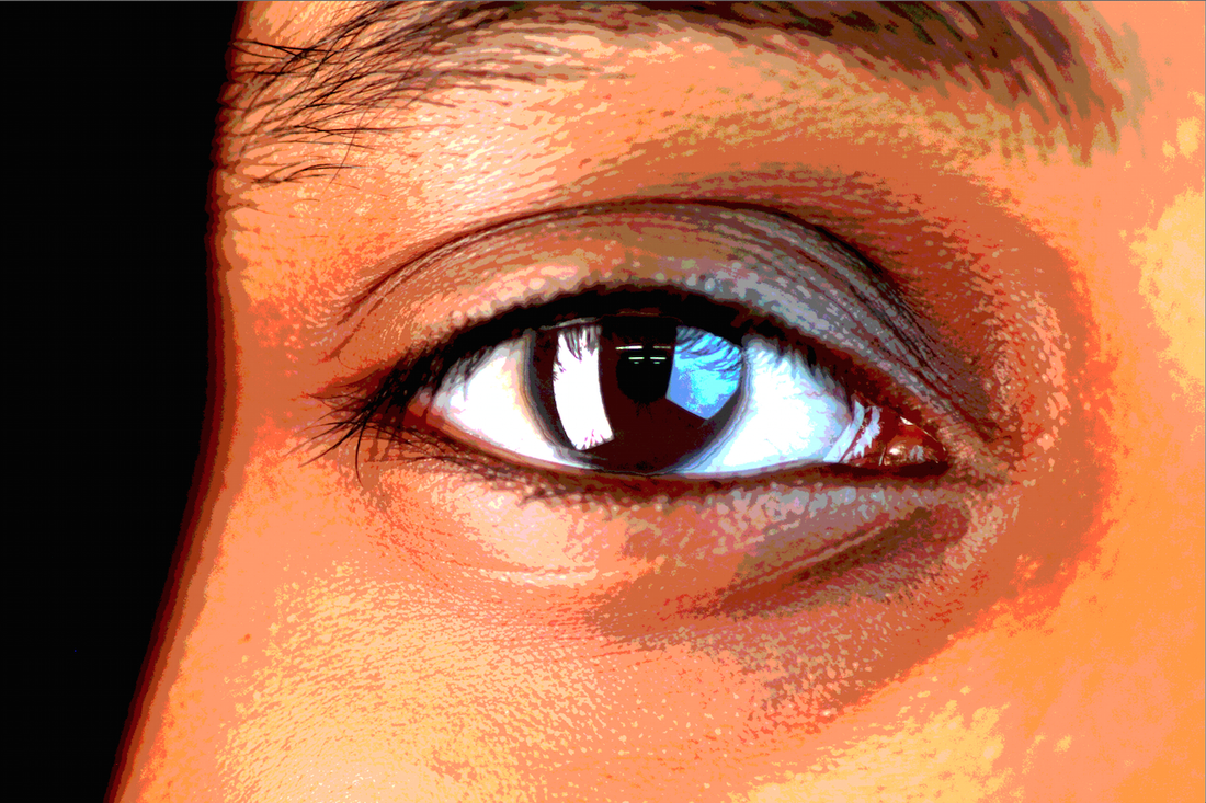
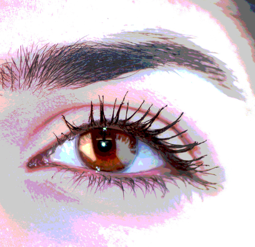
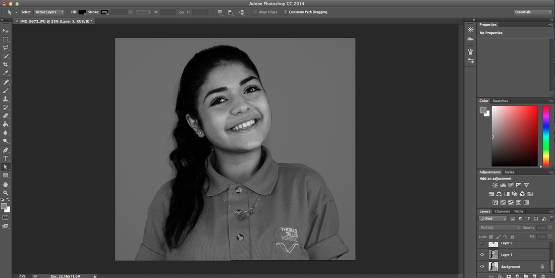
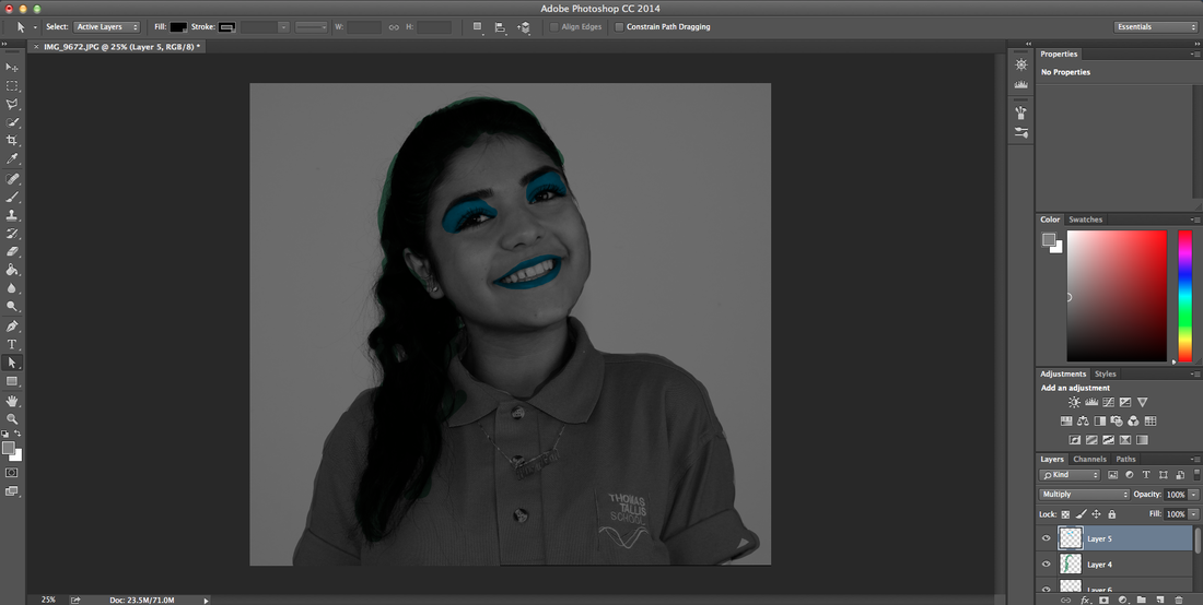
I want to do something similar to Andy Warhol and use the images I had taken of eyes and put them into a pop art collage. I am going to experiment with this idea, so I started with photoshop and made the eyes look more bolder and cartoony. I started by adjusting the levels of the image to bring more colour to eye, but this didn't have a big effect on it.
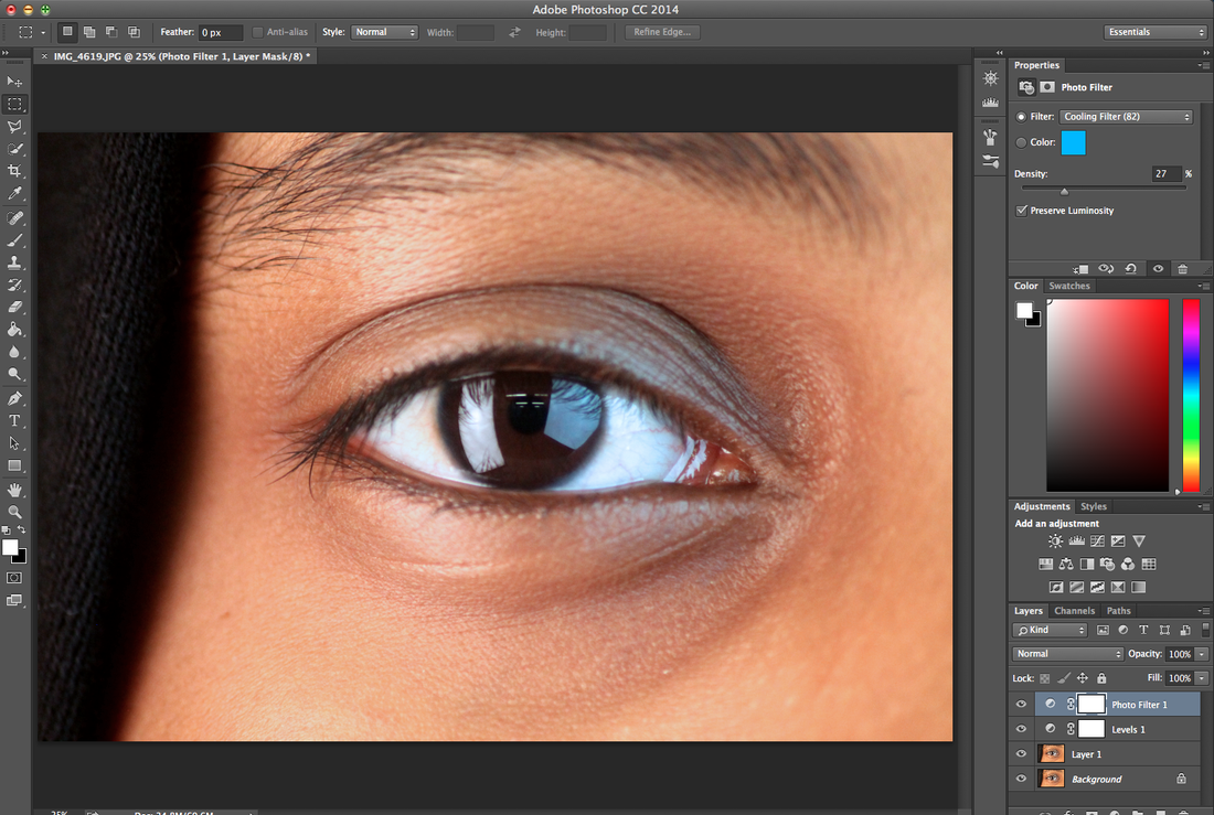
I added a cooling filter so that the pupil of the eye is visible and making the background a colder colour so when I posterise it the colour of the skin wouldn't bring the attention off the eye. I also increased the density this made the filter more effective towards the image.
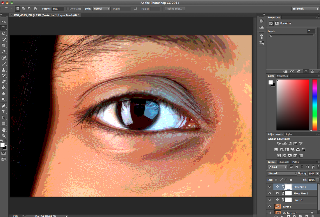
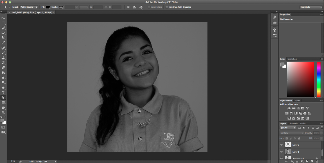
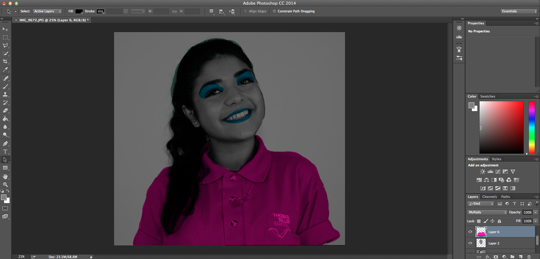
I used a posterise effect and made the level 7 in order for it to look cartoony but again not taking attention away from the eye. However I thought that the pupil didn't look bright enough.
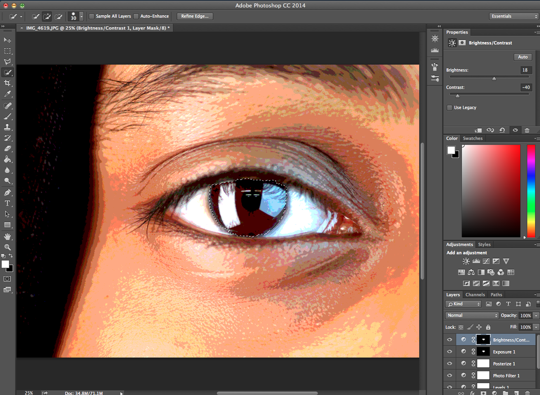
Because of that reason I selected the pupil area and increased the exposure, this making it look more brown.

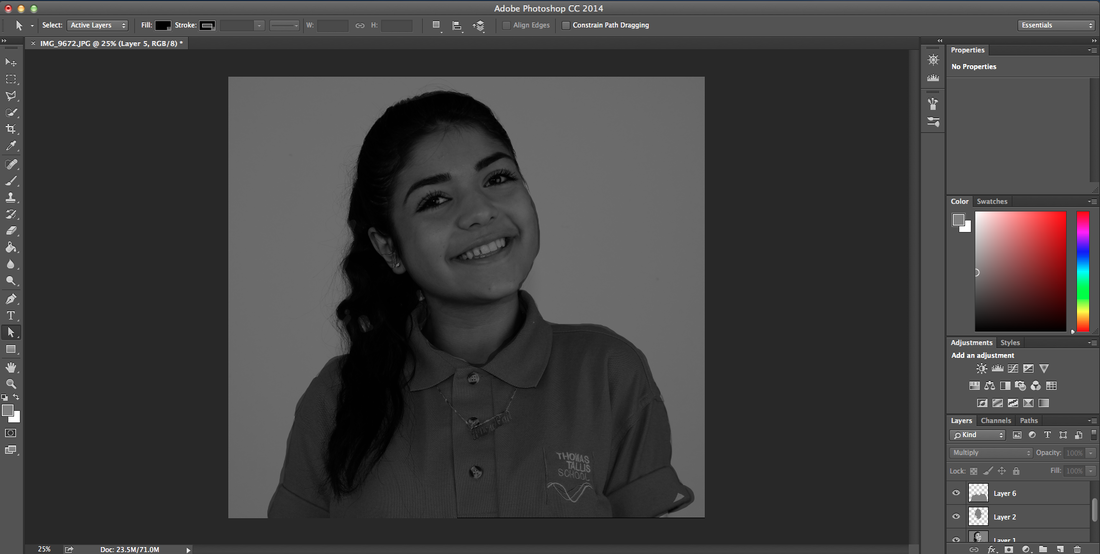
I done the same thing but this time I increased the brightness which made a big impact which is what I was going for.
Finally I added a posterise filter this made it look a bit cartoony.
Out of the set of eyes I had taken pictures of I chose one from each different person and done the exact edits, therefore I have a variety of eyes to work with.
|
|
|
|
|
|
|
|
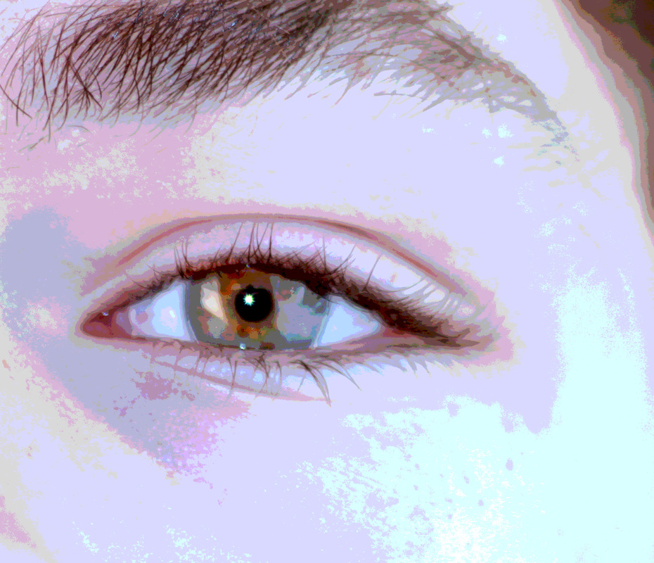
Here is the final out come, however I didn't like how it came out with the eyes so I experimented and used and image of one of the models I used in my previous project and I preferred how that came out.
WWW |
EBI |
|
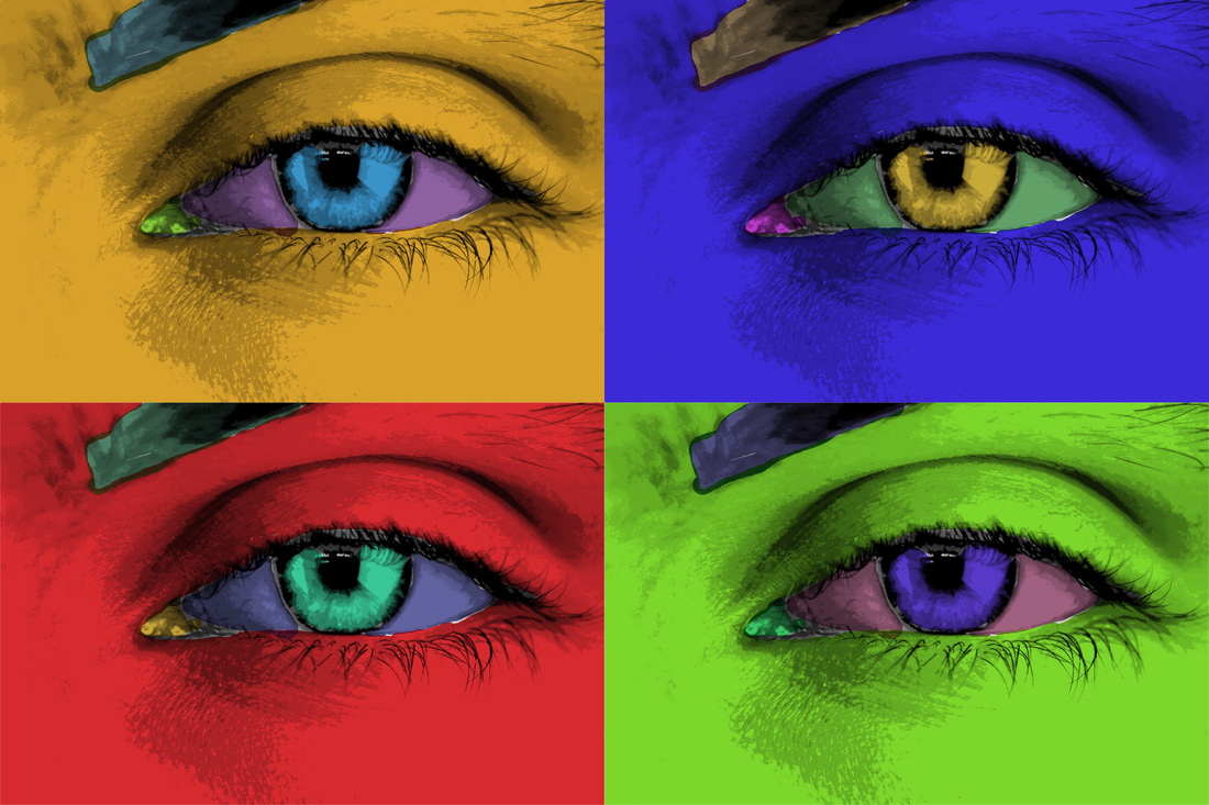
What went well was that I got the look similar to Andy Warhol's work. And how I got exact different colours for each section.
|
I could of improved this image by spending more time on it because there are obvious gabs and I should experiment with other colours because the colours I used didn't go with each other.
|
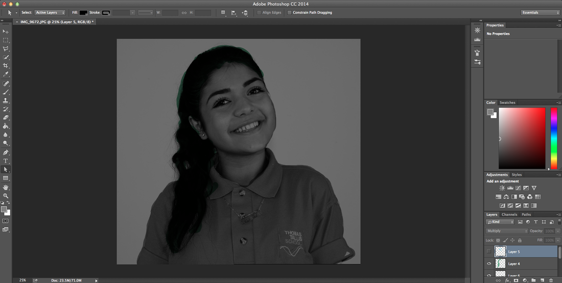
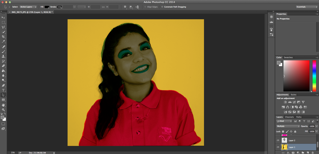
After finding this image I changing it to black and white to make it easier for the colours to look a lot bolder, I then made a layer for each piece of the body such as: face, hair and shirt.
I then started to change the colours of these individual parts of the body that I had previously highlighted. Using a varitey of colours similar to what Warhol would use.
This was the final outcome of my attempt to do pop art like Andy Warhol.
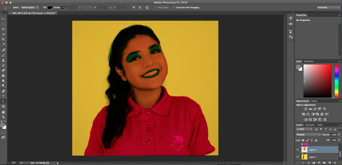
I then made a larger canvas and multiplied it four times, then changed the colour of three of them using the hue and saturation button.
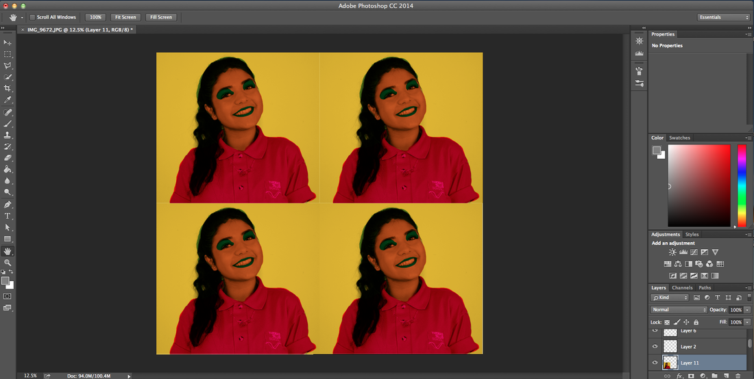
Final Peice
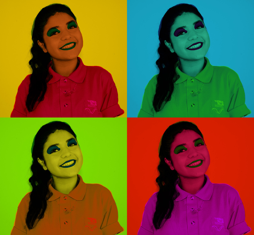
WWWI think I his image I edited is the closest one I have made that is complementary to Andy Warhol's pop art. I like it how everything isn't perfect so it looks like I had also done screen printing.
|
EBII could improve this by exploring the different ways of making the image look more interesting and weird, as well as using different unoriginal background colours instead of the usual blue green red etc.
|
Now I am starting to use a combination of ideas to see different ways I can collect objects and take images of them, I experimented with different things from different types of tapes to a collection of books of the same author.
Todd McLellan
Todd McLellan is a photographer who dismantles different objects no matter the size and he lays out all the contains around each other in a structured and orderly way.
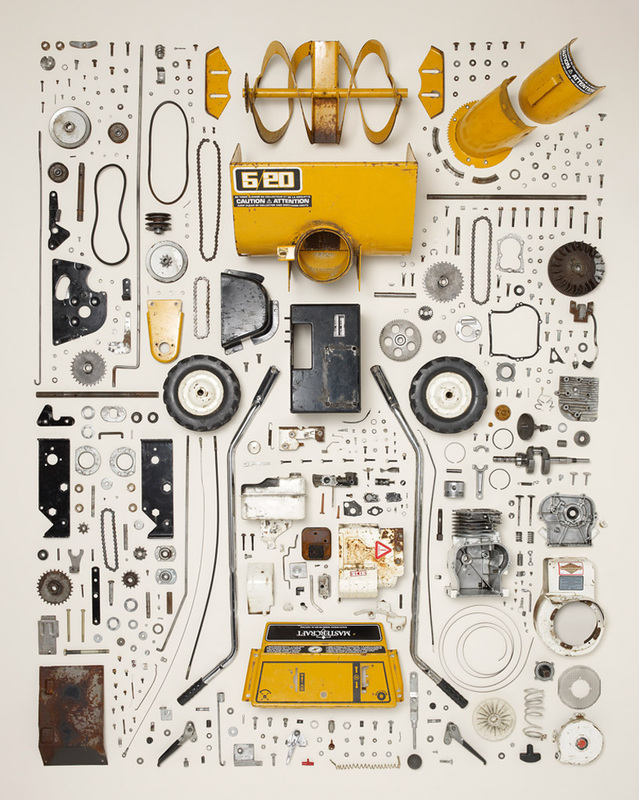
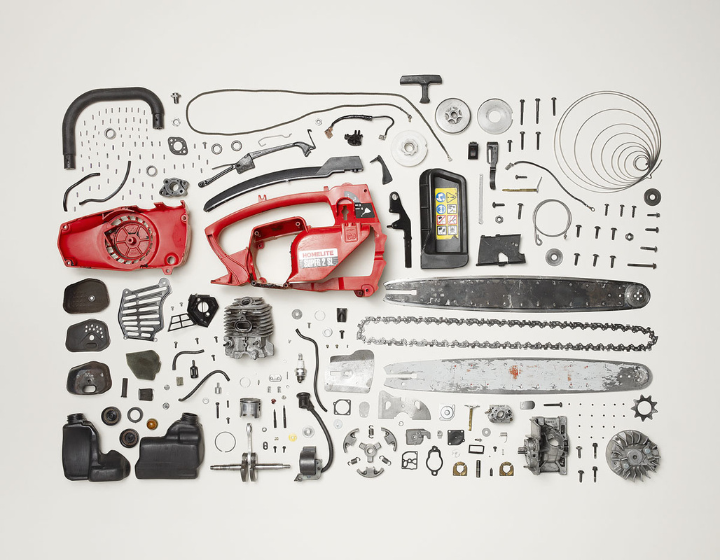
Third Set Of Images
From these set of images I got the idea to dismantle different objects and set them out neatly, to make them look like a collection from all the different screws, locks, bits and pieces from that object. I looked for multiple objects so this idea was carried out.
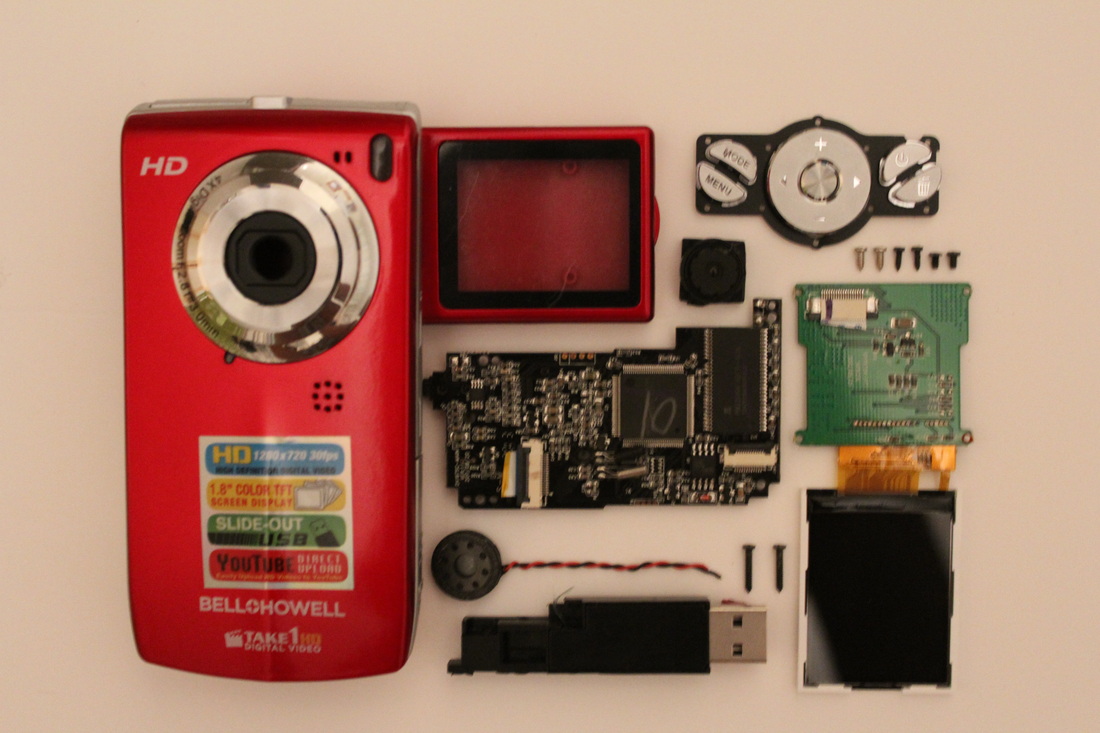
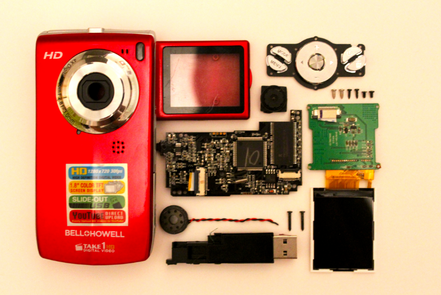
I am going to start experimenting with different colour backgrounds Like what Jim Golden has done this makes the images have more of a bold effect.
WWWWhat went well was that everything thing is properly organised and straight like the examples of Jim Golden I have above. And how the background is clear
|
EBII could improve these by dismantleing other objects and organising them in a neater way. I could also improvve them by editing them on photo shop to get rid of the flash and the shadows that are in the image(s).
|
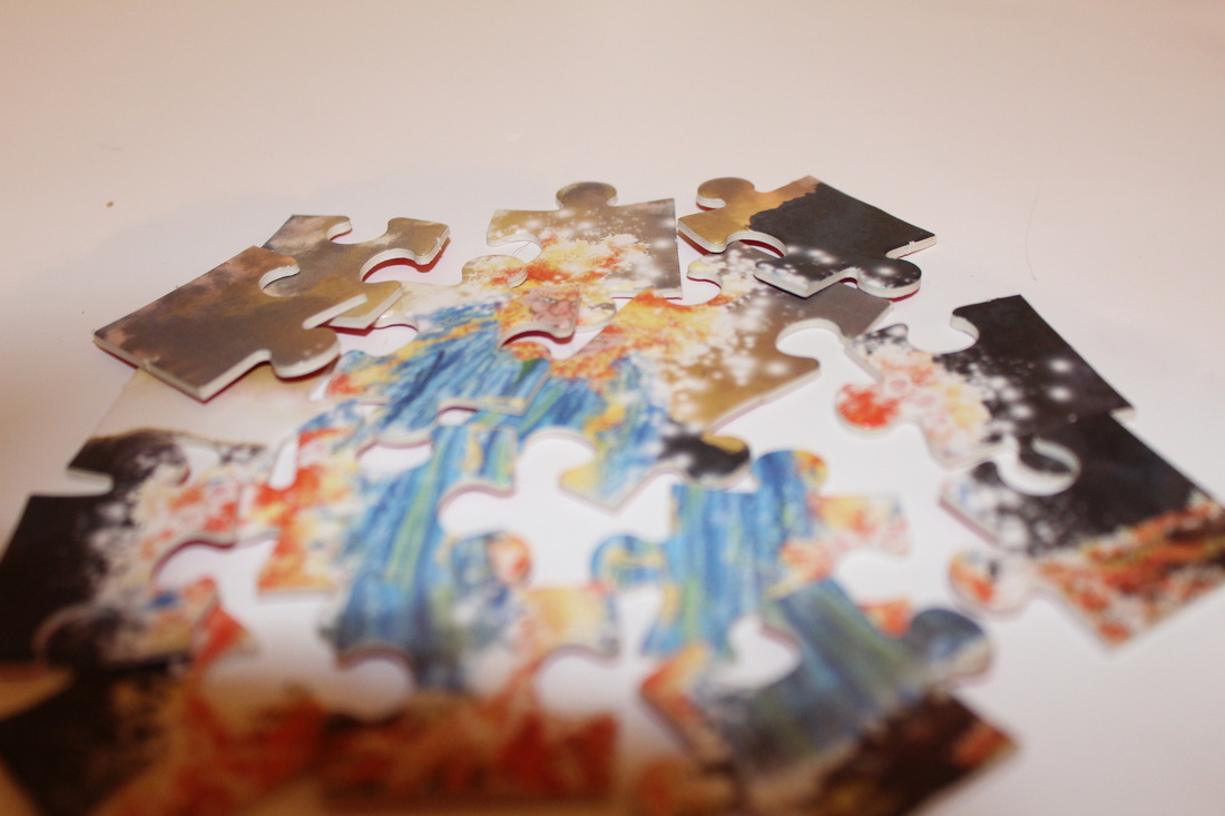
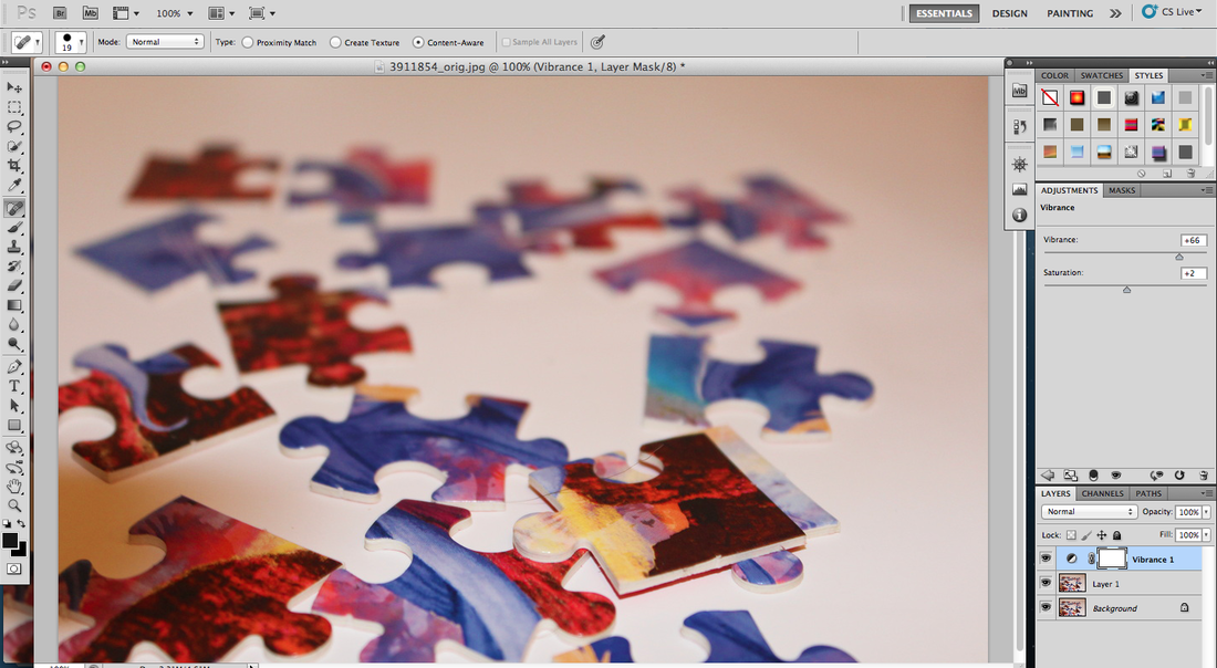
I wanted to explore different ways of the ideas of collections, so I found some puzzle pieces and tried to find different ways I could present them, in order to meet my specification. I started by just grabbing them and dropping them from a certain height and took a picture where they would land. The second way I experimented with them was that I just layered the pieces of the puzzle in abstract ways, but still keeping it's original image so you can actually tell what the puzzle is showing.
Fourth Set Of Images
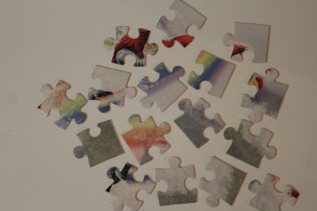
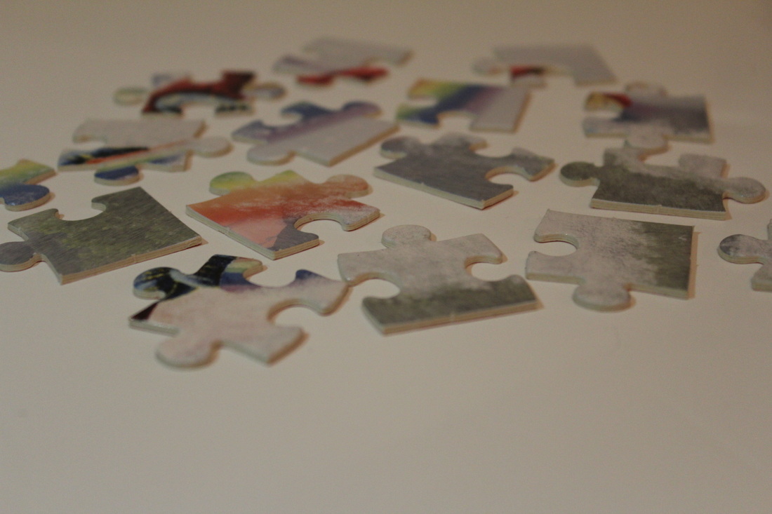
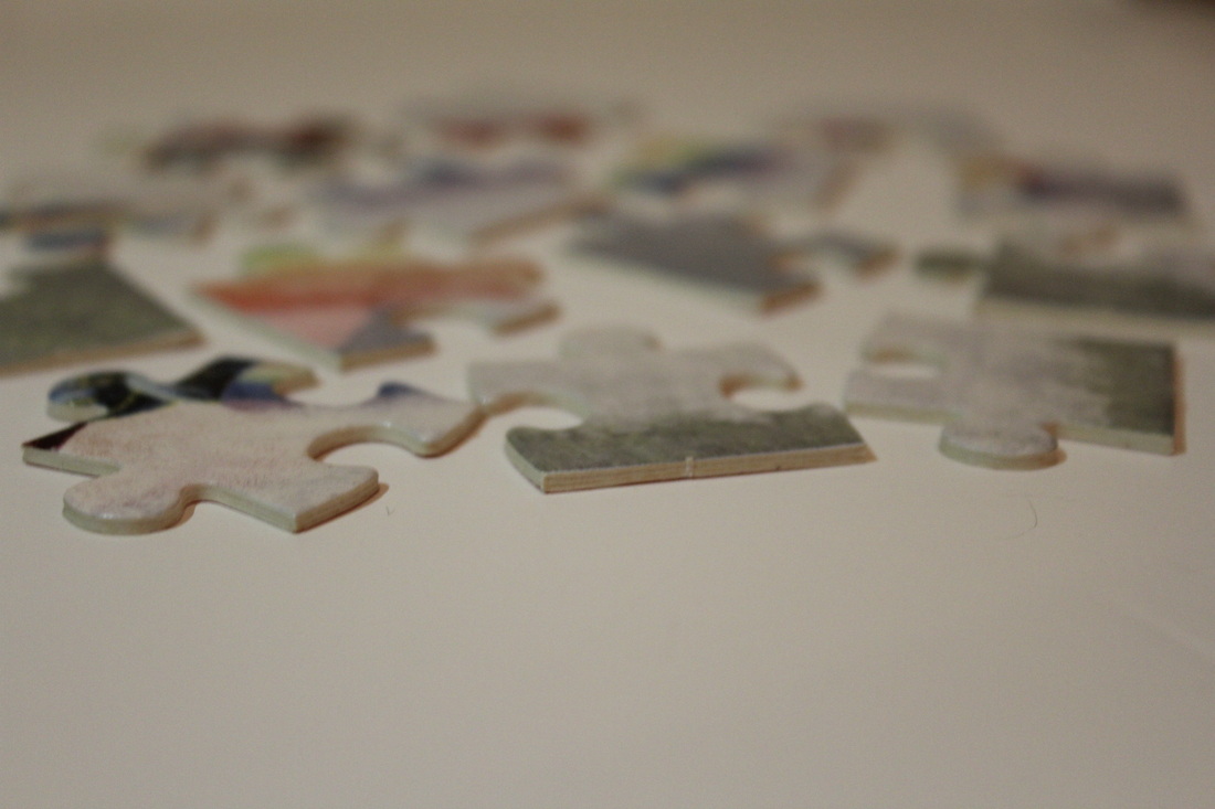
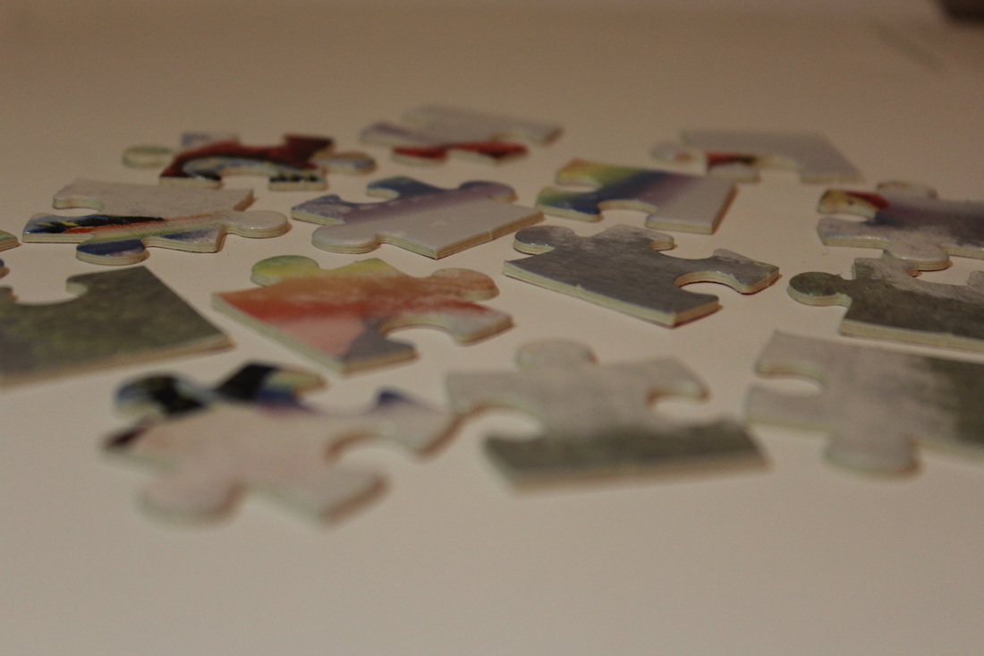
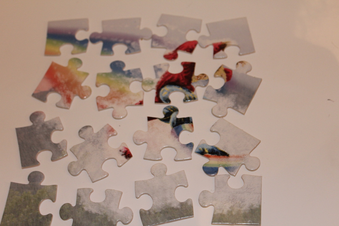
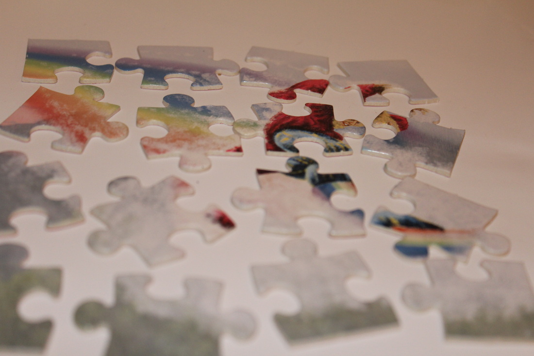
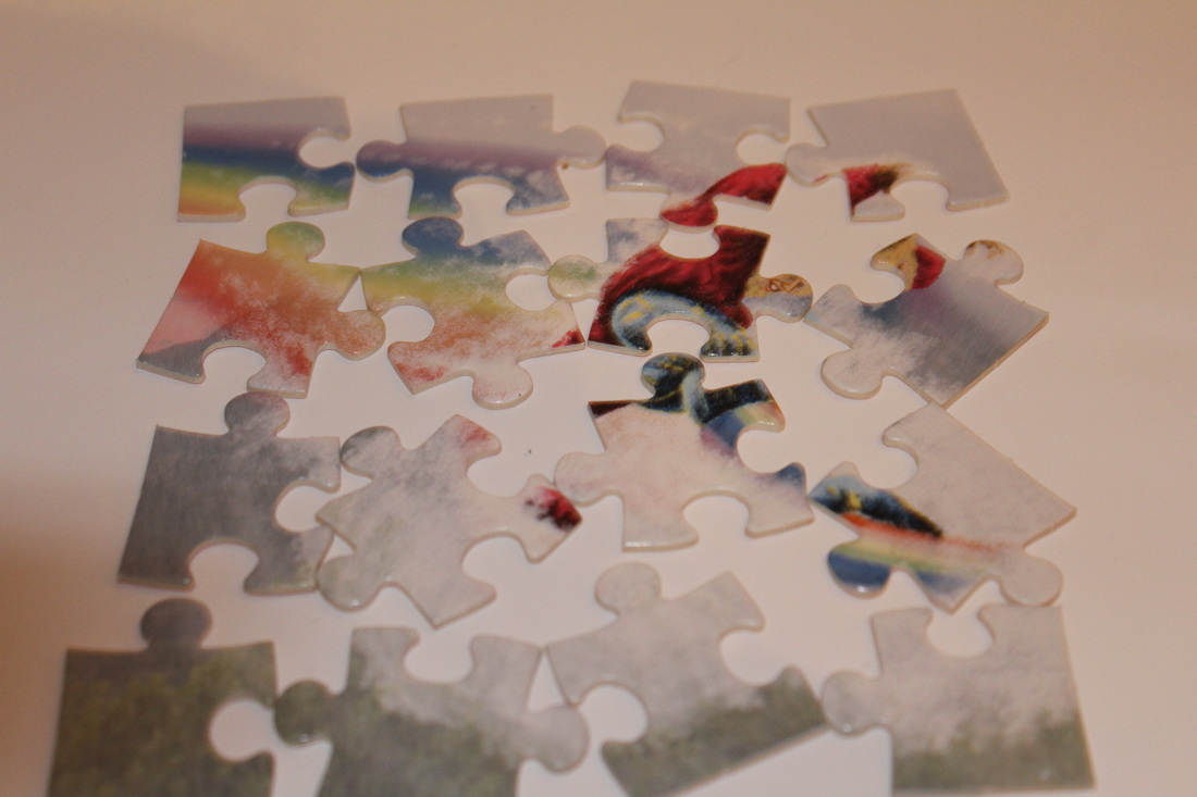
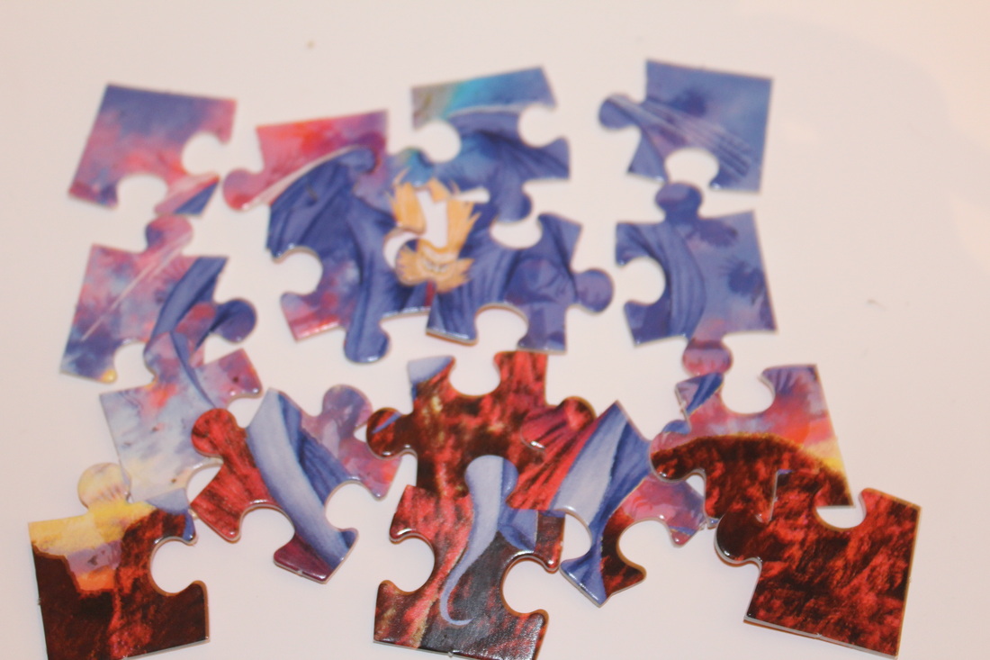
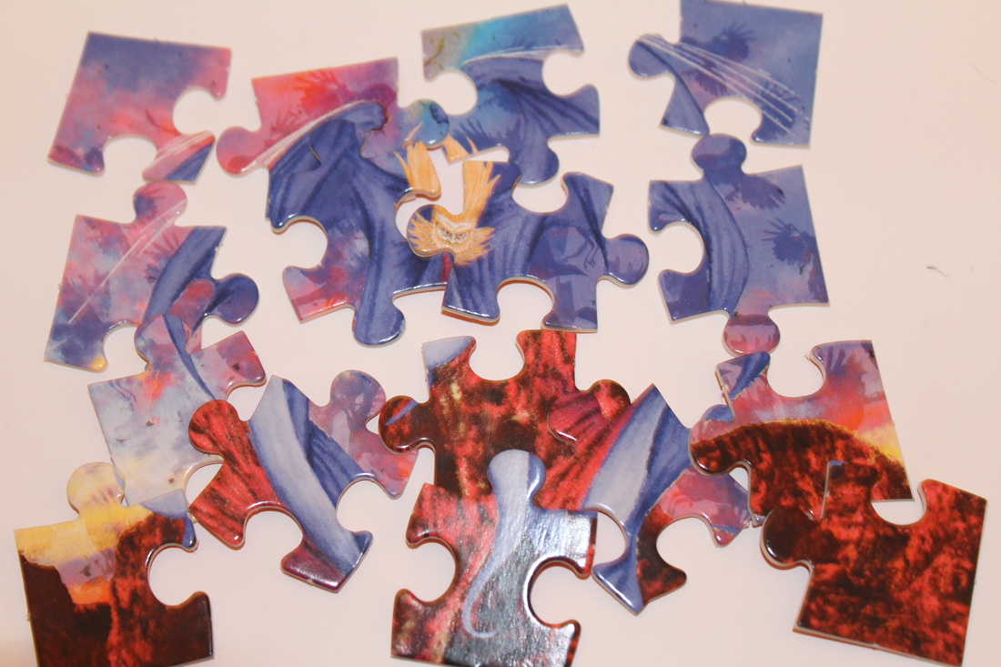
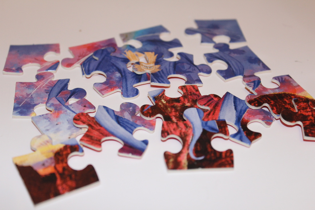
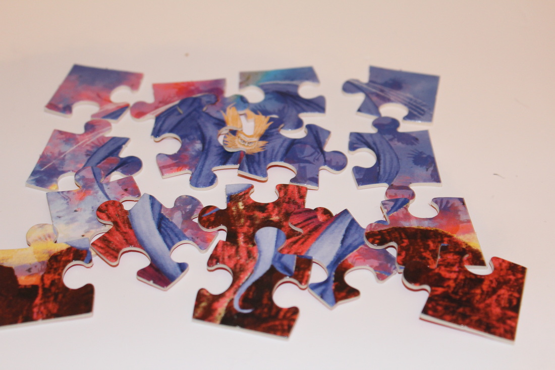
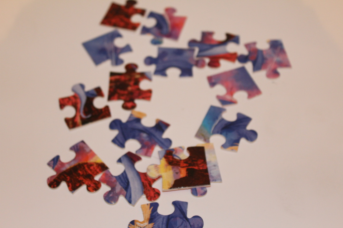
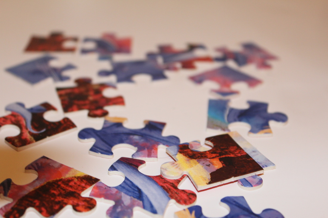
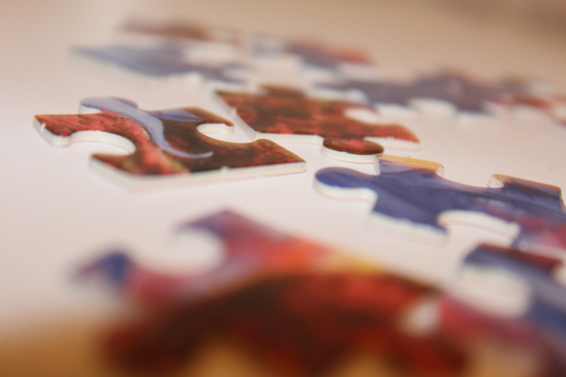
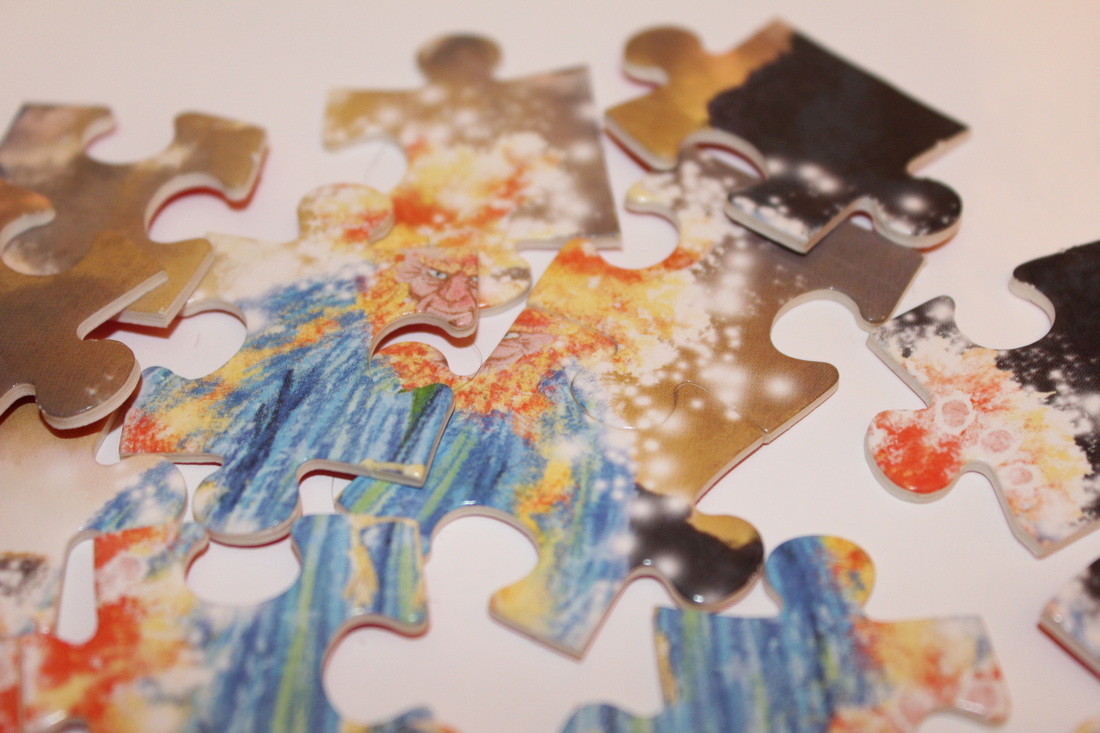
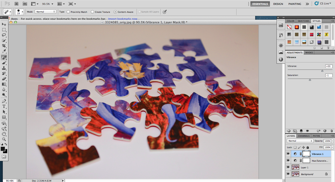
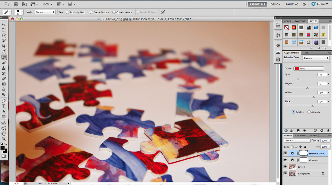
I think these images came out really good however to improve the more, I edited the best ones on photo shop, this helped make the flash less obvious and the objects have more of a shadowy effect in the background. For my first edit I increased the vibrance while decreasing the saturation, this makes the shadows more bolder and the puzzles look more 3D.
Againg I done the same with the other pictures and they had the same effect.
To enhance the puzzle peices a bit more I used the red from the selective colour adjustment and increased it, this made the made parts of the puzzle stand out more, although this made the background seem red I played around with the other selctive colours: magenta, yellow and black.
To give the image more of a cool effect I messed around with the colour balance.
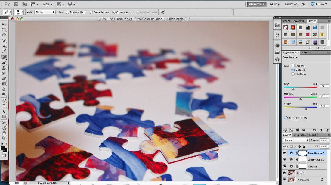
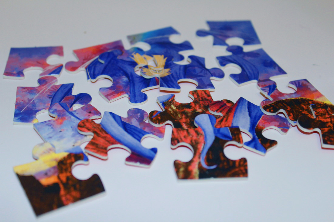
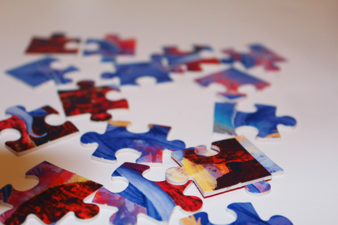
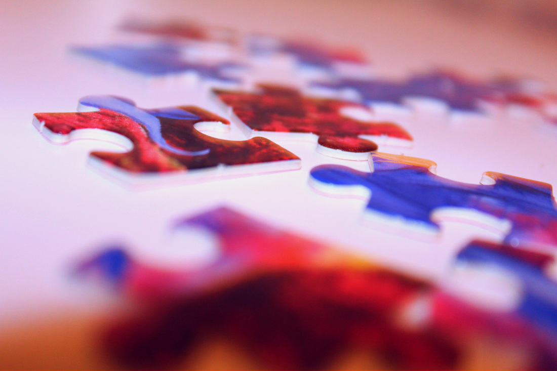
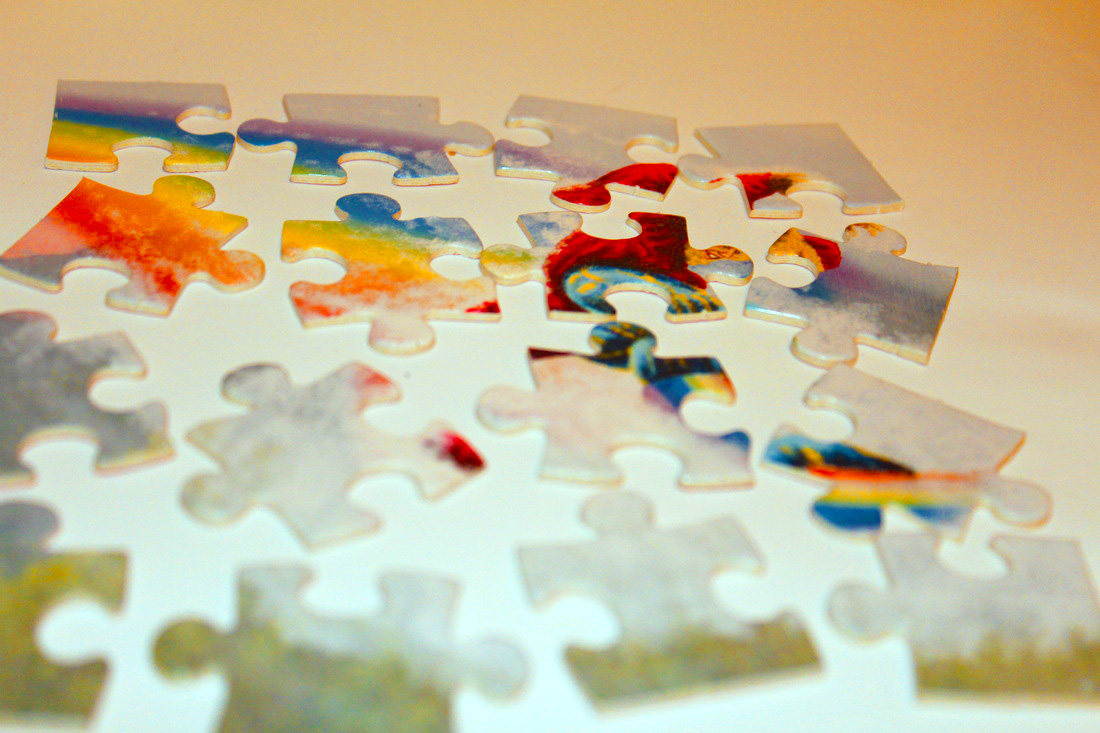
WWWI really like how the puzzle pieces have layered on top of each other, creating the shadows and how taking a variety of images from different ranges and perspectives makes a big difference on how you view the/an image.
|
EBII could of improved these images by not just using one puzzle but mixing a variety of them together so there are multiple colours, I should also try and use a diffrent colour paper to put underneath so when and if edited on photoshop the colours will stand out more.
|
Fifth Set Of Images
I then started to experiment with stacking books with the same author, in at multiple angles and different stacking techniques.
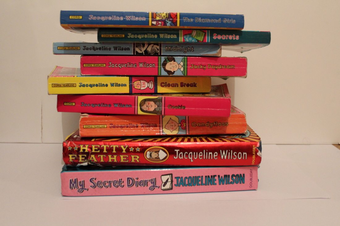
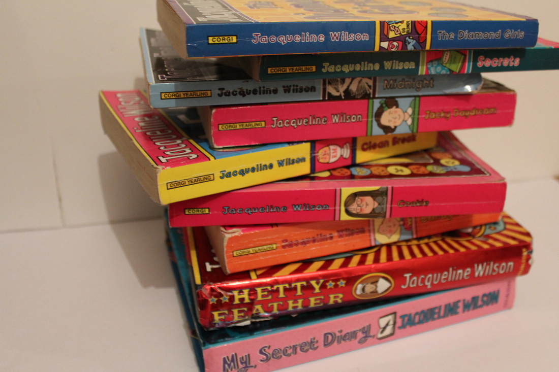
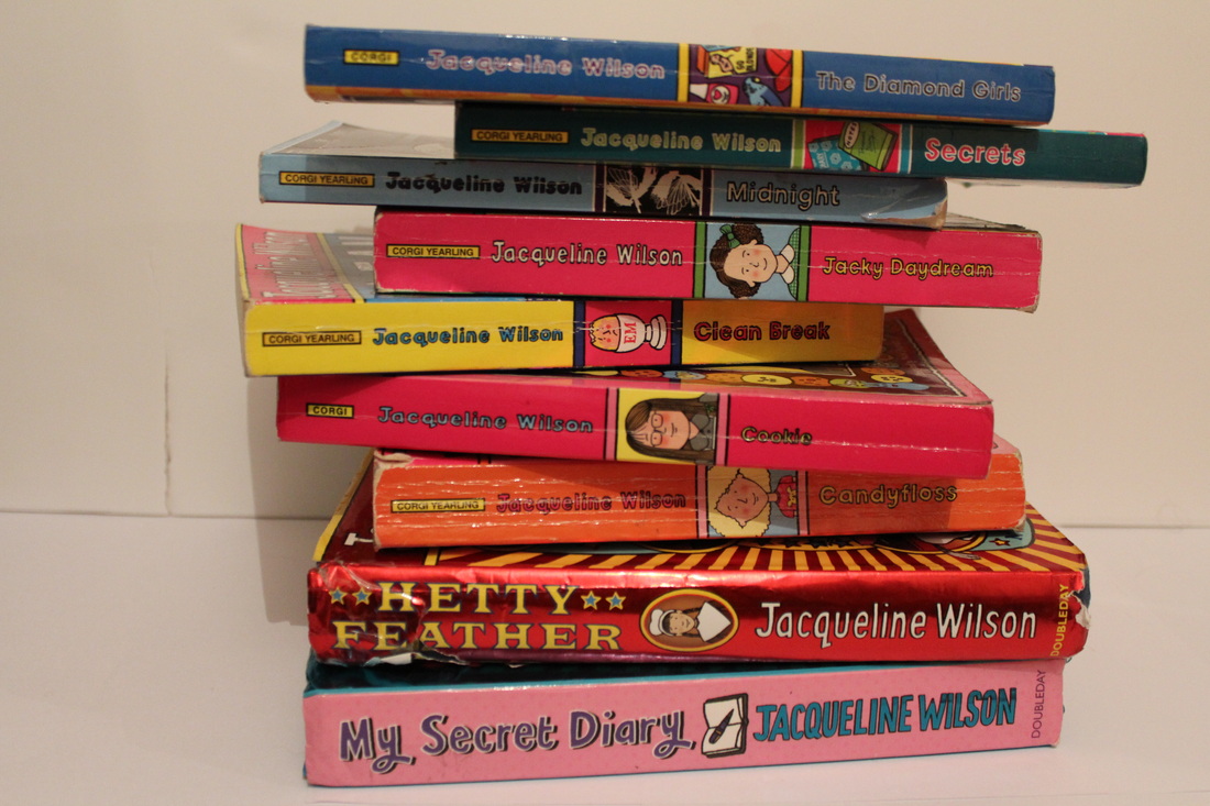
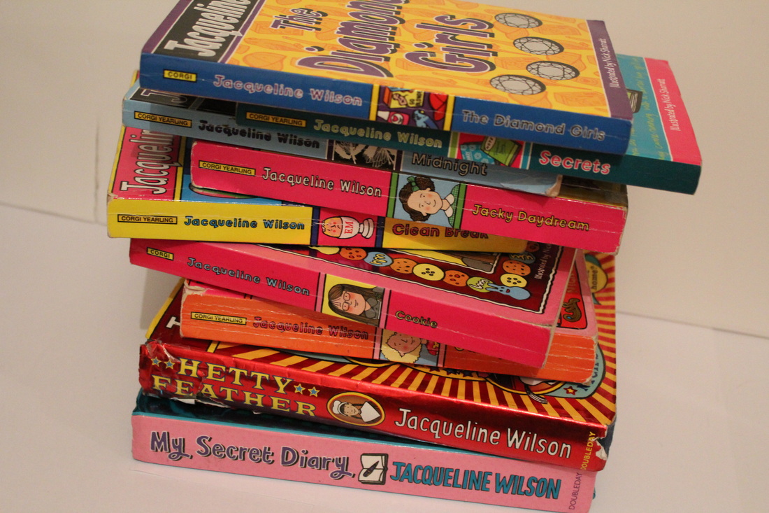
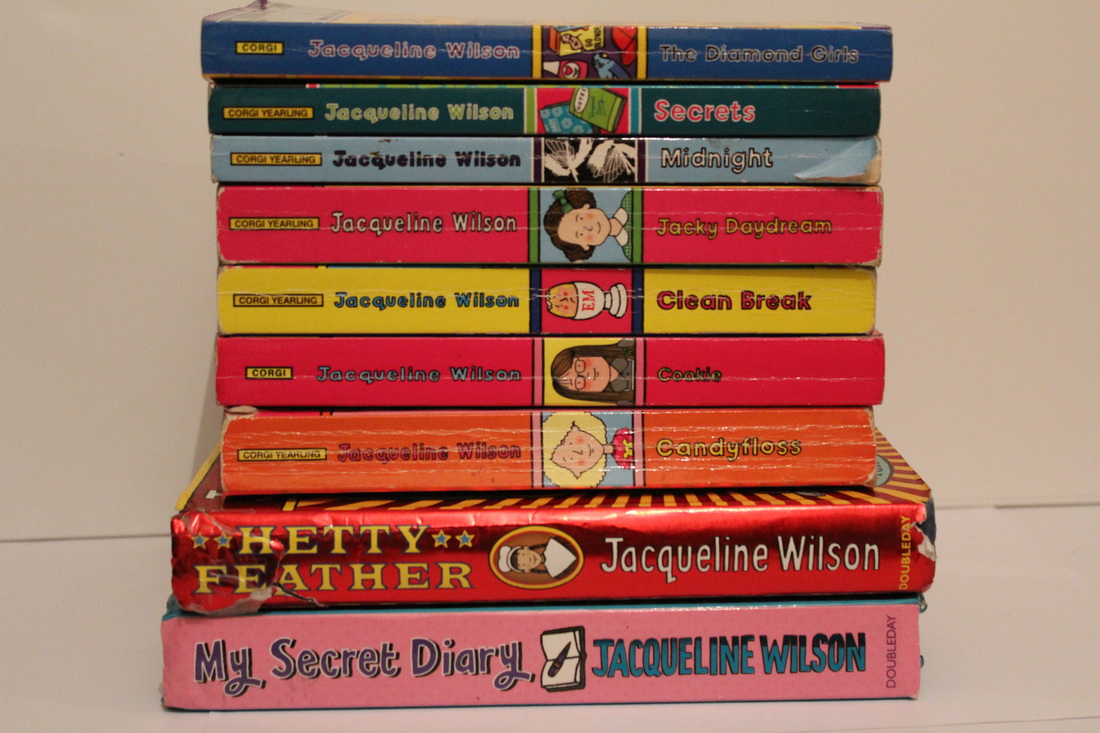
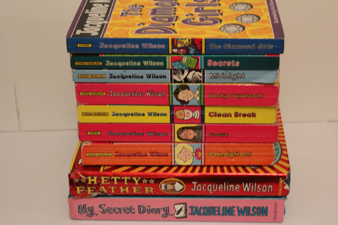
WWWI think that the things that went well with this set of images is that the books are from the same author and therefore it looks more like a collection.
|
EBITo improve them I could have explored the different ways I could take the images at different angles, I should have also taken image of different parts of the book for example just the book spines and then find other books that are on a shelf and experiment.
|
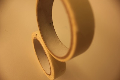
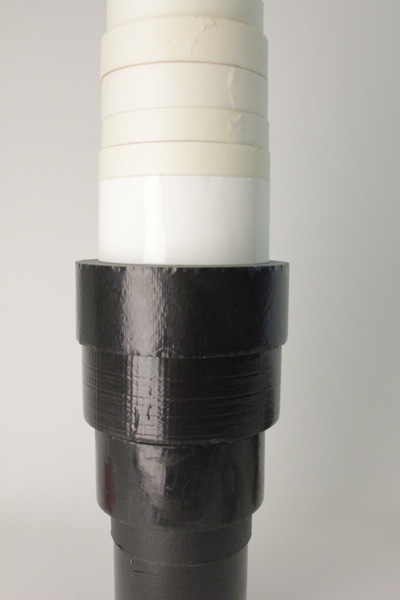
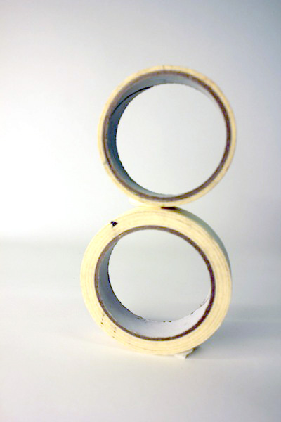
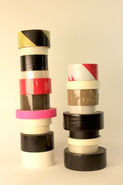
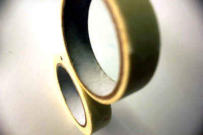
Sixth Set Of Images
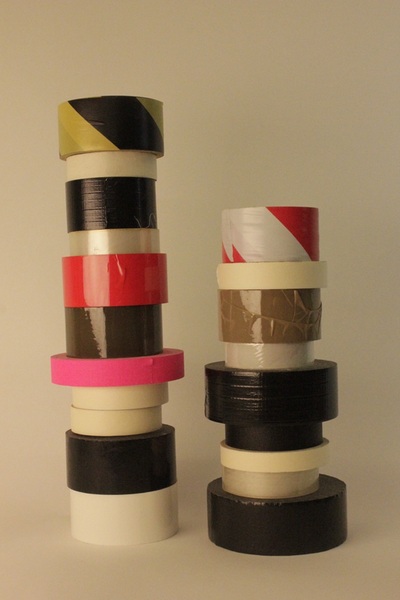
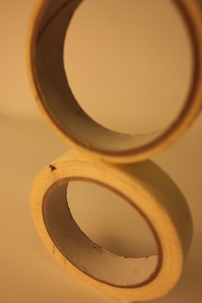
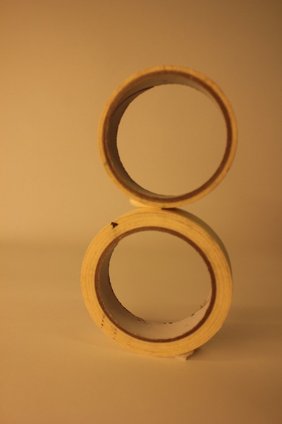
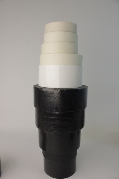
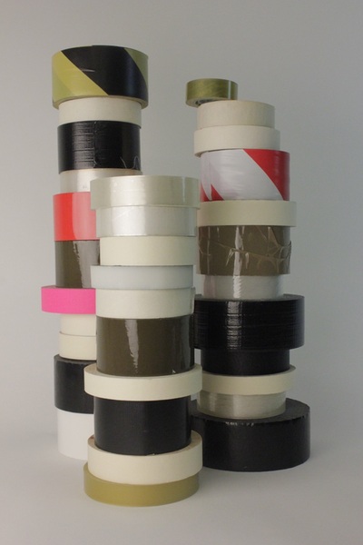
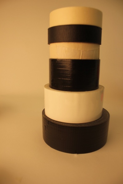
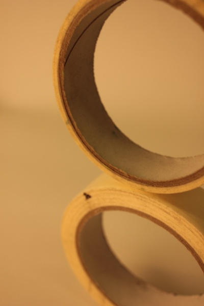
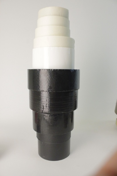
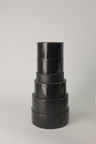
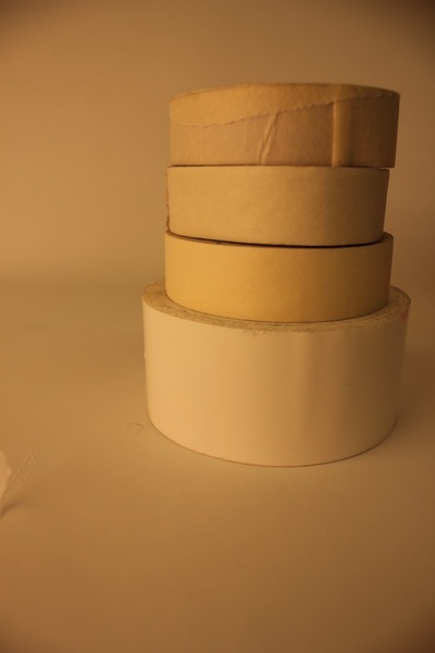
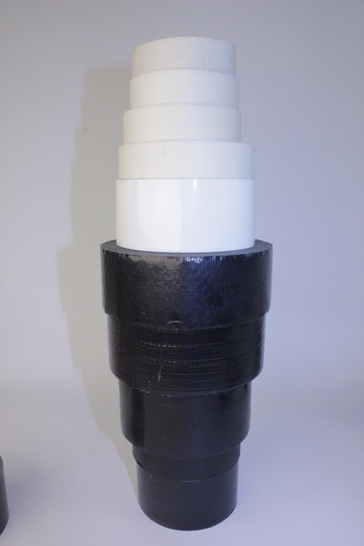
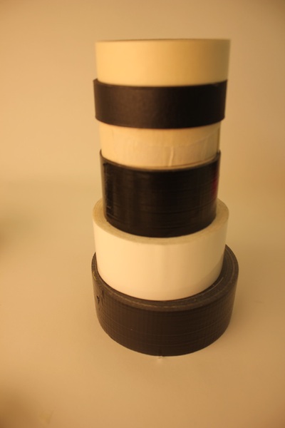
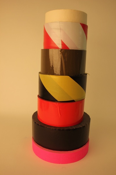
WWWWhat went well was how the different types of tape complimented each other, colour wise and the looked interesting the higher I stacked the tape.
|
EBIMost of the images could be improved by editing them because I had a yellow spotlight most of the images have a yellowy effect in the background, therefore I went on photoshop and played with the levels to make the background more white.
|
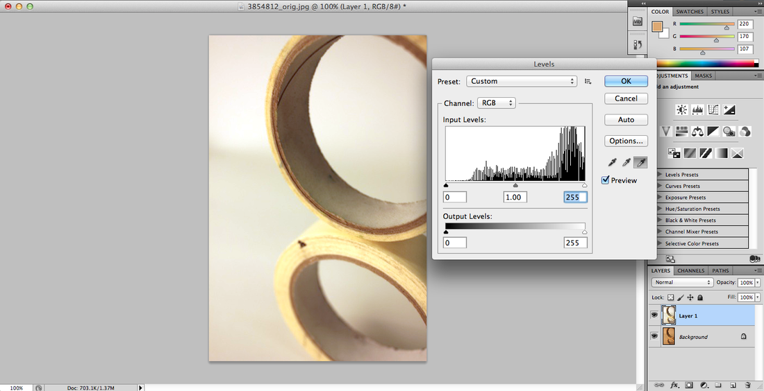
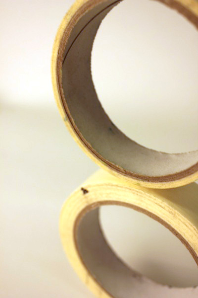
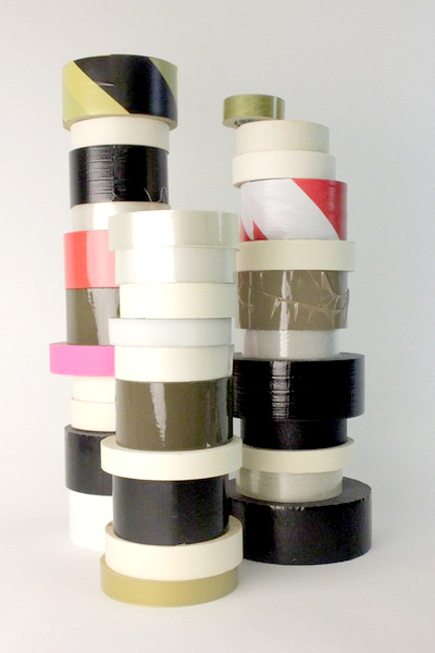
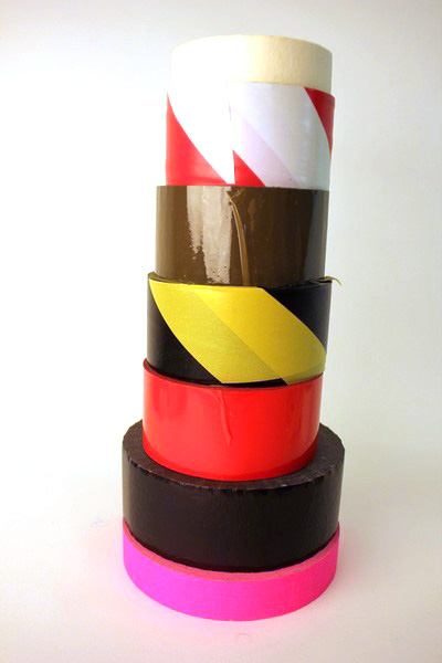
These edited images look a lot more improved because of the white background, not all of them came out as expected either they came out too dark or to bright, however I tried to level the background colours out evenly.
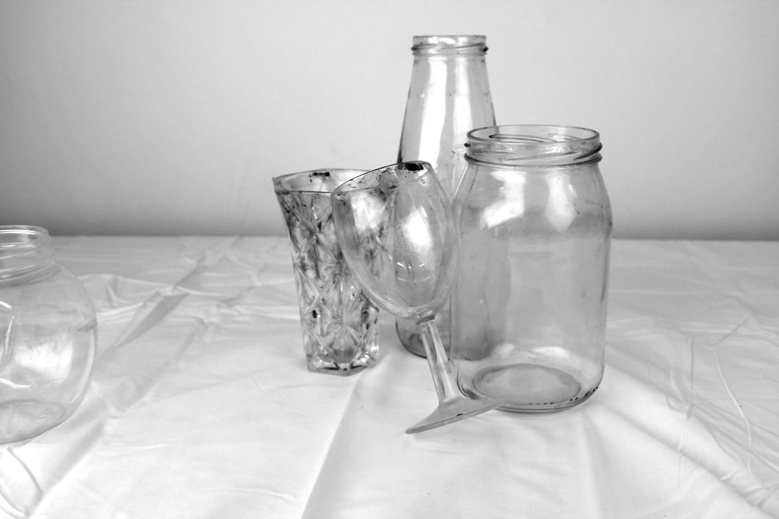
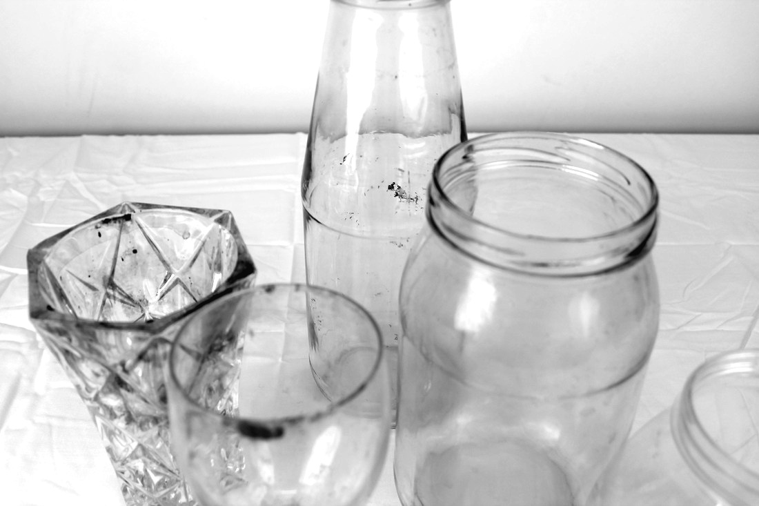
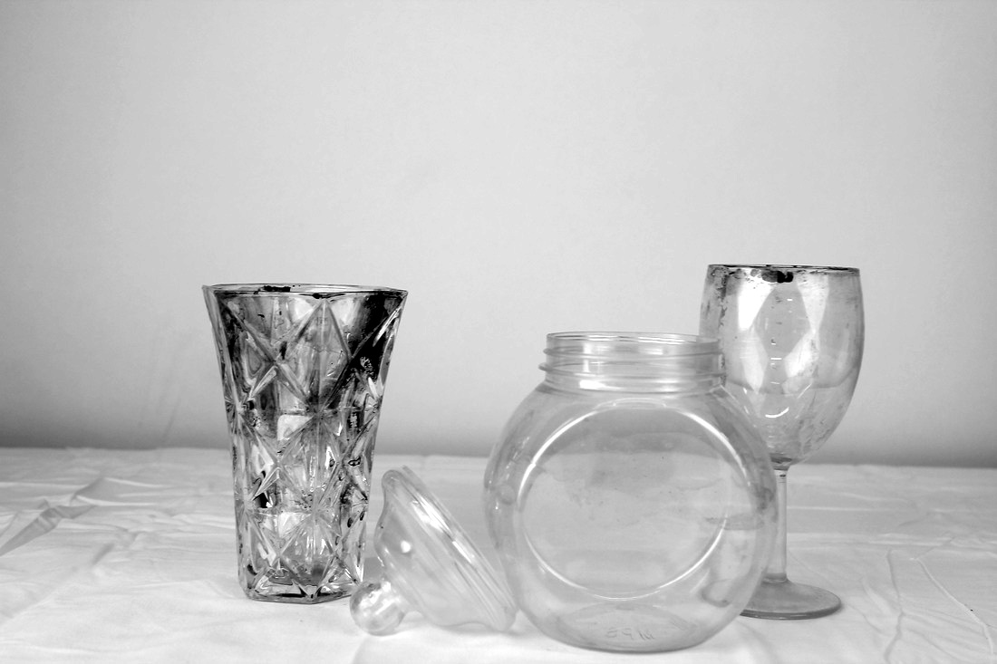
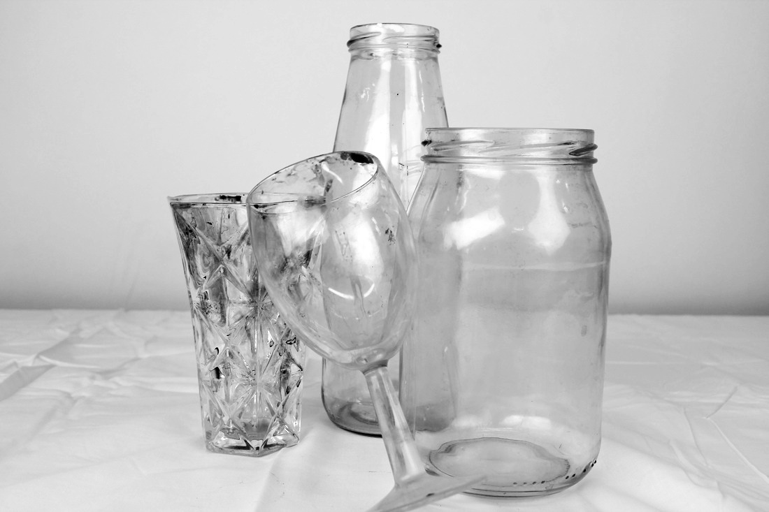
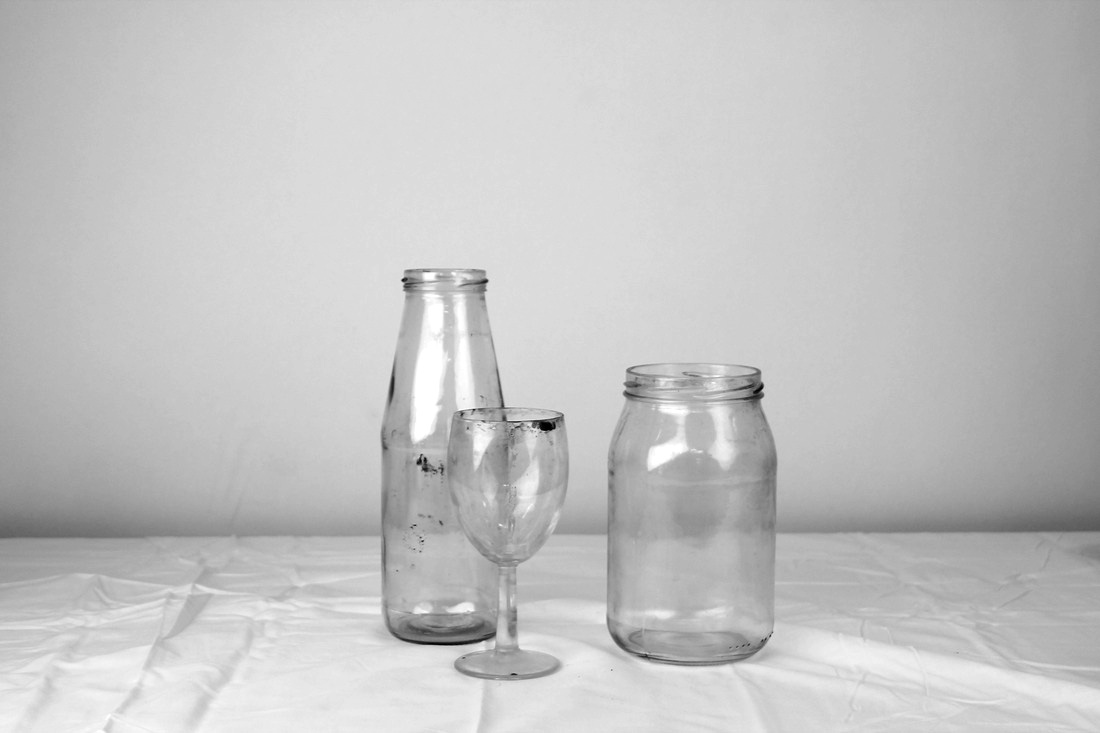
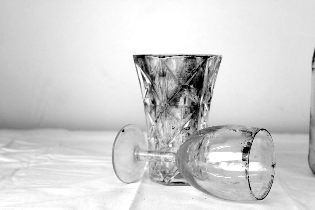
Laura Letinsky
Laura Letinsky’s was more interested in the food perspective of things, and taking images of different collections of food and kitchen supplies for example, bowls, cutlery, plates etc.
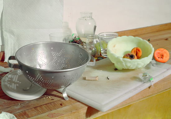
Seventh Set Of Images
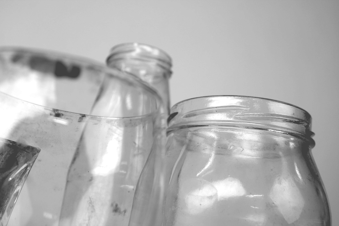
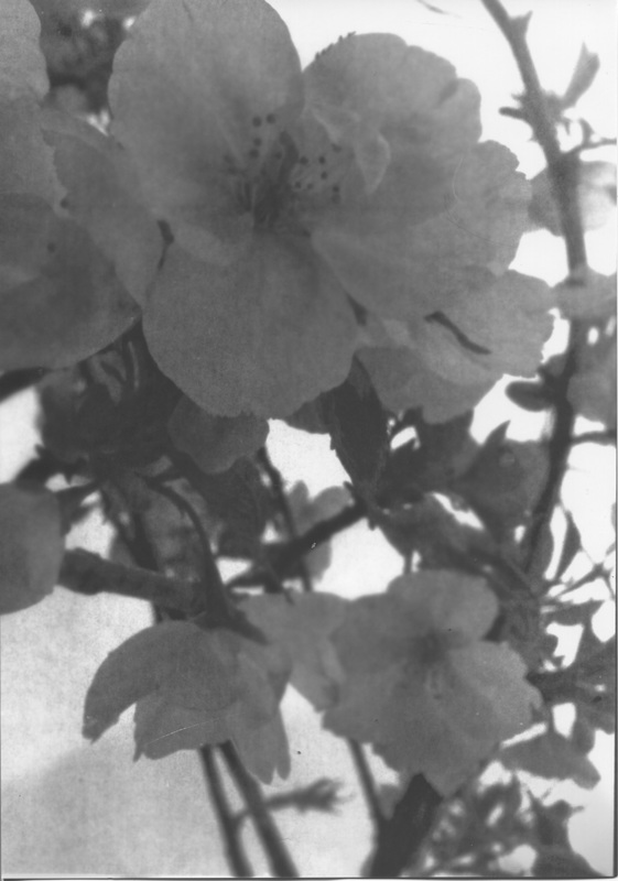
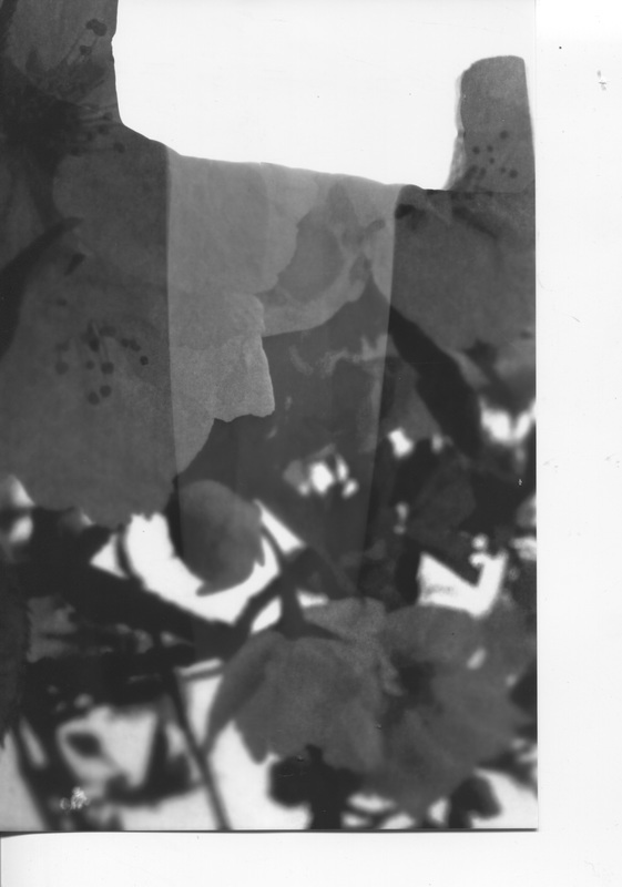
I am taking images of kitchen utilities like cups because it's similar to Laura's but there is no food involved therefore, I think I should do this for my other set of images. The camera was accidentally set on black and white.

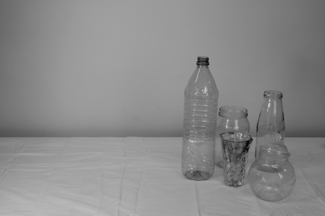
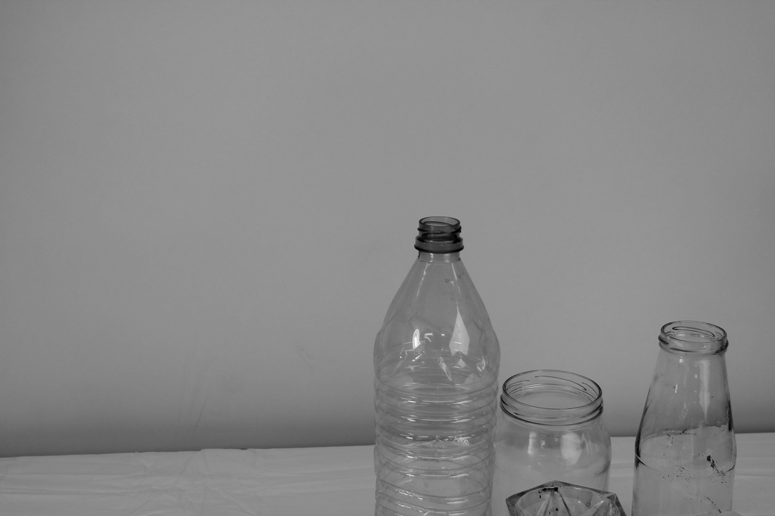
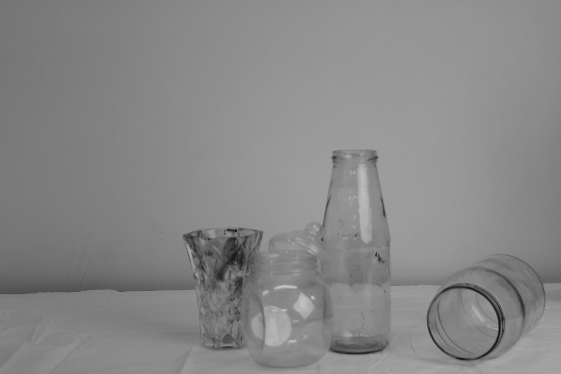
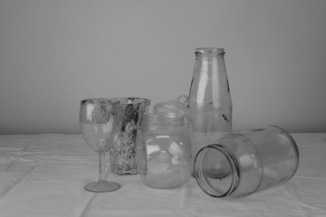
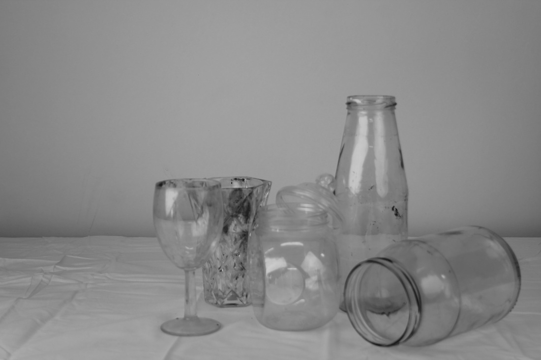
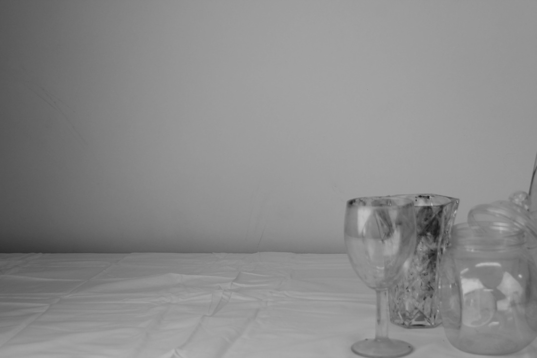
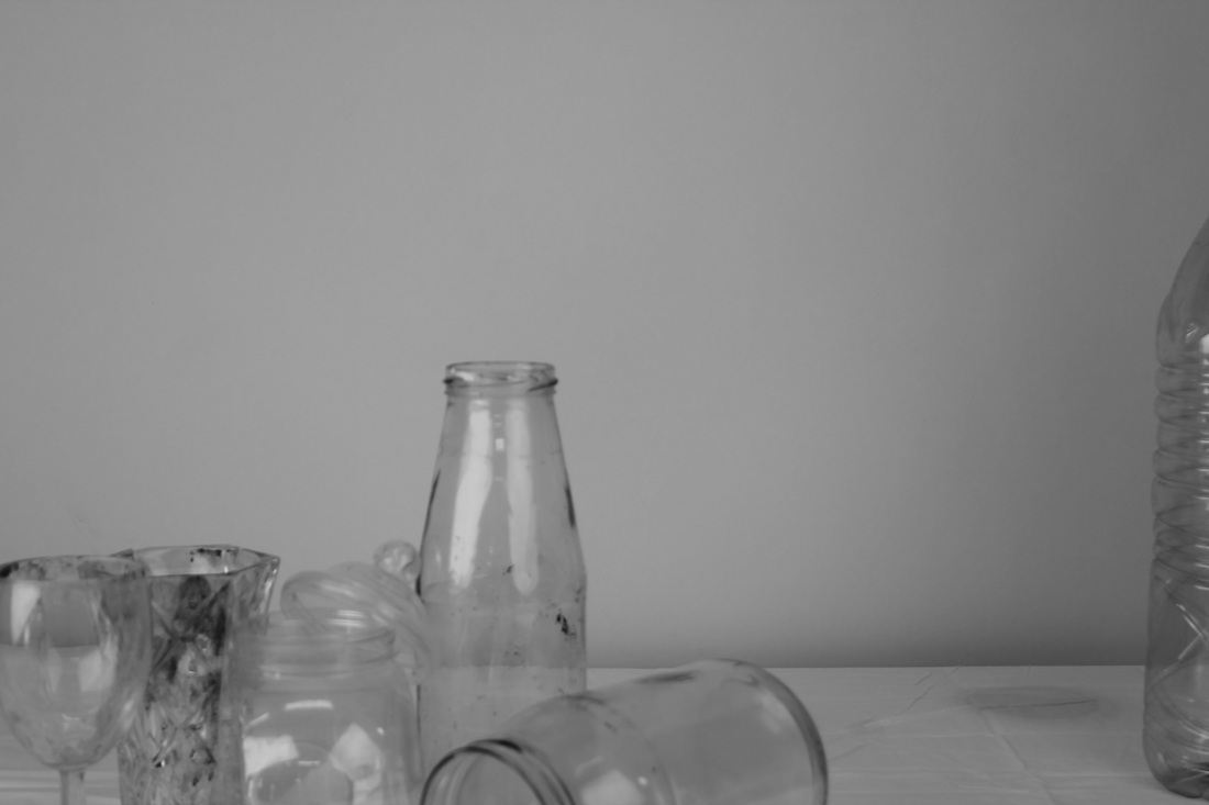
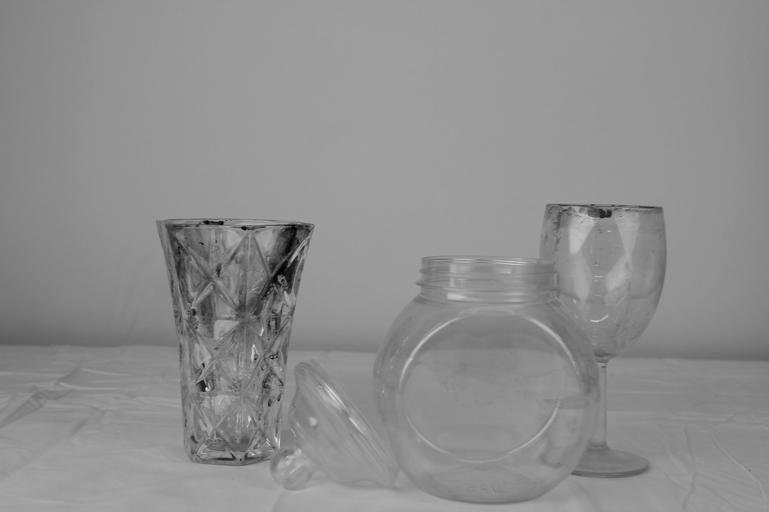
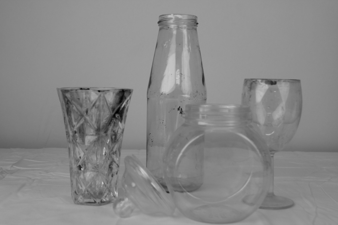
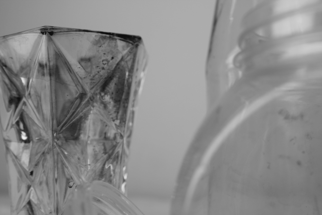
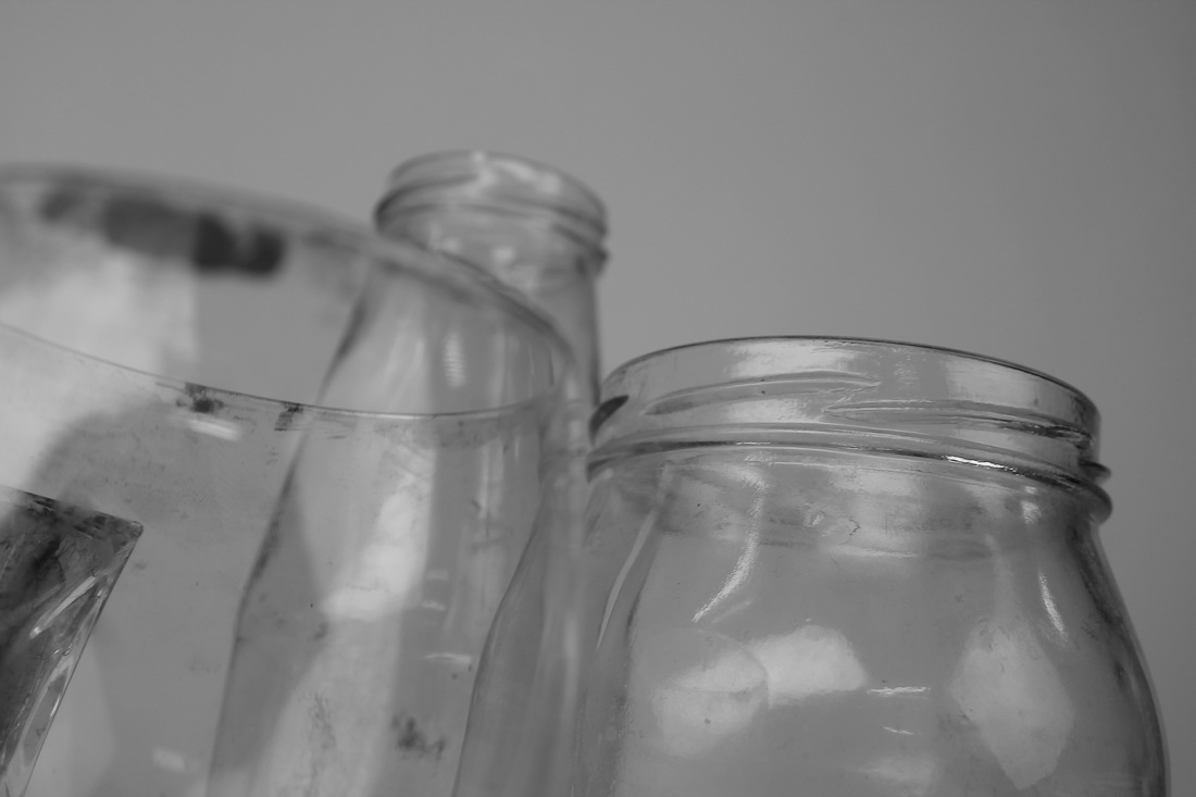
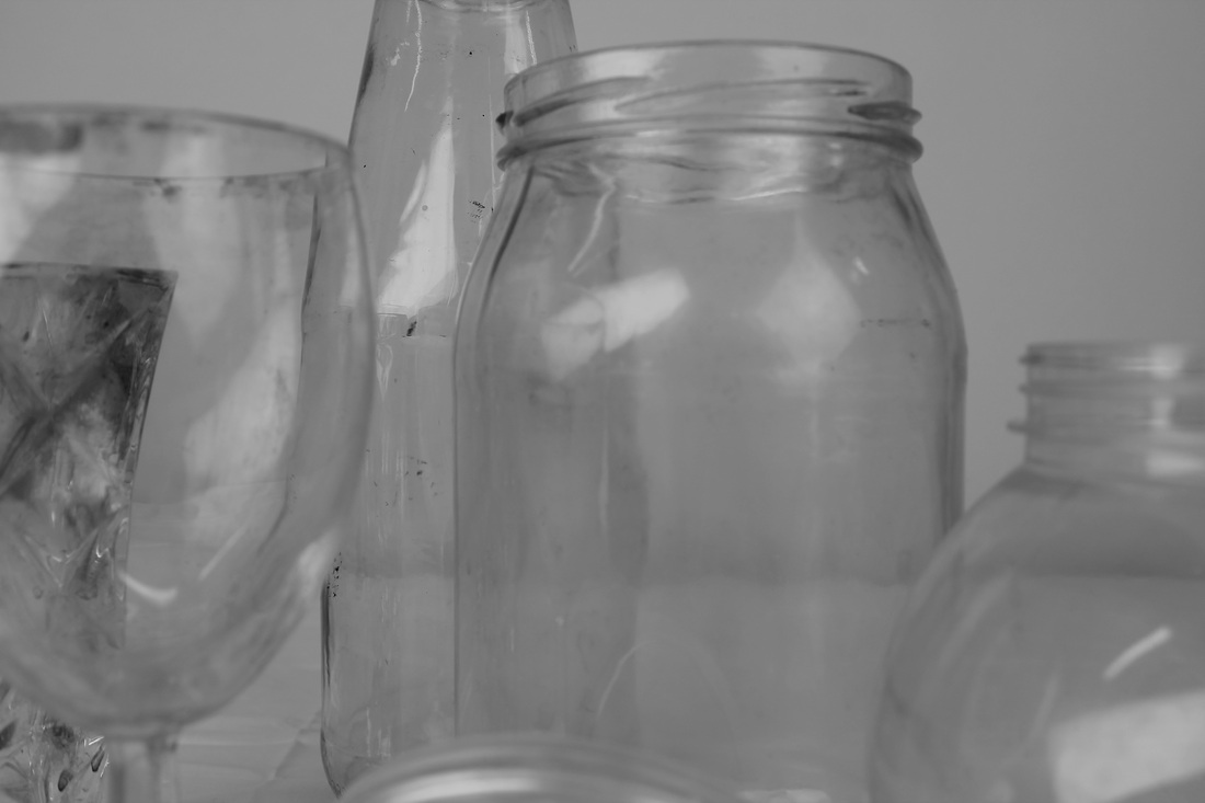
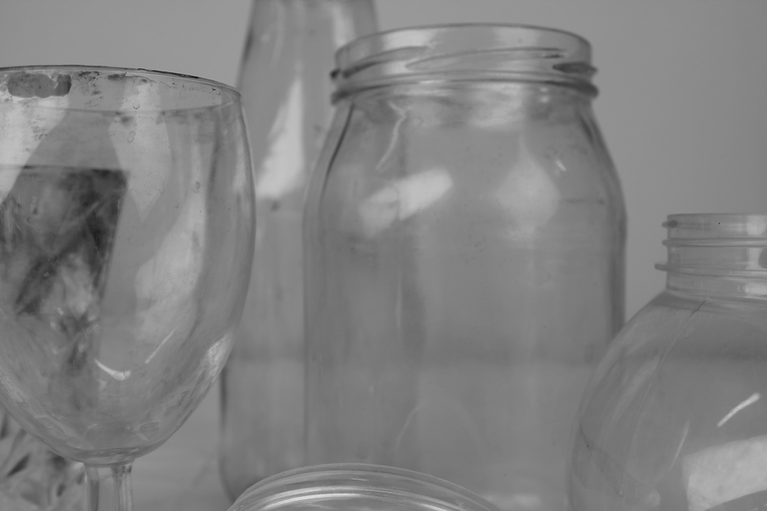
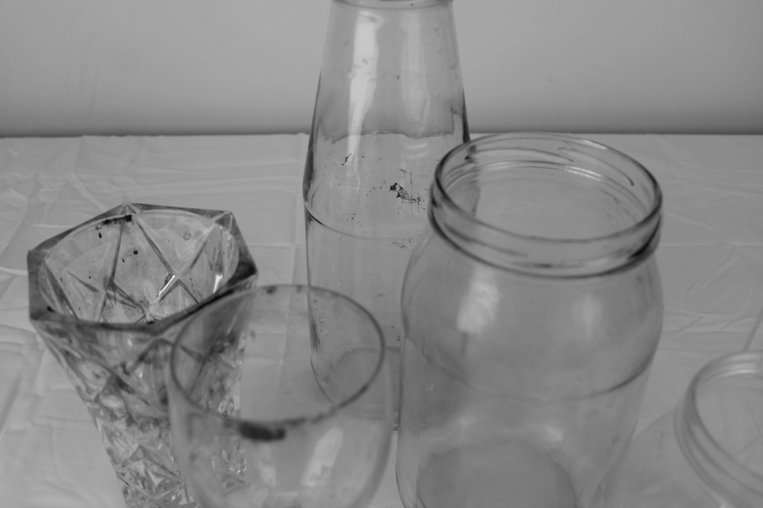
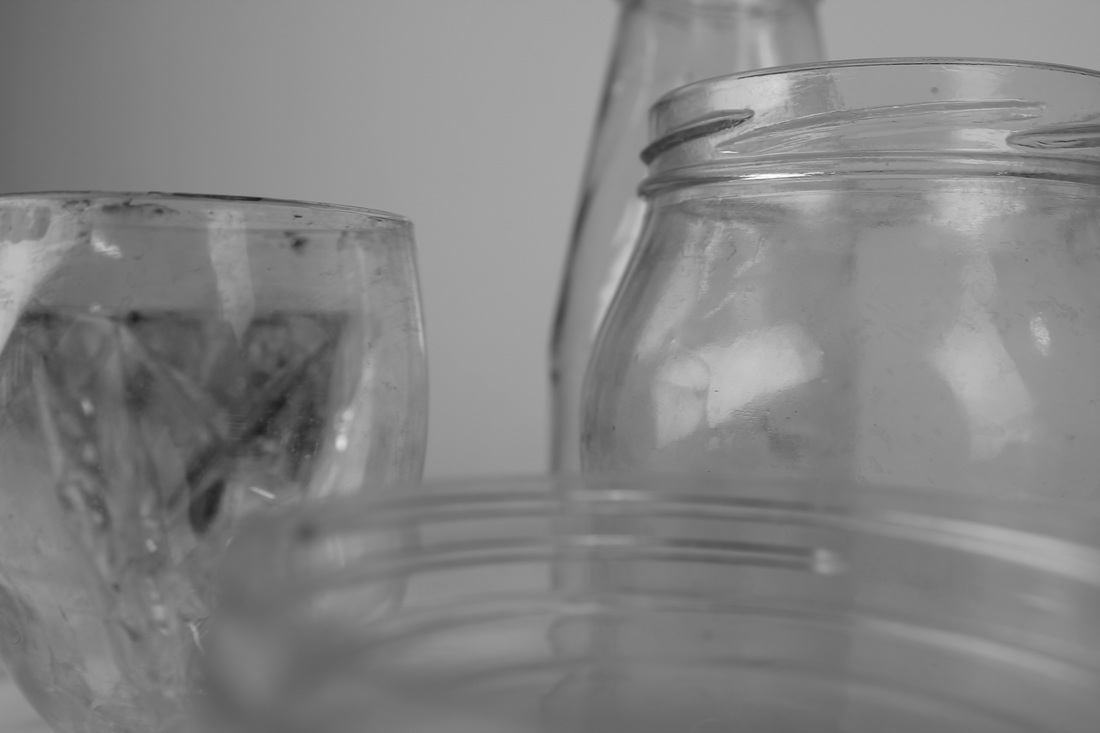
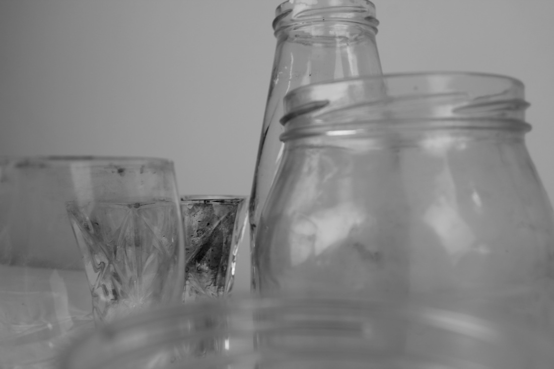
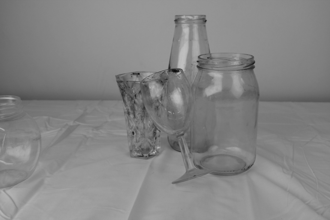
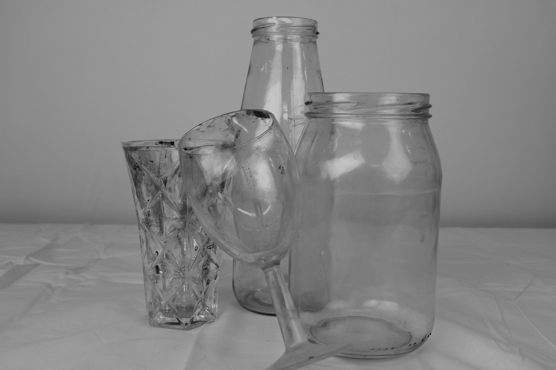
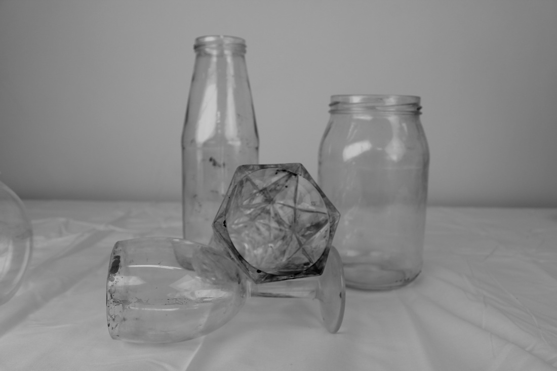
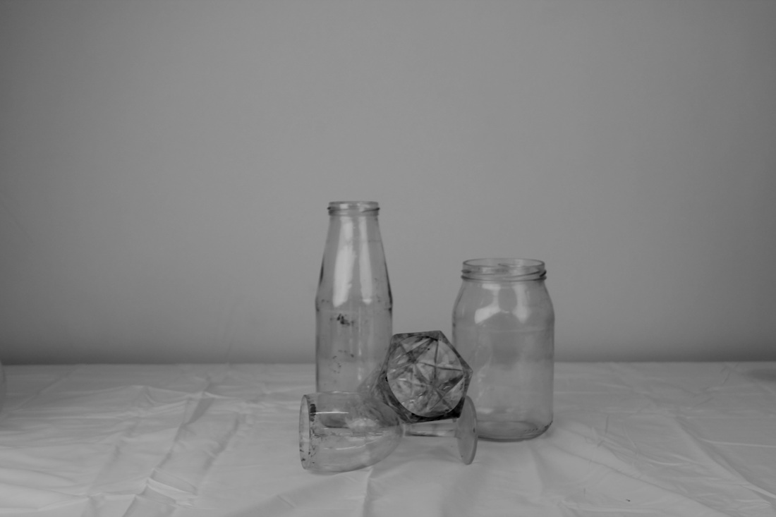
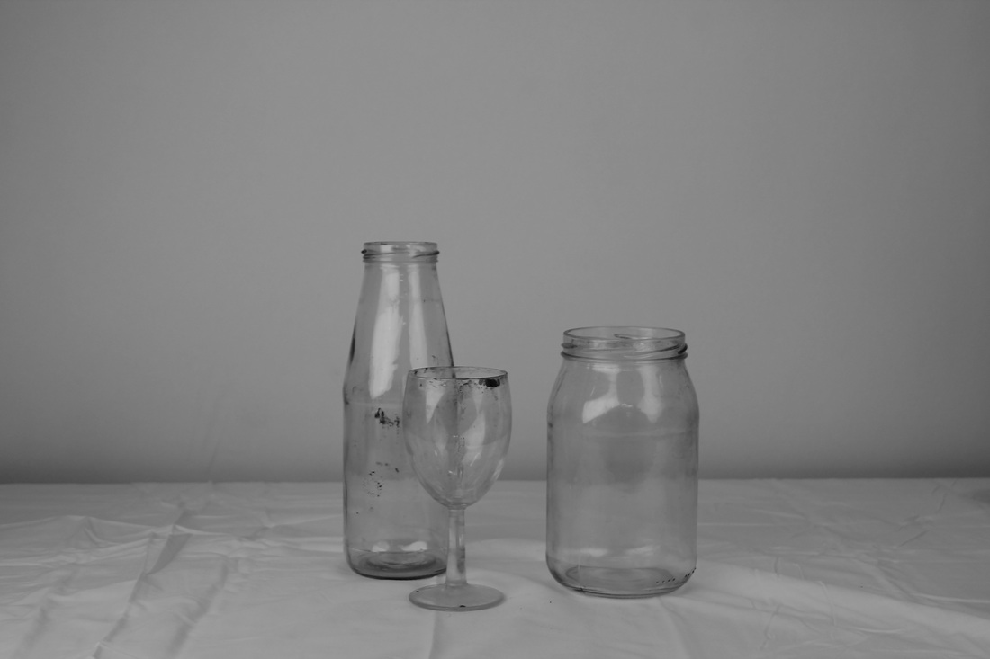
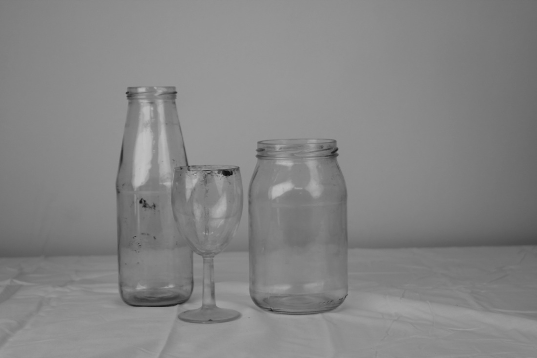
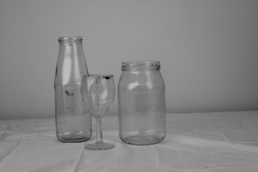
WWWI think that I done similar things to Laura, I am happy with the outcomes of these images, and I took them from different angles. Showing diverse perspectives of the glass bottles, cups and jars.
|
EBII could improve these photos by finding and including other kitchen appliances such as : cutlery, plastic utilities pots etc.
|
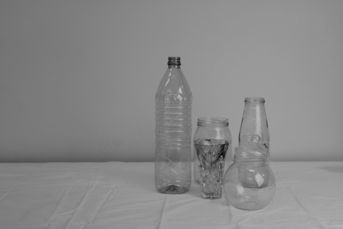
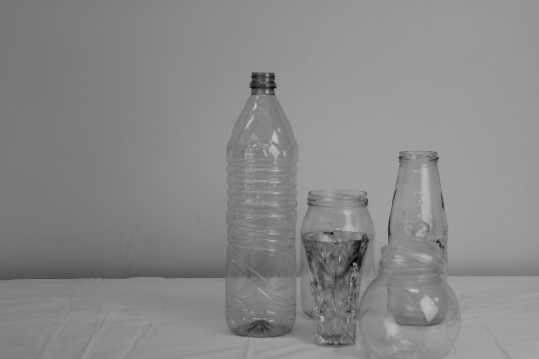
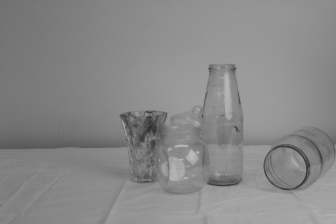
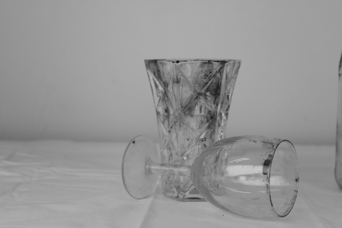
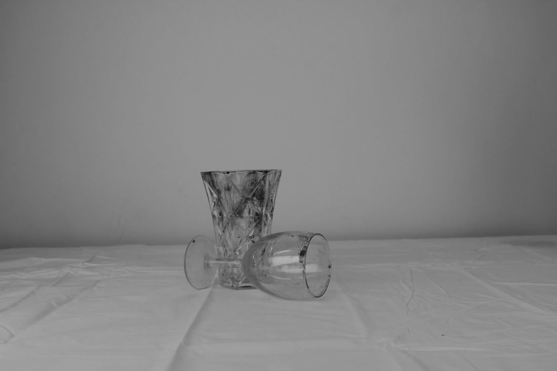
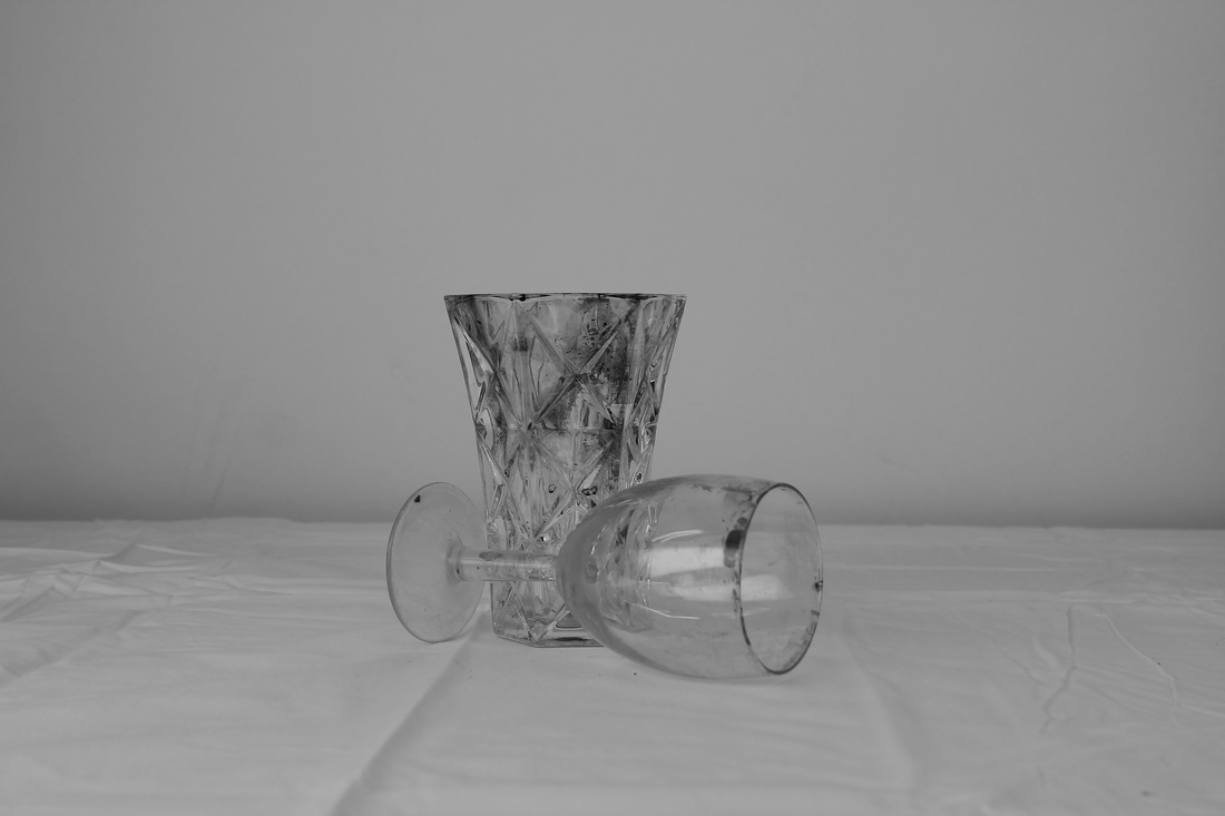
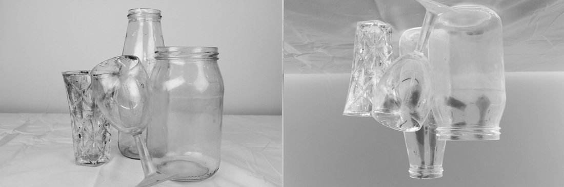
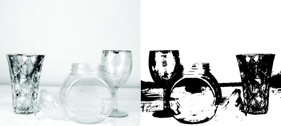
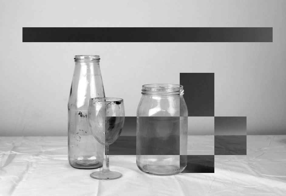
I think that these sets of images are good and don't need that much improving, however I wanted to experiment with the different tools in photoshop, wether thats making the background lighter or adding a coloured theme.
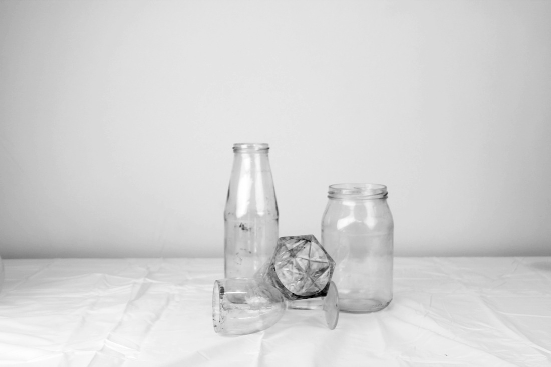
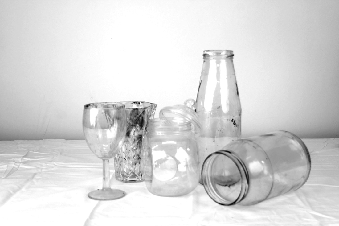
I then found some creative ways to edit them and combine them together. For this bottom one I had edit the image on the left and converted the colours to the right image I though this is a good idea because of the way the glass cups and jars are position and how the cup is leaning against the others. The inverted images makes everything look more confusing. I am experimenting different ways I could make these set of images look unique. I have put them in doubles to make them look like they are in pairs, this gives it a more fun twist to it.
Final Pieces
Evaluation Of Image(s)
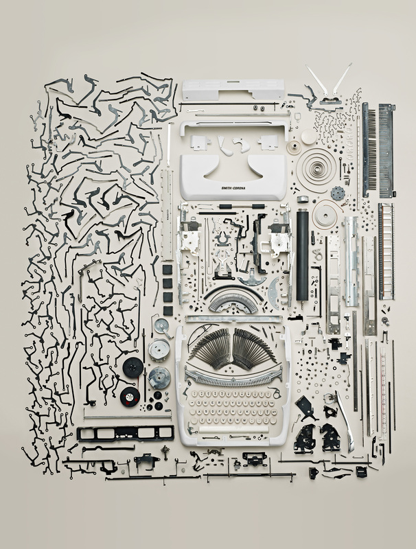
I have chosen to evaluate one of Todd McLellan's images using bloom taxonomy questions based around this image.

In this photograph I a see a typewriter dismantled with everything within that object surrounding it in a neat and organised way. Three words I would use to describe this image is : Organised, Crafty and inspiring. If I was to describe this photograph to someone who could not see it I would use the same describing words and explain the different ways its set out and because of the way it's set out it almost looks like its creating another shape/ image. Between naturalistic and abstract I would say that this image is abstract because you wouldn't normally see a type writer dismantled to such extent. And also it doesn't compliment any naturalistic object for example : Plants, tress, flowers etc. From this image I can recognize many things for example I straight away realised it was a type writer from the way the photographer set out the keys of this type writer, however the whole equipment on the left side of this image are completely new to me. I can recognize that they are the clicks for the keys but it would have never occurred to me that, that is what they look like. Personally I think different types of equipment was used too dismantle this object, set it in place and to take the image. The First piece of equipment I think this photographer may have used is ; Different variety of screwdrivers, possibly a tripod, white light spot light(s) and likely a pair of tweezers to place each object in a certain space. McLellan placing all the contents of the type writer and setting it out in a neat position gives us the impression that all of these screws, wires and metal rods, can make something that is so'simple' but yet complicated at the same time. This photograph reminds me of a blueprint on how the put something together.
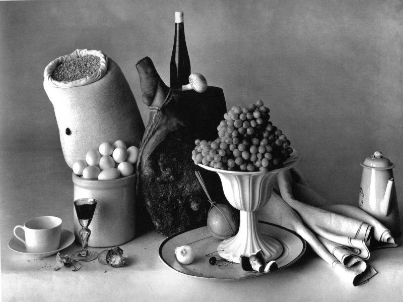
Olivia Parker
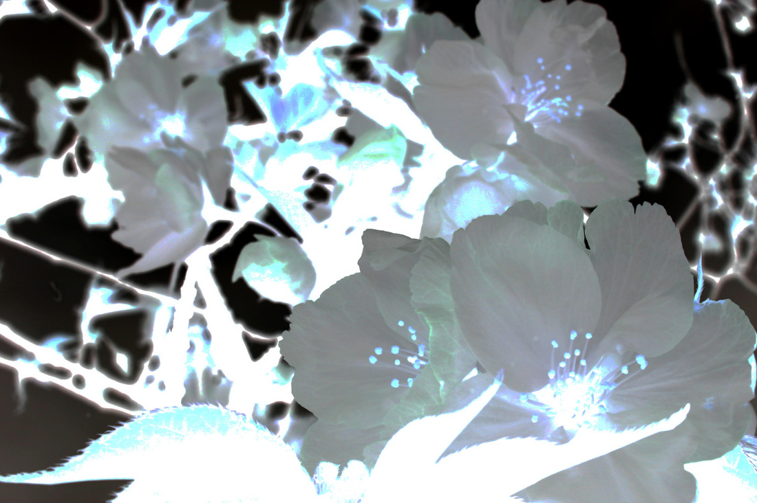
Olivia Parker uses strange objects when creating images of collections. She doesn't have an exact theme, however most of her images that relate to collections all have something in common with one another. For example they are all in black and white.
Eighth Set Of Images
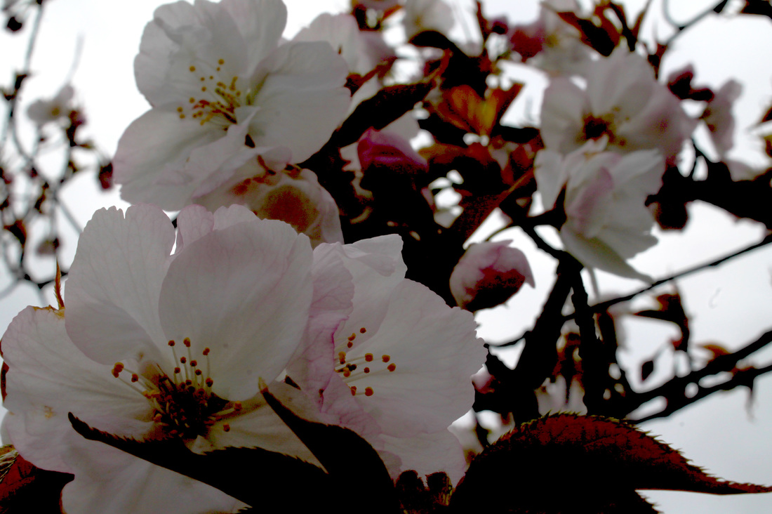
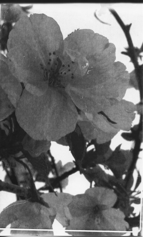
With these set of images I am going to try and mimic Olivia Parker by using a black background and making the main object in the image white and / or grey. To do this I could either find objects that are white in colour, have the camera set to black and white theme or take normal photos with a black backdrop and edit them on photoshop.
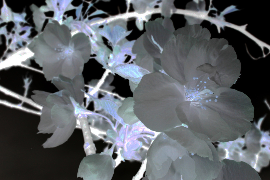
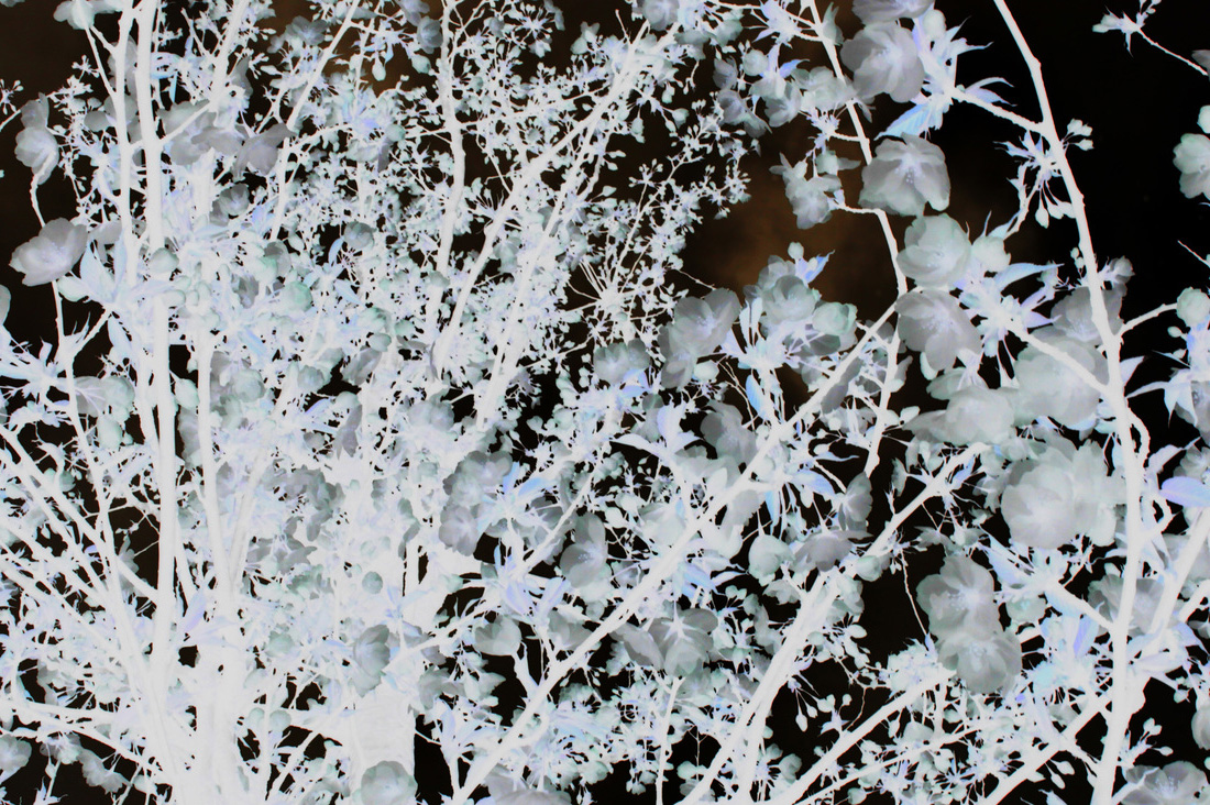
I have taken a set of images of flowers, I am then going to do an experiment by inverting the images on photoshop, then print them off and use them in the dark room to create some photograms.

Here are the edit versions of my images from photo shop, to turn these images into photograms I had to start off by again going on photo shop and flip the image horizontal and invert them, this makes the images look identical to the ones I had taken when I use them in the dark room.
|
|
|
Here is the out come of my images after using the darkroom to create them into photograms.
As for these set of images I am printing them at a standard printing size using photo paper and have them placed in the gallery in a certain way.
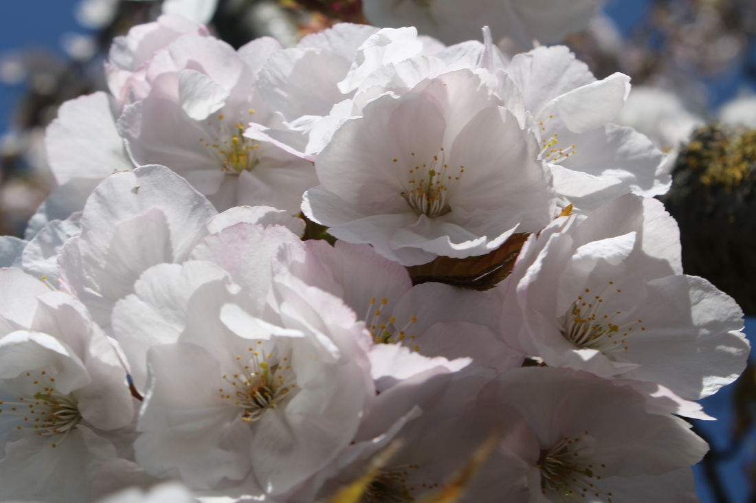
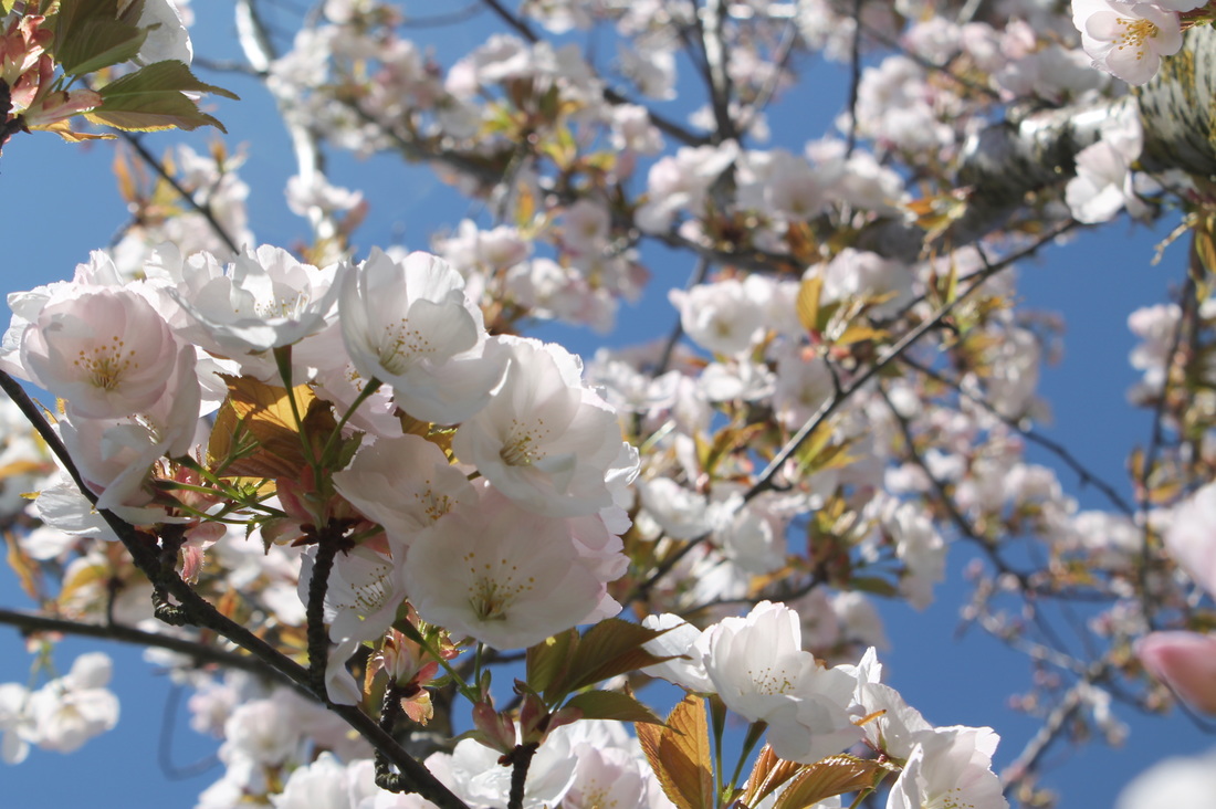
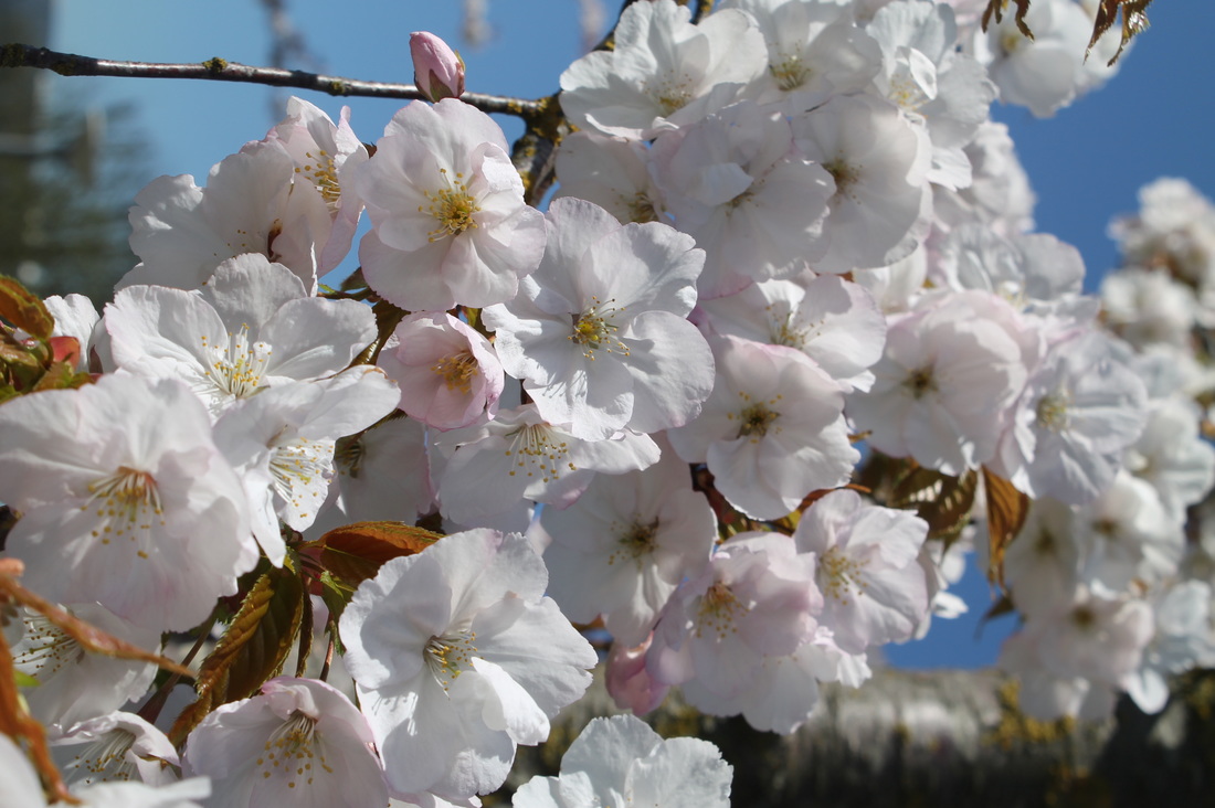
WWWI think that the focus of all of these pictures is really good because I had taken an accurate close up without using a micro-lens, which has been a big improvement and achievement.
|
EBITo improve I think I should have taken more images that have different colour backgrounds,you can see from the set of images above that I only have one that has a green background. I could have also found other textures of different flowers with different colours, instead of using the same type of flower
|
Final Piece
Ninth Set Of Images
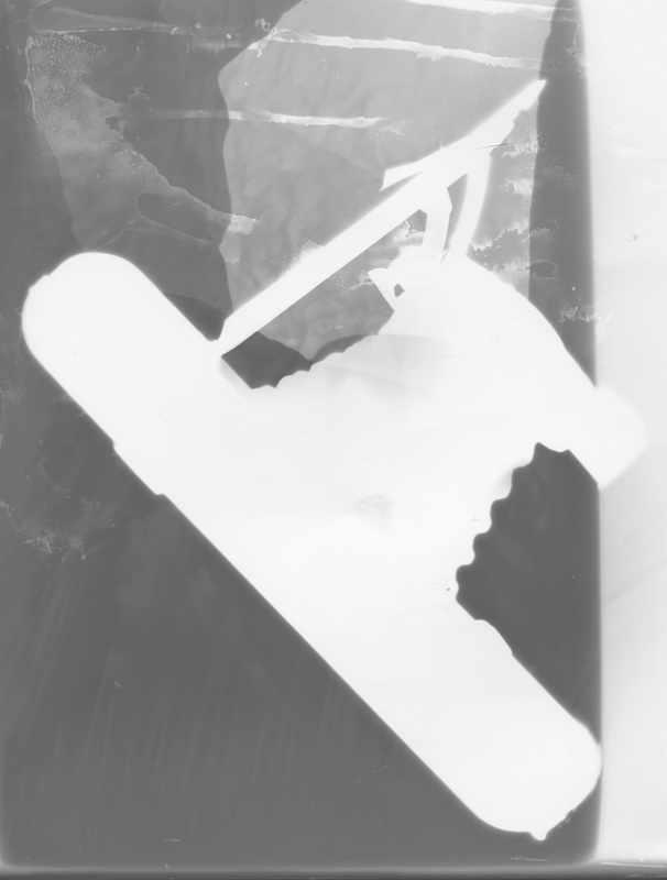
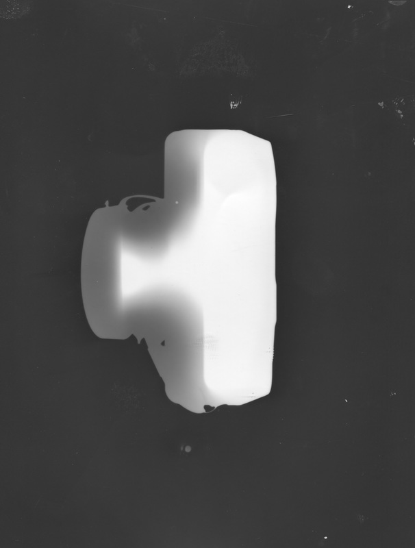
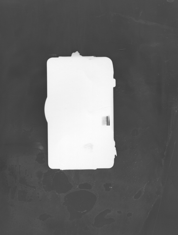
Using the dark room I'm using different cameras and used them to create photo grams. I tried to do something like Olivia Parker by having a full black background while the main object/ centre of the image is a light grey or a white.
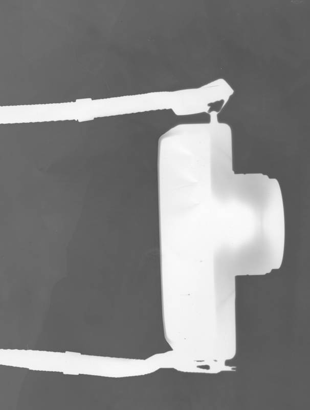
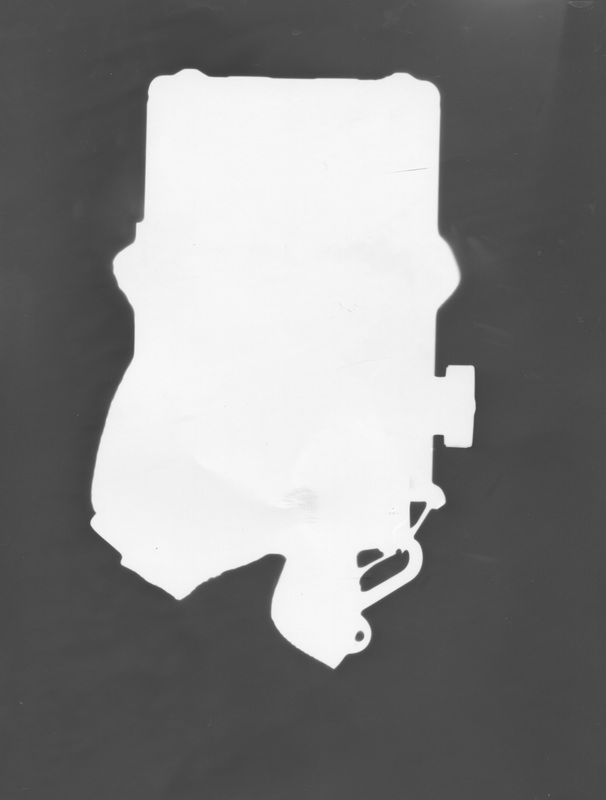
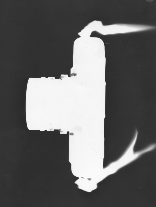
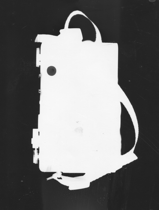
Here are the cameras I used:
Here are the cameras I used:
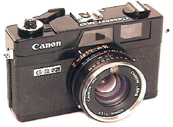
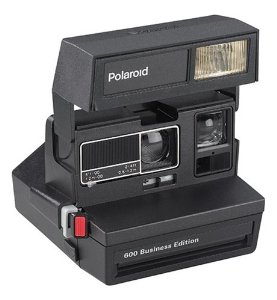
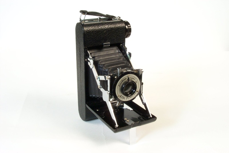
canon canonet ql17 giii polaroid 600 kershaw eight-20 penguin
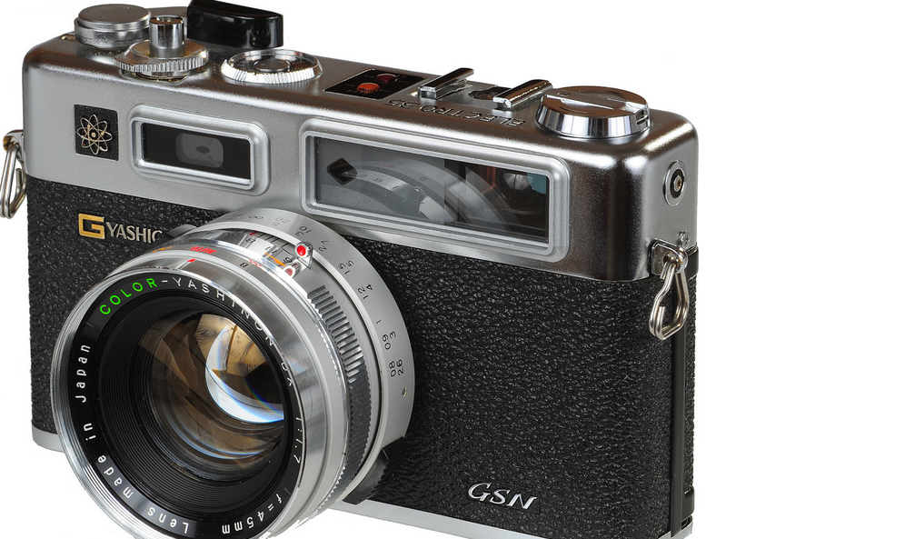
yashica electro 35
WWW |
EBI |
|
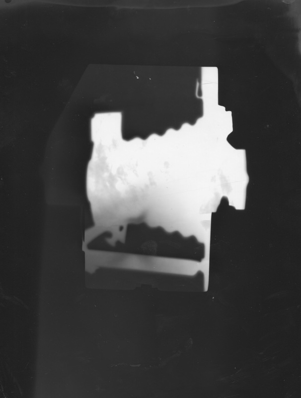
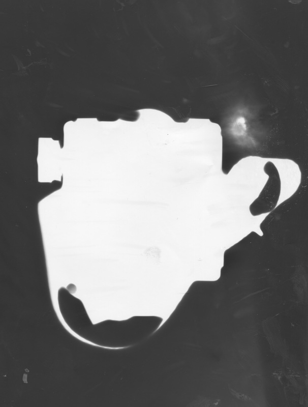
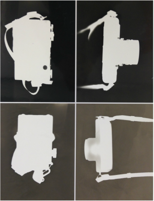
I think that although these photograms aren't the best most of them came out really good , especially the small ones. However some are dark than others which do make them look odd even though they should be matching pairs.
|
I could improve these set of photograms by keeping them underneath the white light for longer so that the shape of the cameras were more clear and obvious.
|
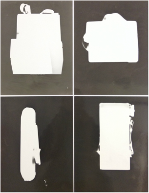
Here are my improve photograms, I had done them in pairs therefore I am displaying them next to each other.
WWW |
EBI |
|
I think that the shape of the cameras was one of the achievements that I achieved, because it took me a long time to get them correct, depending on what camera I used.
|
With these photograms it was clear that all of them had came out exactly ow I wanted it because you can clearly see that the shape of the cameras had came out correctly, however because I didn't leave it in the developer for 5+ minutes some came out darker than others, most of them a dark grey.
|
Final Piece(s)
|
|
To create this final piece after various trails of creating the perfect photograms, here are the best outcomes I made. I felt to place them in this order because the photograms that are placed next to each other is the same camera, however they are placed in different positions, Its not as obvious to tell that they are cameras but I think this is one of the advantages of having them as photograms; questioning the audience on their intelligence about cameras.
Final Evaluation
I have explored many different artist(s) throughout unit two, to help with photo shoot ideas and final pieces, I looked at various artists that have perspectives on how their work would be viewed as collections, my theme. I used artists that don’t have any correlation for example: Andy Warhol, Olivia Parker and Lauren Lewinsky. I discovered these artists by doing a mood board on pinterest and looked for artist that does work that is similar. This has shaped my understanding to think that not all artists have the same idea as each other even if the work they are doing is kind of similar and that would be placed into the same category. One technique/ process I used a lot of the time was photogram(s). I wanted to experiment on different ways I could present my specification while creating final pieces at the same time. To fit photograms to my theme collections I collected and/ or found objects that are some how linked with each other and use them to make different photograms. One of the hardest things to do was looking for diverse ways to present them as final pieces. I started to focus on groups of objects that would be categorised together, this making it easier to pin down the final outcomes I would be creating. It was extremely hard looking for different and creative was to present images and or final piece(s). I tried to stay constant with my work and not go off track for example sticking to the idea of my theme collections, in most occasions I had ended up taking a series of images of flowers, realising that I had to present them in a way they could be viewed as collections. After this I was back on track finding and developing new ways to get an acceptable set of images. Throughout this unit I had used several sources to help with my investigation on how various photographers had shown their work and how, it is then classified as 'collections'.
To take all my images I had used a canon EOS 600d. The prime technique(s) that I had used the most was photo shop. For the first half of unit two I was primarily used photo shop, nonetheless the further my website - unit - had developed I had used a variety of different processes and techniques. Such as the dark room to create my photograms. When creating my photograms you can tell that I didn't leave most of them long enough exposed because the backgrounds came out greyish rather than black, this is something I could improve on the next time I use the dark room. I had also used a photo printer- (Canon selphy CP720 compact photo printer) to print of 5 images I am currently using as a final piece, I could have found another way to present such as: mounting them, however I wanted them to have a glossy finish, and therefore thought it was a good idea to experiment with that kind of machinery. For a couple of photo shoots I had done at the beginning of the unit I used two white bulb spot lights. To refine my work I had done multiple different outcomes and then decided which were the best ones to use; trying to find a way to display them together.
By recording my ideas I had to screenshot a lot of my work; while using photo shop I would screen shot each step and define why I had done that exact action and how it effect the image; whether I was happy with the development of the image or not. Likewise when I had my images that I didn't take on a camera for instance my photograms, I would use the scanner to scan them and post them on my website. I also took images of my final pieces if they were too big to scan and or if I hadn't made them using a computer: photo shop.
Overall I am very proud of my website and believe that I altogether I had made very successful progress on my whole unit, even though I did struggle for quite a while I had found an easier way to think of diverse ways to inspire me, for example more research, continuous set of images, evaluating and editing them.
