The Natural World
AO2: Research, Critical and understanding Ideas
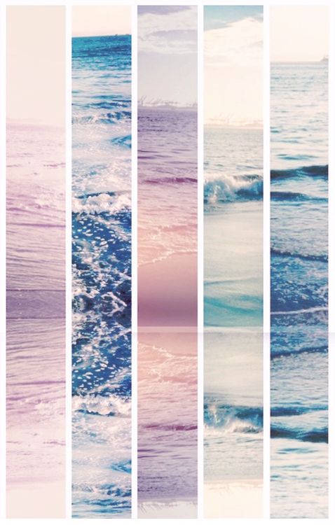
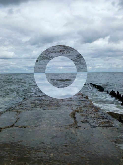
For my year 11 mock, I have chosen the category: The natural world because I think it will be a hard challenge to do seeming how most things are man made. Below are some images that I have found on Pinterest that I think have to do with 'the natural world' these images has inspired me to take a natural photo and make it look distorted , by either hand made or over a CAD : Photoshop, illustrator.
My pinterest account.
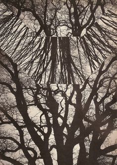
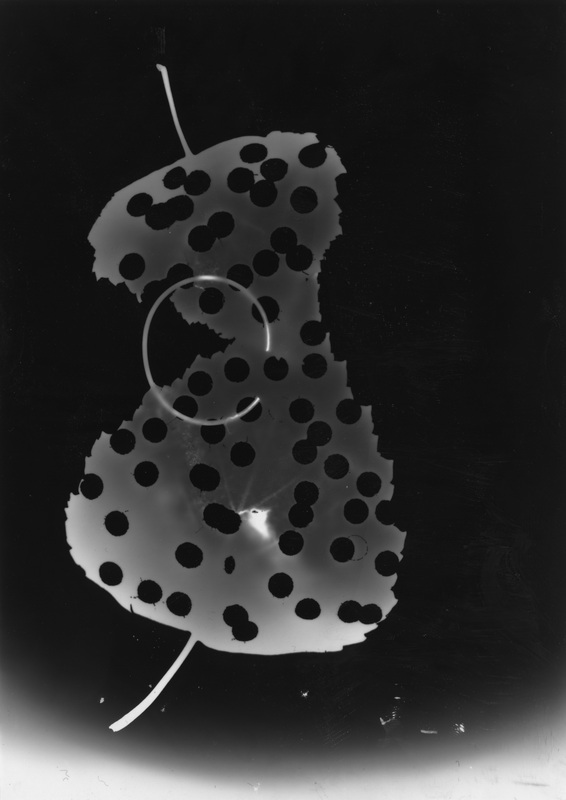
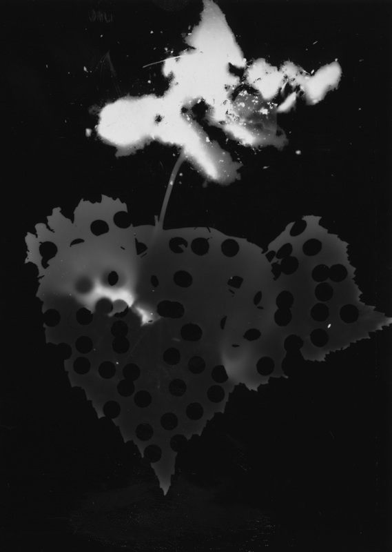
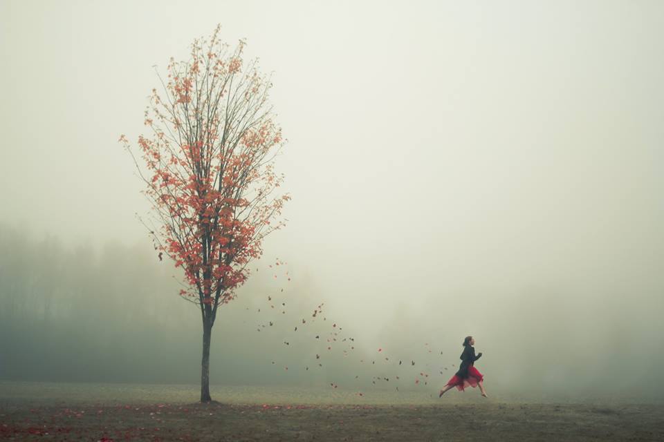
Looking for Bambi
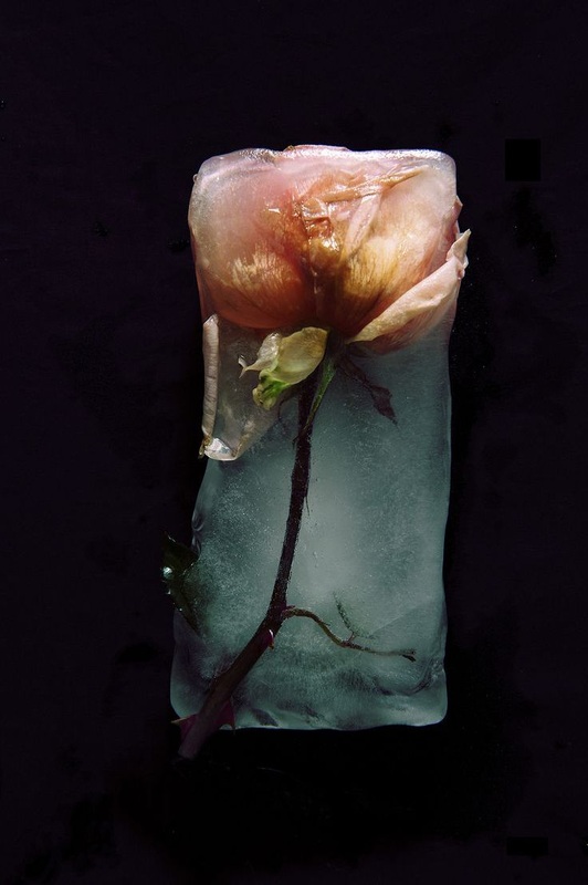
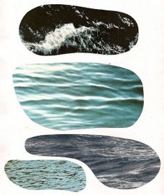
I found this photographer on pinterest called Looking for Bambi, who takes of multiple images of different things such has different landscapes, people and nature. Am came across this image of a glitched flower this gave me the idea of doing something similar to my image of the flowers that I had taken. I used this idea for about 2 - 3 of my final pieces because it makes the image look likes it's not complete.
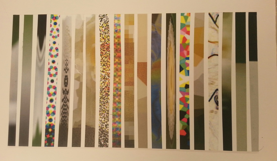
First set of images

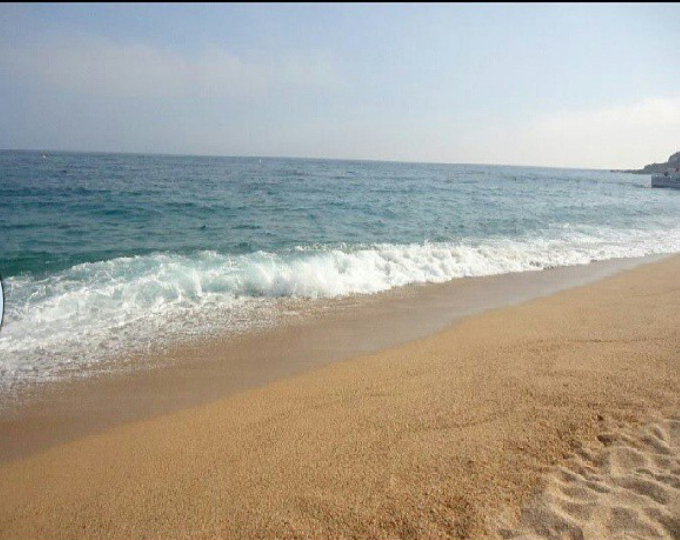
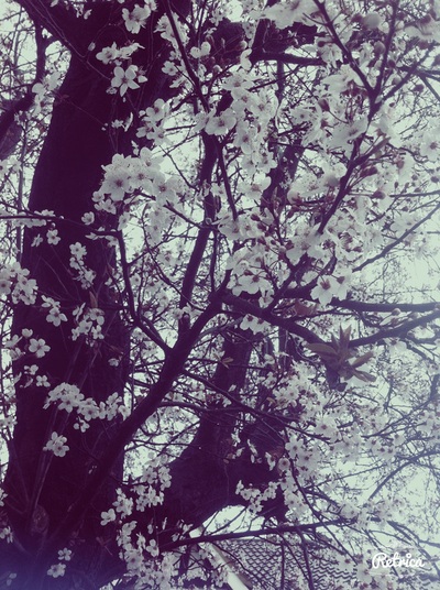
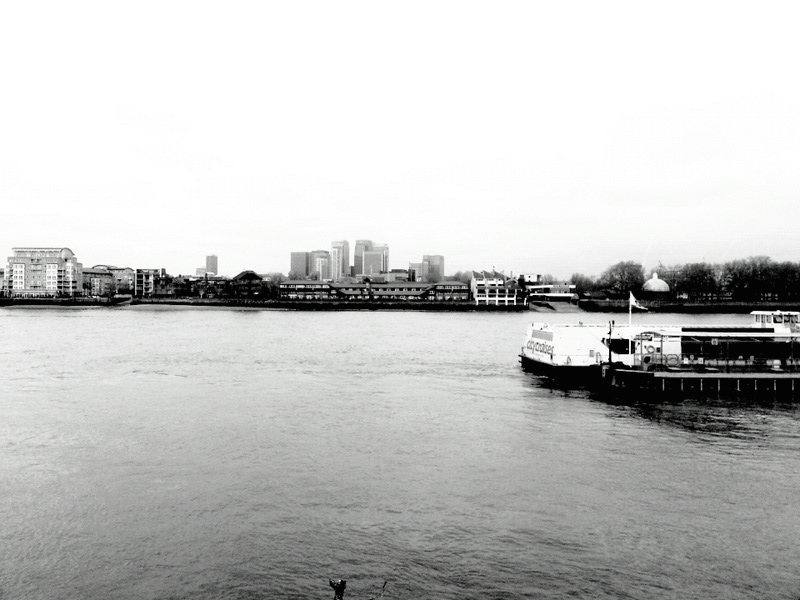
WWWI took all these pictures at different times and places that were significant to me and they fit perfectly into the project I am currently doing. They are all inspiring to me because they all are different pictures taken at moments that I consider to be perfect and they came out exactly as I would have hoped. They are all unique and are not connected whats so ever.
|
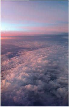
EBII think I could of improved these by making them a little bit less fuzzy than they already are, for example the photo of the clouds that are a pinkish colour looks a bit blurry therefore my goal is to take pictures that are more in focus.
|
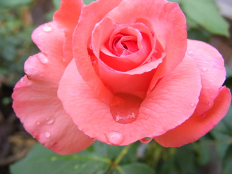
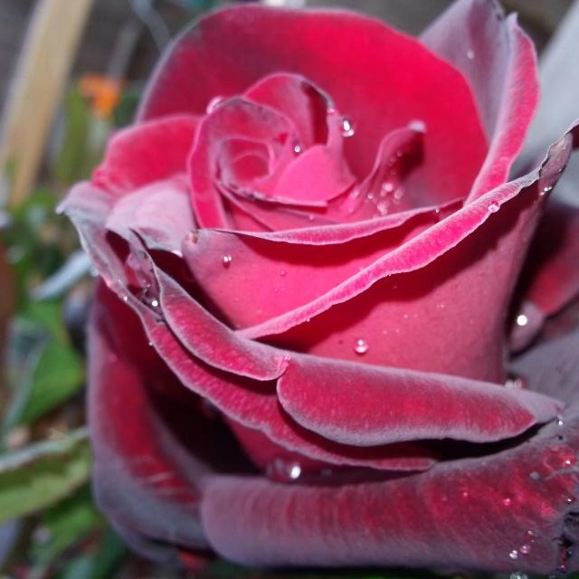
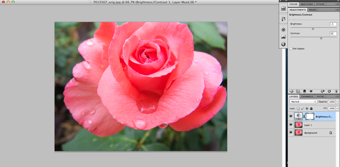
I have chosen this photo because I thought it had a really good close up of the water droplets and the folds within the rose. I started editing this photo by dragging it into photoshop and creating a second layer. I then increased the contrast by 32, and decreased the brightness by -5 this made the picture brighter and more defined.
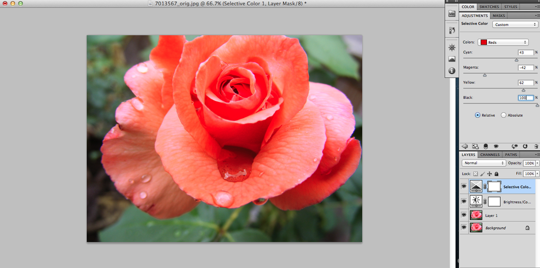
I then went to 'select colour' and change the effect red mixed wit cyan at 43%, magenta at -42%, yellow at 62% and black at 100% making the flower look like it has a red effect.
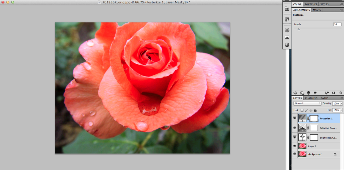
I then change the level of the posterise effect to 26% making this image look a bit more bright and cartoony.
Finally I added a filter called cooling filter (82) with the colour blue and the density of 24 % which gives it a more cold effect and bolder outline.

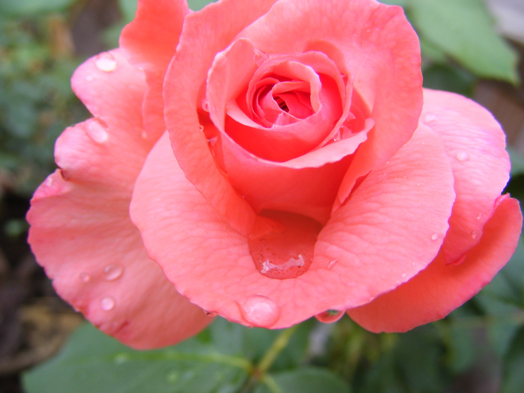
WWWMaking the photo look red and a bit cartoony improved it because the petals now look more defined, you can even see the lines that are on the petal. I also like how there is a different shade of green for the back ground leaves, this compliments the flower even more making it look more vibrant and bolder.
|
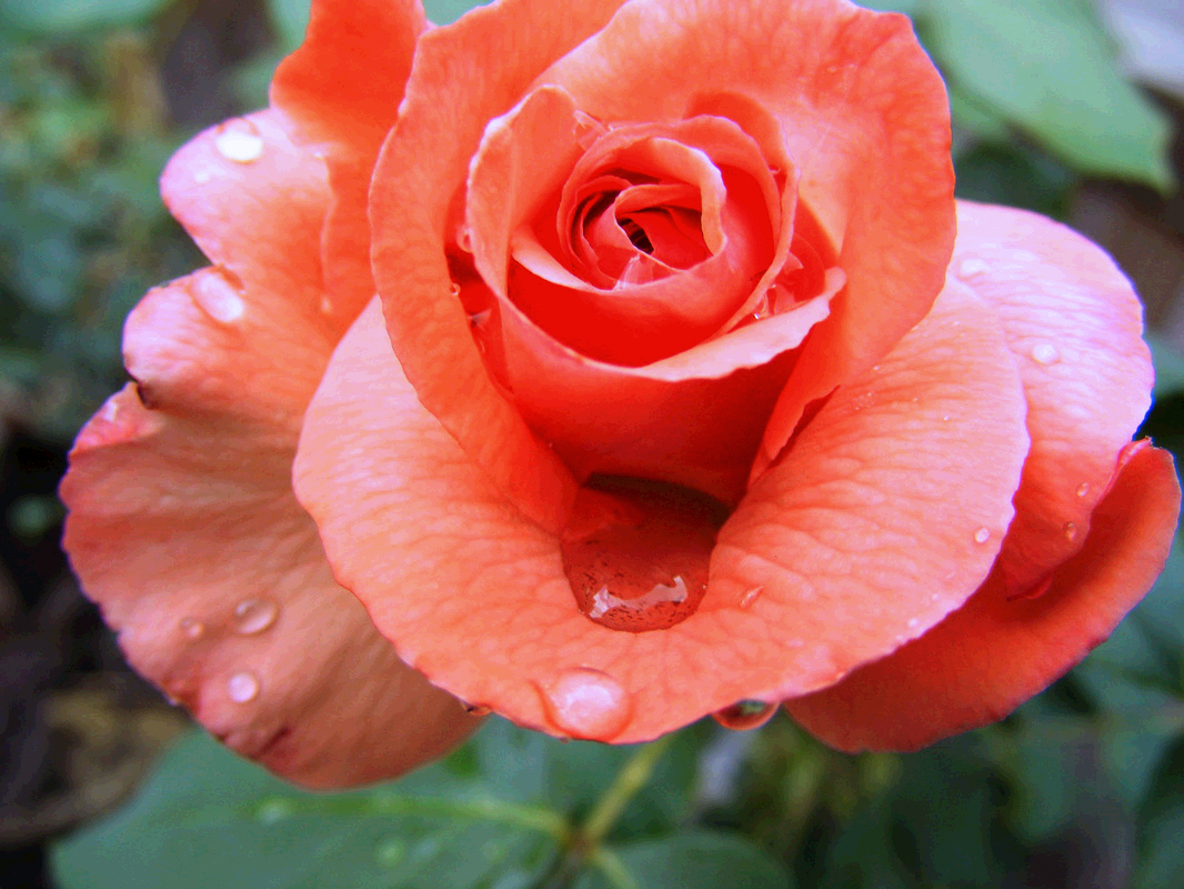
EBII could have improved on this by adding a darker shade to make the petals look more defined. I also could have improved on it by giving it a different effect, changing the whole colour of the rose so it looks different, or even adding a black and white effect.
|
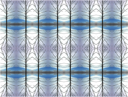
My original idea was to have the flower as the back ground with grey scale sections on the image. I changed the image to have multiple images of certain sections. I edited them to make them look glitched but I wanted the viewer to still see that it is a flower. I done most of these edits using both the computer and an app on my phone. To make it look 3D I stuck the edited sections on foam board and stuck them accurately on the original image. When the section was over lapping, I cut out the piece required and stuck that back over one of the images.
WWWWhat went well was that this final piece looks 3D, I am happy with the different glitching effects that I had done, which made this image look more computerised then if I was to use a grey scale.
|
EBII could have improved on this final piece by putting the glitched images around the whole image instead of having most of them gather in the middle. I could have also used bigger sections when using the foam board because the bottom right hand corner looks a bit empty.
|
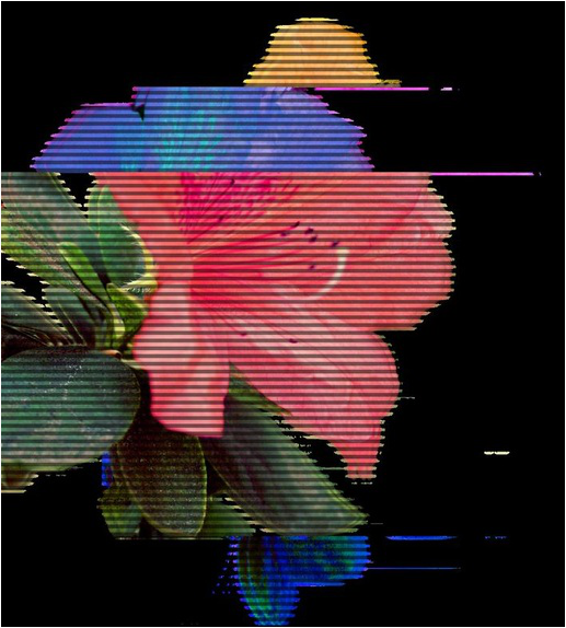
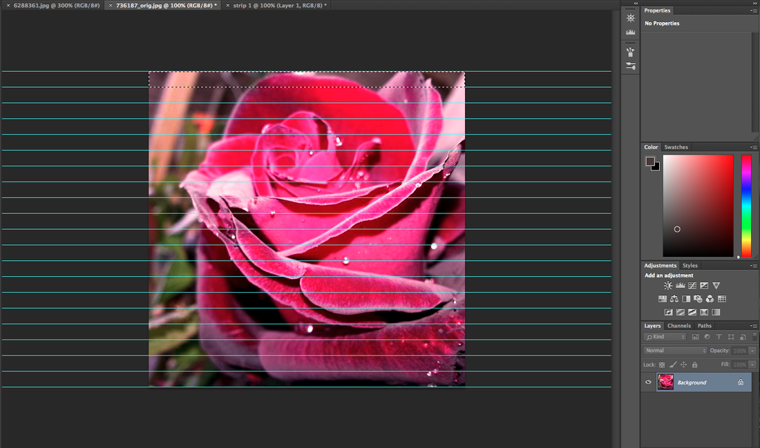
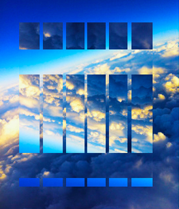
For my second final piece I used my second flower. Again I'm going to glitch it. However, I am taking a different approach to it but sectioning the image into small strips and each strip will be glitched in different ways. I am then going to stick them into the correct order of the flower. I started this off my adding a deep red filter with a density of 45% because the flower is red to make it look more vibrant. I then continued with an effect because the image was not dark and it was in full focus.
I then used guide lines, to get an accurate idea of where each strip is and how big it will be. I started from 5% and made my way up to 100% throughout the image so its has the exact and even amount of space between each strip. After this step I copied each strip onto a new slide and glitched them individually, one-by-one to make sure I don't use the same glitching effect and that everyone looks different. I then stuck them on a white sheet of paper to make sure that each strip is in the correct order and them I mounted it on foam board.

|
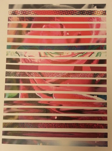
|
WWWWhat went well was that the image is in full focus that you can see every single water drop that is on the rose, from the original image, however from my final piece I like how you cant really tell that it's a rose because you have the different glitches in each strip, although I did try to keep the editing a a minimum because I didn't want it too bright.
|
EBII could improve this final piece by giving each strip a bit more space because I think they are too close together. I also think I could of improved on how I placed the strips I should have experimented and lined them in a jagged line rather then straight.
|
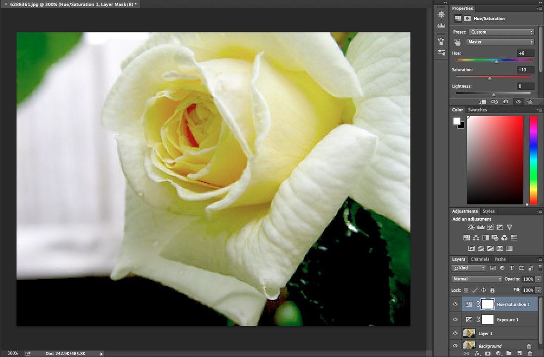
For my third final piece I didn't do a lot of editing because the image was already bright and the grey scale wouldn't be too dark, in this case. However I started by increasing the exposure to 0.31 and decreasing the offset to -0.0389 this made the background of the rose less bright bringing more attention to the actual rose and the leafs inside.
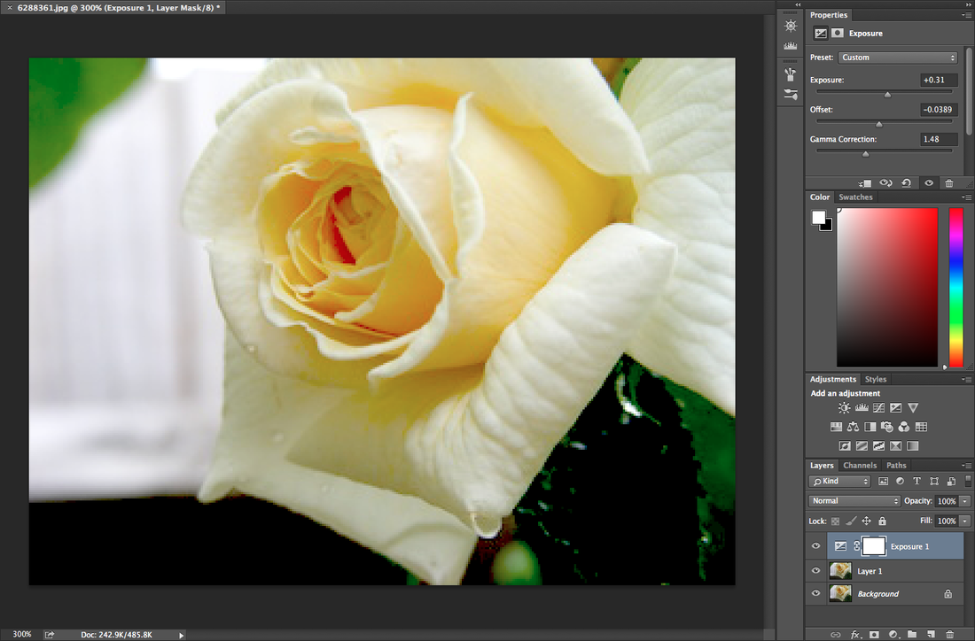
I thing increased the hue of the image, this caused the rose to have more of a bright yellow effect rather than a dark yellow orange, like it was originally.
I then put guide lines from 5 - 95% so that they are all the right size. I the crop every single strip and use a glitching app on my phone.
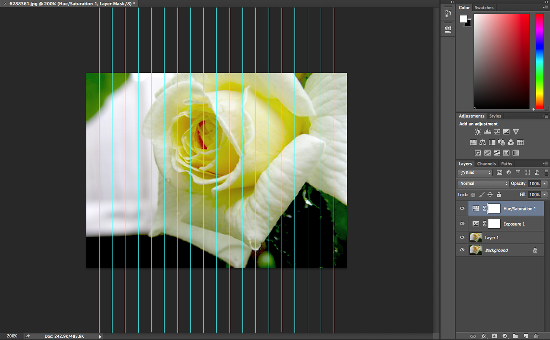
I got the idea to do something similar like my second final piece with the glitching 3D strips how ever this time I will layer it landscape and use different glitching methods. But I still used the app on my phone to do so.

|
|
WWWI think this final piece went well because it was more 3D image because of the range of glitched strips, and how I organised them I also think that the places I place all the glitch images where well spread and not to clumped.
|
EBII could of improved on cutting the strips a lot more accurately straight because you can tell some are cut the same size, I also need to make a big improvement on how I placing the strips because you can clearly see that one of them is extremely wonky.
|
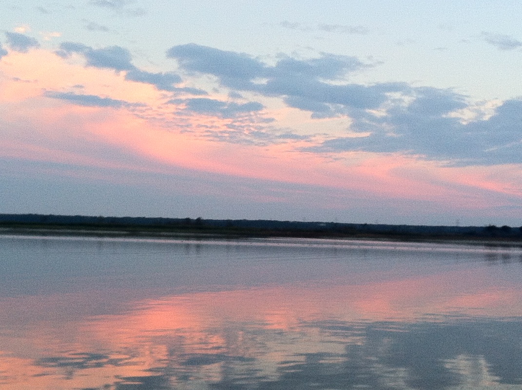
I wanted to take a different approve to all the other final pieces I had created, so I used the image of them reflecting sunset I had taken, and started by increasing the vibrance to 81 and the saturation to 53; this made the sky in the image look more bold and pinker than it originally was. It also enhanced the baby blue in both the sky and the ocean.
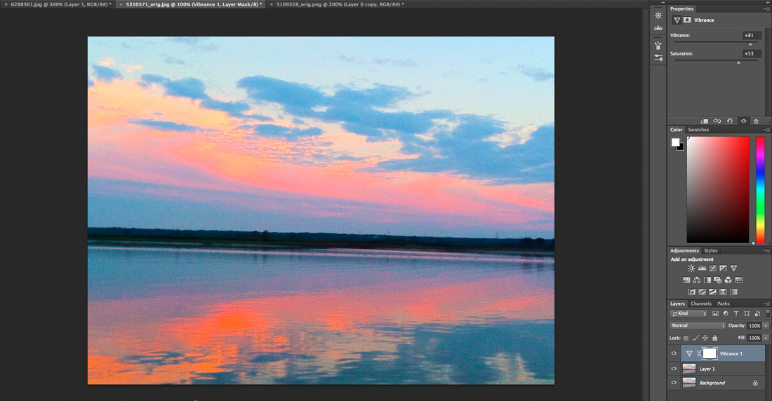
The contrast was increased causing the horizon line look more darker.
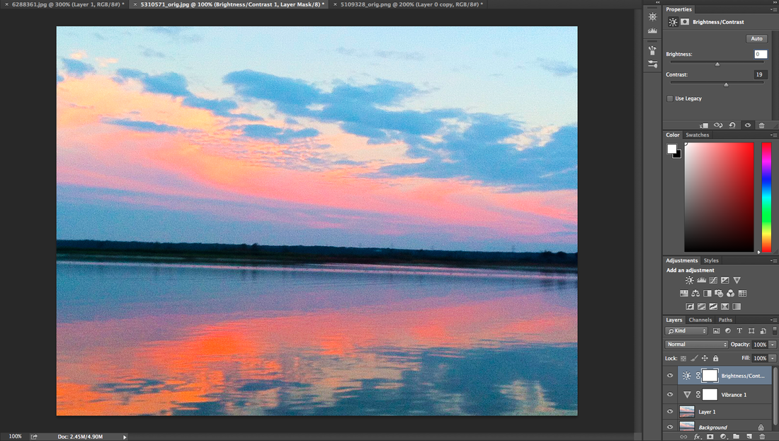
I then changed the hue and the saturation this gave the sky a more purplish colour added with a bright orange whereas the oceans reflection is a dark orange.
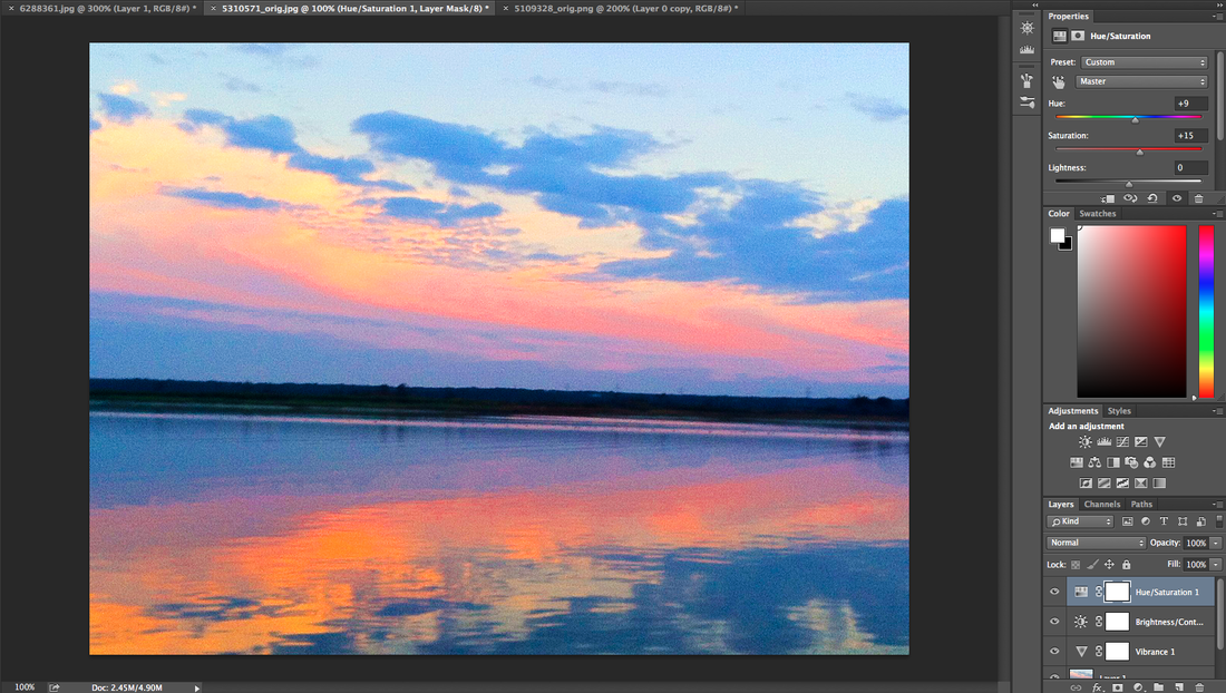
I then wanted to change it, but have the glitching effect still. To do this I added a crystallize effect and changed the size of the pixels this made the image look weird, almost like it had be copied and flipped. It also looks like a painting more than a photo.
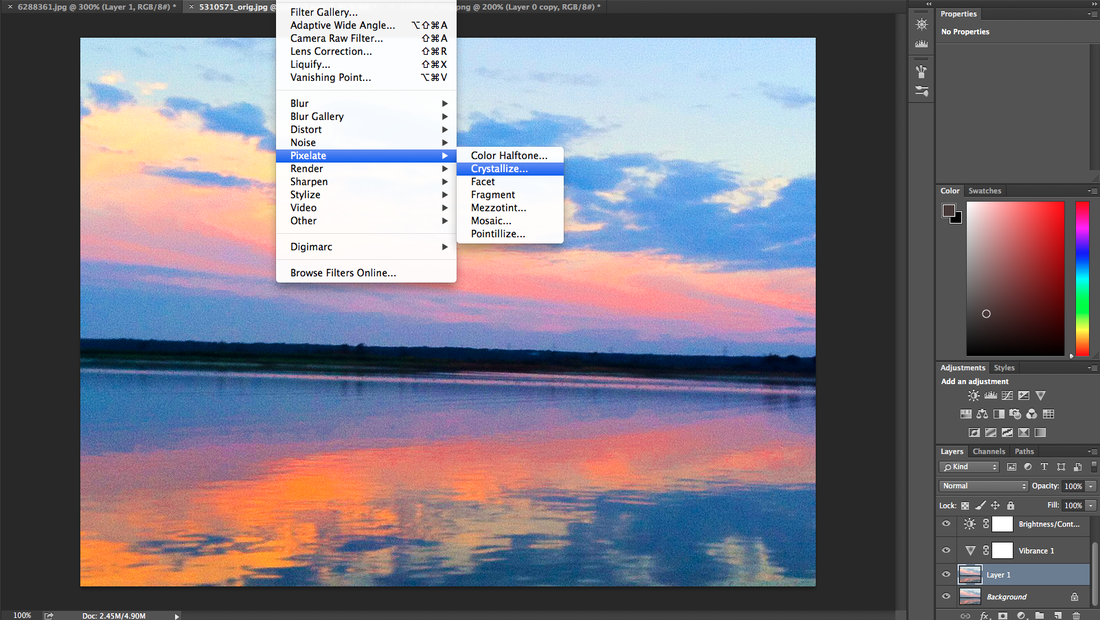
WWWI think this final piece came out really good because you can see a difference between the before and after, I like how the crystal effect makes it look more of a painting. The colours of the image are also more bold and brighter; catching someones eye if place on a plain white background.
|
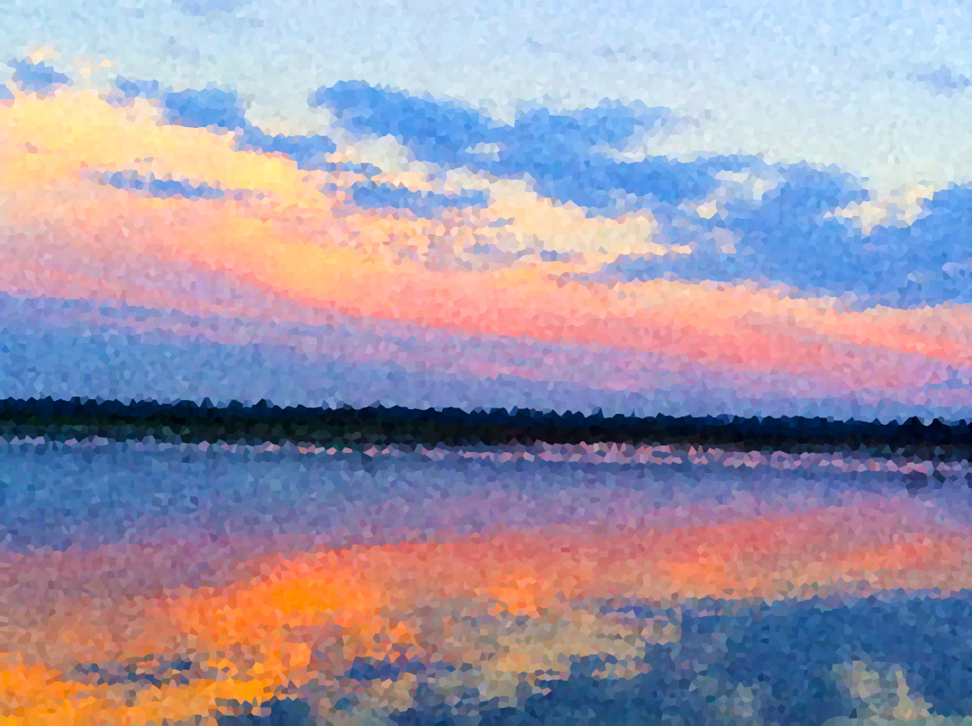
EBII could of improved my experimenting with the different sized pixels, because I now feel like these are too small, however it does show each aspect of the image without blurring it out as much as the thicker pixels would.
|
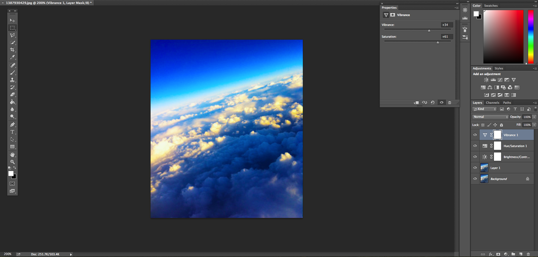
For my fifth edit I had started off by increasing the brightness to 14 and the contrast to 42, this improved the look of the sky because you can now see the different shades of blue properly. It had also made the shadow of the clouds more obvious.
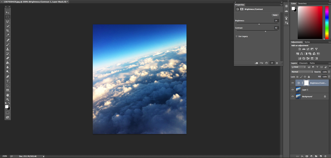
Secondly I had changed the hue to +1 the saturation to -1 and the lightness also t -1. This made the colour of the clouds look a tan colour which was one of the aims I was trying to get.

Increasing both the brightness and the saturation made the whole image look different, the clouds are more expressed, with a sun glow on them and the clear shades of blue on the whole image.
I then started measuring out the image using the guide lines to get accurate scale rectangles.
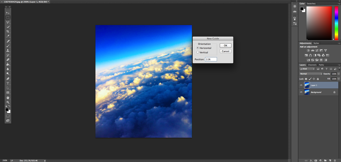
I started creating accurate horizontal and vertical lines on the image.

After I got my guide lines I had decided to create flipped rectangles within those lines. I started by selecting the shape and how long i want it, I then went onto image; transform and vertical flip, which flips that rectangle.
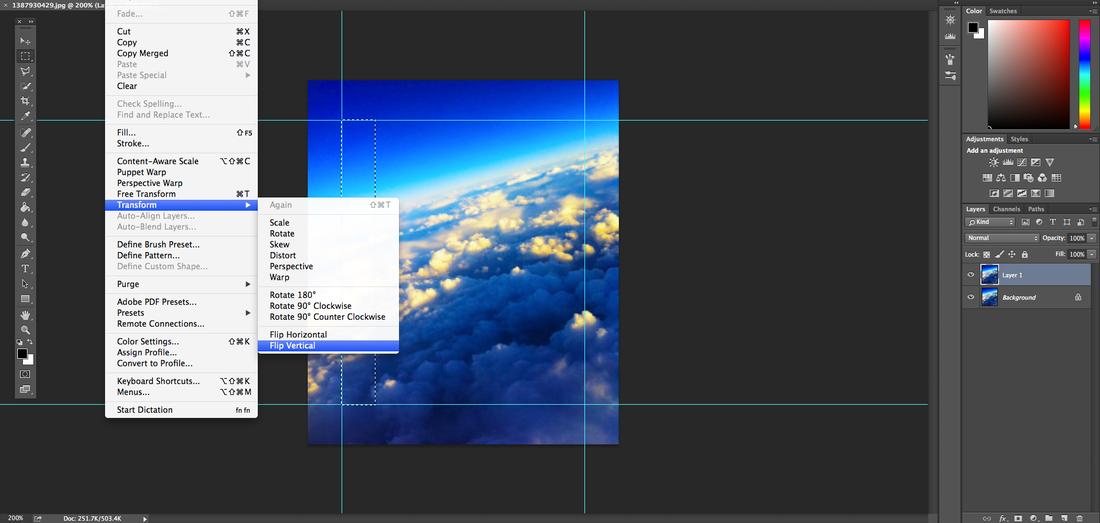
I then repeated the previous step seven times, however the last two I had tried to join back to the image making it look more confusing. I then added a warming filter which gave the image a more darker colour tone to it.
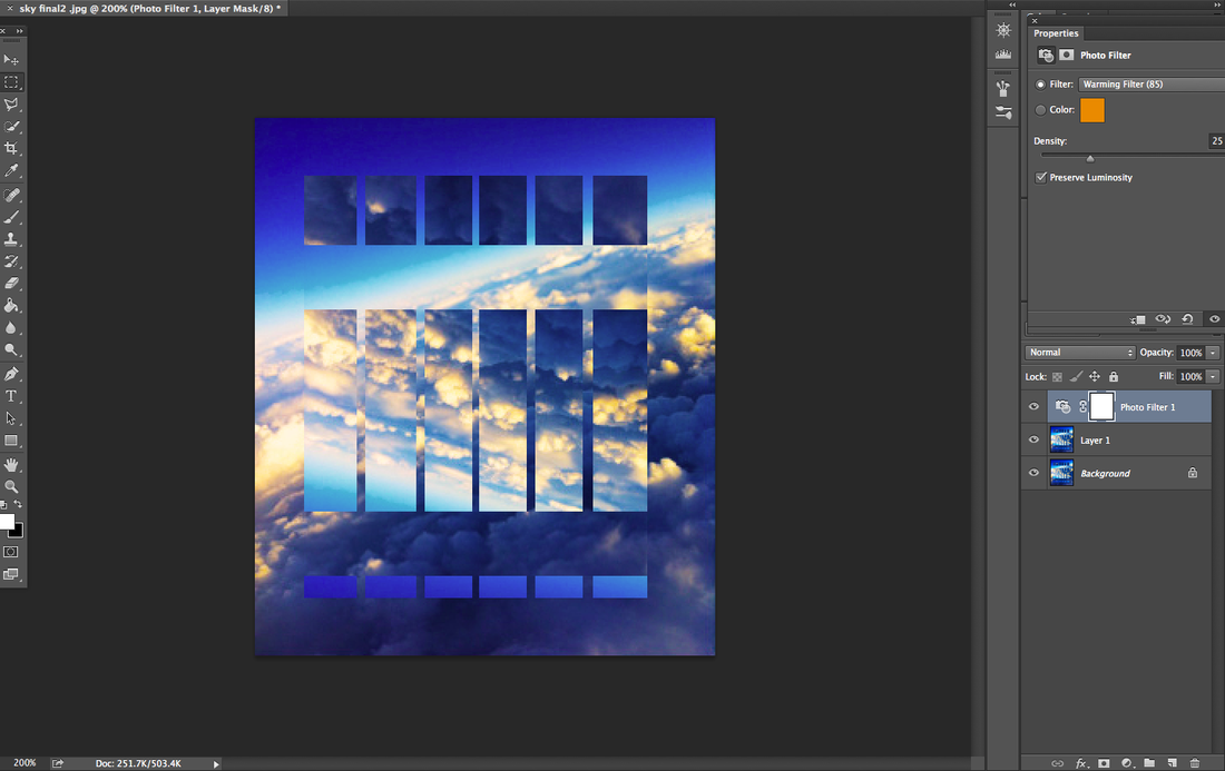

WWWI think the final edit went really good because there is a lot going on in the image and it is quite confusing. There was a huge step from the original to the edit, which I believe had improved the quality because, the original looks a bit dull and not as interesting and the edit.
|
EBII could have improved this image by adding something else to it to make it look more distorted than it already is. Although he colours and the editing is good you can see at the top that the first strip going horizontal isn't actually combining with the image, which makes the image look more weird yet uneven.
|
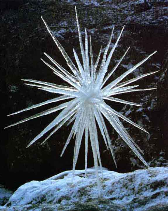
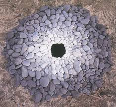
Andy Goldsworthy
Andy Goldsworthy is a British photographer who collaborations with nature to make his creations of leaves. He photographs each piece he makes only once after making it and leaves it after. Generally he works with what ever comes to hand, for example: leaves, twigs, snow, stones, ice. "I want to get under the surface. When I work with a leaf, rock, stick, it is not just the material in itself, it is an opening into the processes of life within and around it. When I leave it these processes continue."
- Andy Goldsworthy 1956. Gold worthy's images are natural everything objects, which he had found and created an interesting distorted illusion creation using the outside nature that is around him.
- Andy Goldsworthy 1956. Gold worthy's images are natural everything objects, which he had found and created an interesting distorted illusion creation using the outside nature that is around him.
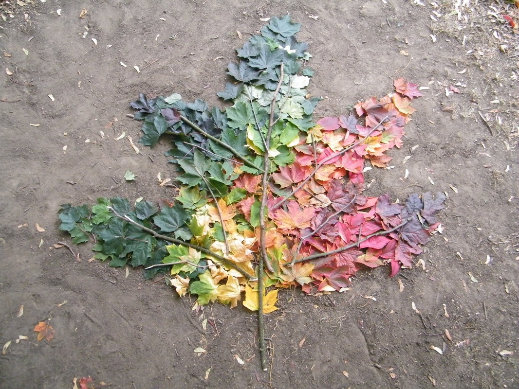
Second set of images
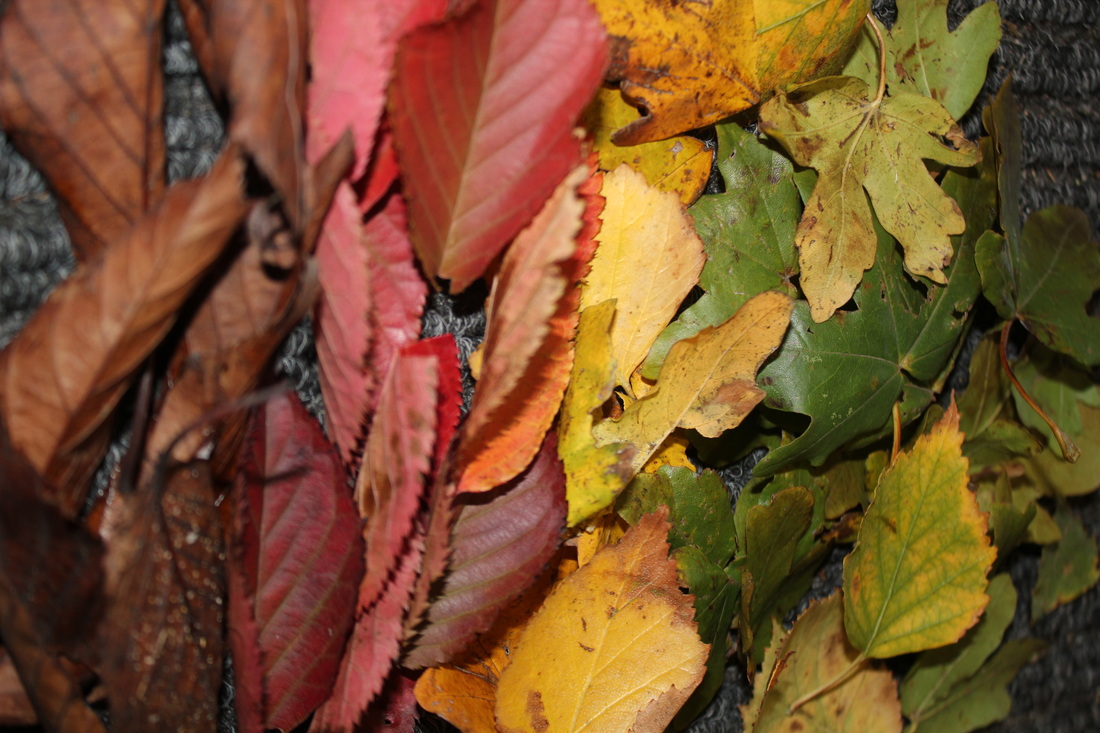
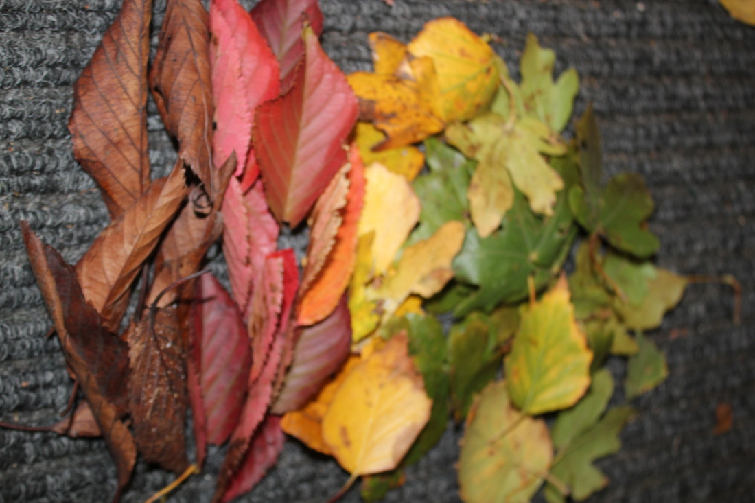
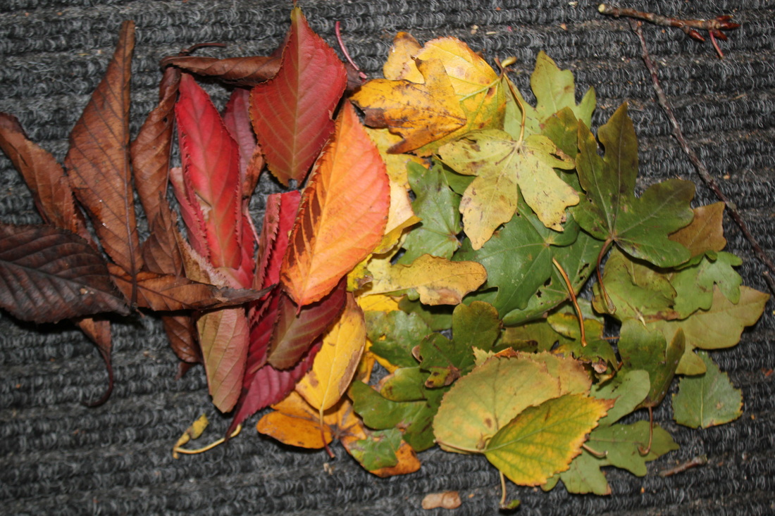
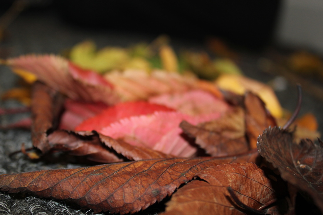
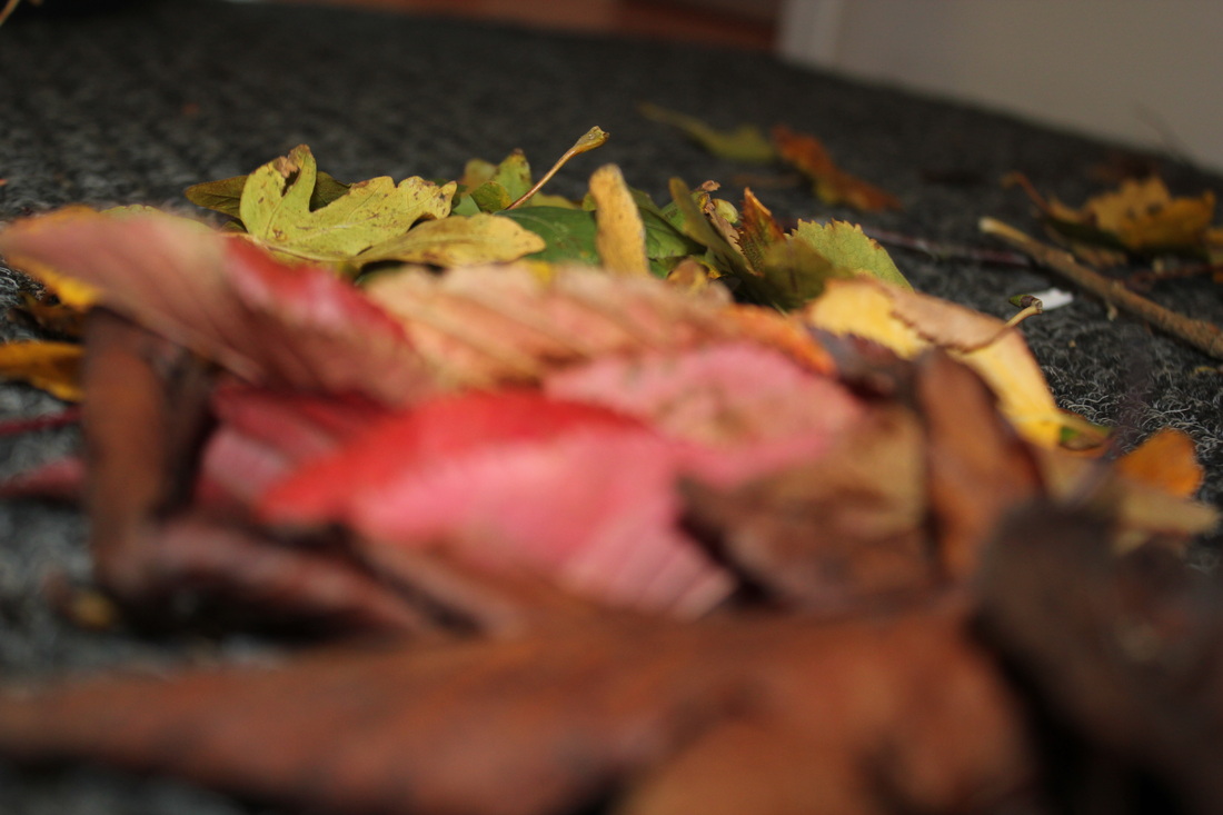
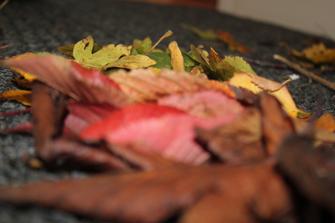
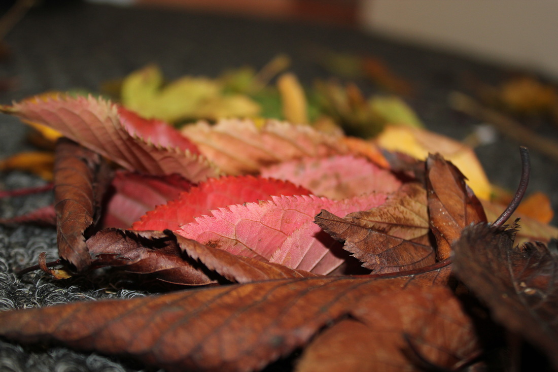
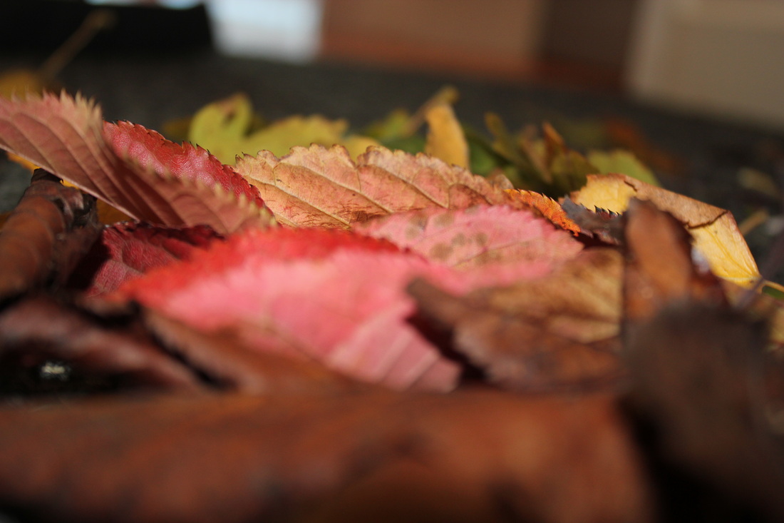
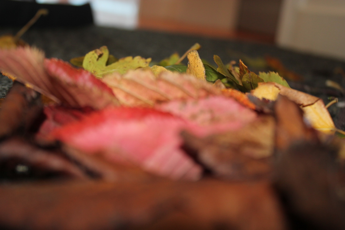
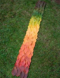
Goldsworthy has inspired because of the different ways he uses nature to create art and produce it through a photo, for example he uses different range of shades from one colour to create an illusion , that is why I had chosen to use the gradient colours of a rainbow from brown to green. However because I only had a limited amount of supplies and i'm not that intrigued with have the same idea with him so I decided to change what I would take photos on.
|
|
WWWI like these photos because they have an almost gradient effect going from brown to green. I got this idea from the artist I got above: Andy Goldsworthy, because he would create images by making the object the wanted out of leaves that are all in the same colour category
|
EBII think I could of improved on the background that I took the photos of the leaves because, I placed the leaves on a carpet which is why it has its weird material. I could also improve these photos by having more orangish coloured leaves because it looks like its going from brown, red straight to orange when I what it to like that leaves have a gradient effect.
|
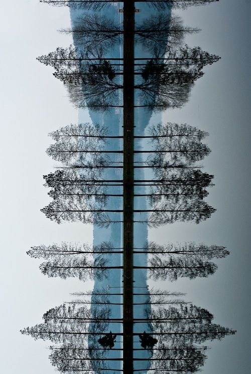
Gerard Bryne
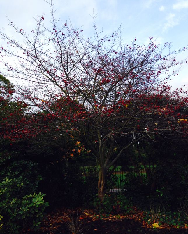
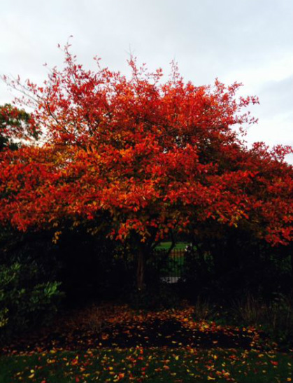
They show just that – trees on roads in the evening. A country road. A tree. Evening. - Gerard Byrne. These images are large trees, in the country side, with a light on them too make them look spooky and almost scary, there are multiple lights shone on the tree(s).
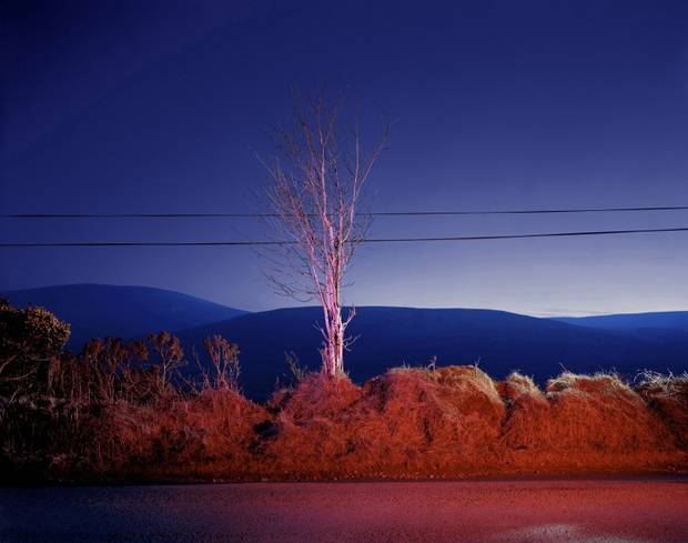
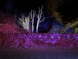
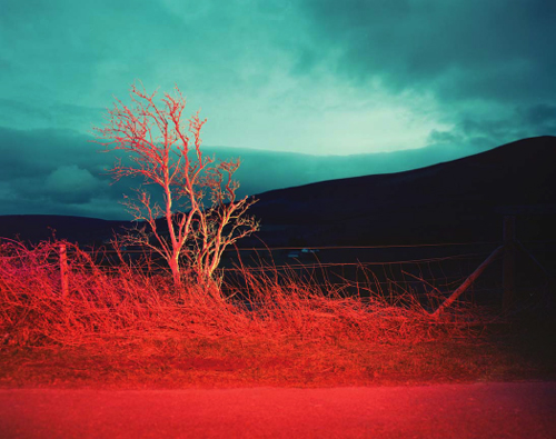
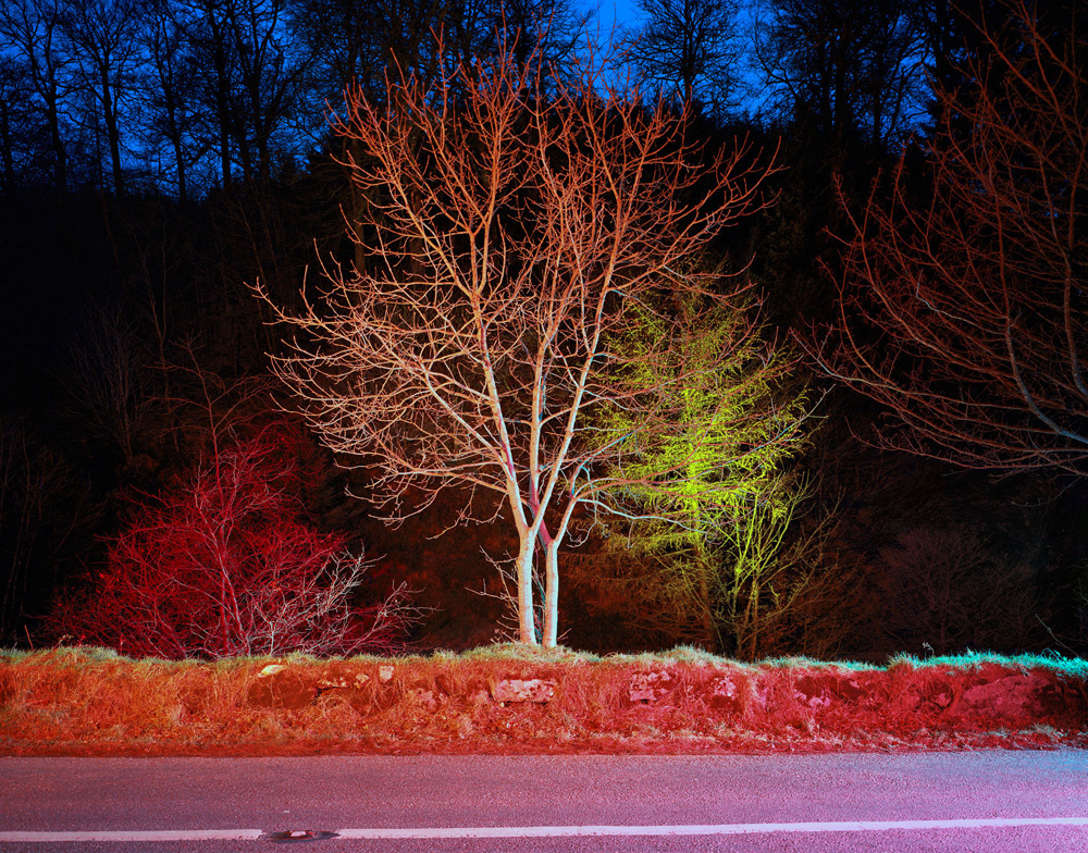
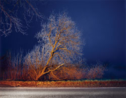
Bryne had inspired me to take images of trees while it had different colours of light facing towards it. I really like these photos because the trees are bare, and that there is not just one section of the image that is eye catching but the whole thing is.
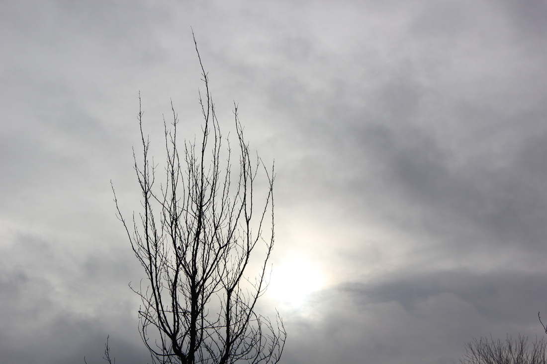
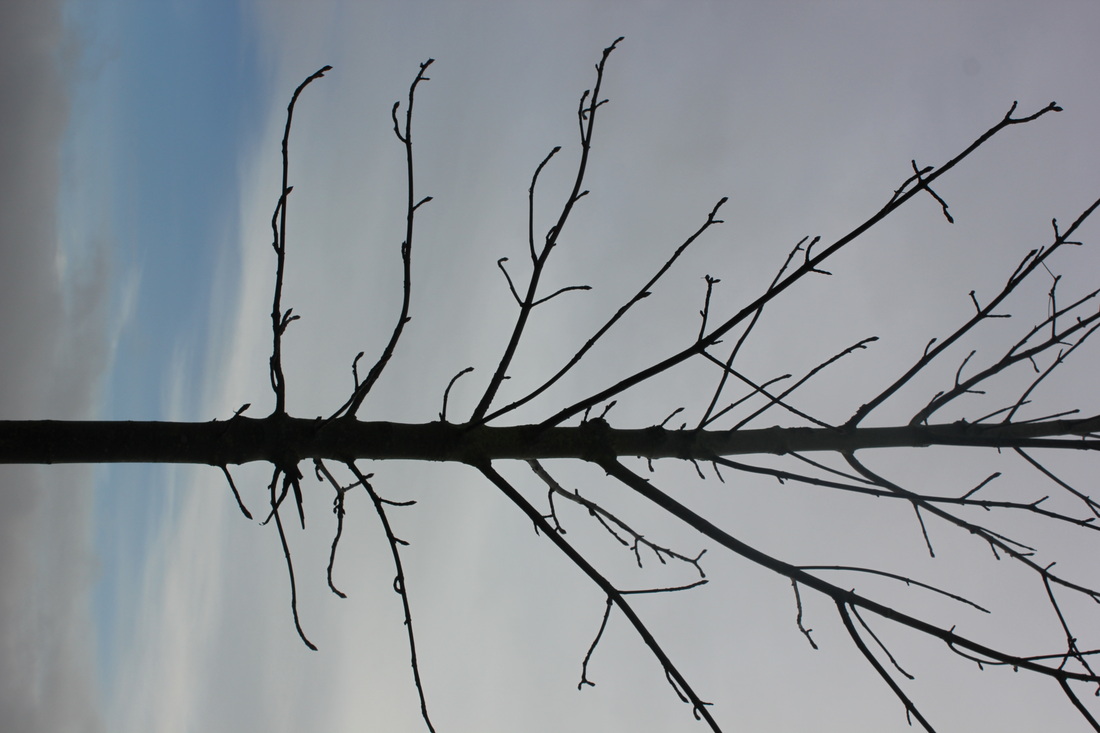
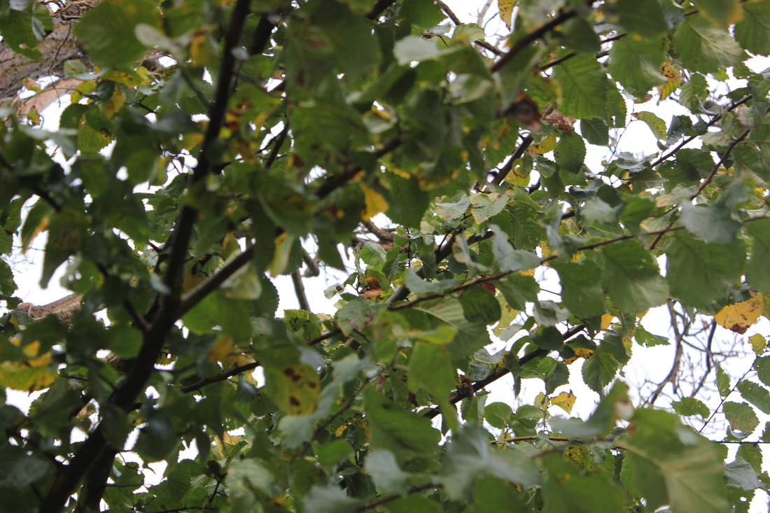
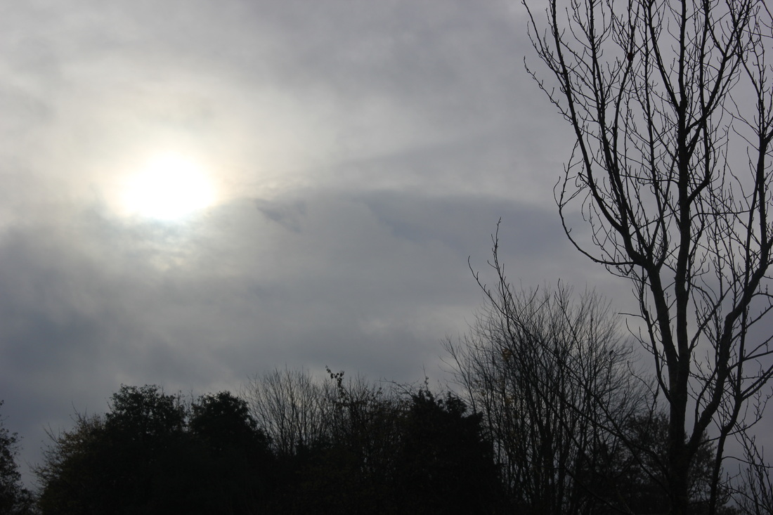
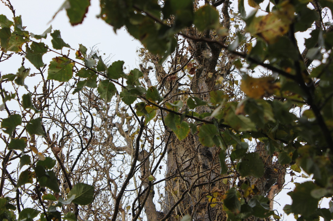
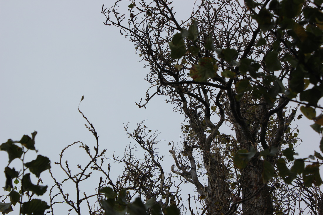
Third set of images
WWW |
EBI |
|
I think that 2 - 3 of the images are good because they are clear and don't look boring. I like how in most of them you can see the sun, although the background is a dark grey colour making the image look more dull and gloom. overall I think they cam out pretty good because of the range of objects, plants in each photo,
|
I could on improve on the angles I take my photos because most of them are crooked making the images look weird and abstract. I also could improve on the brightness of the image because most of them are dark and gloom, which makes the image(s) look boring.
|
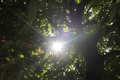
This is my favorite photo because you don't get the impression that it is a tree. I took it this way because it looks interesting and that I took it starting from the middle of the tree . I started by increasing the exposure to 1.01, the offset to 0.0759 and decreasing the gamma correction to 1.00, these changes made the image look filtered like the is a grey shade in front of it which isn't what I was aiming for.
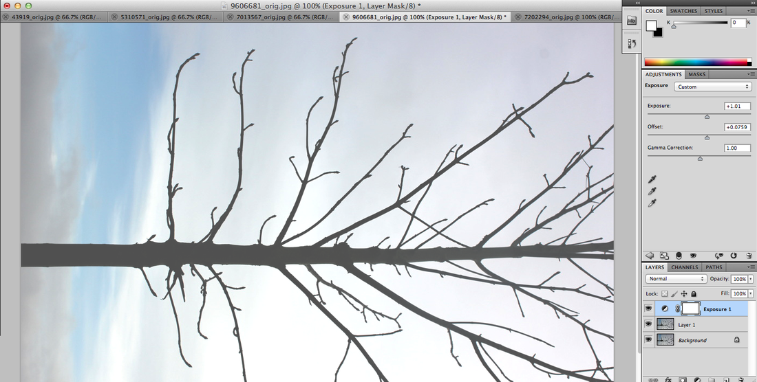
I changed this by reducing the offset to 0.00 its original setting, this made the background of the image go lighter and the tree look darker and bolder.
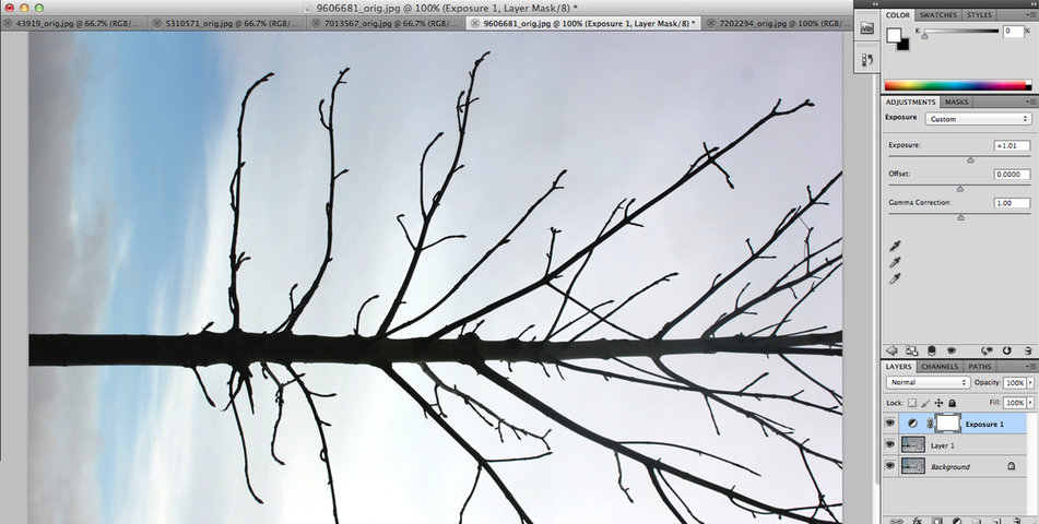
Although the last step was an improvement I wanted to make the image look more eye-catching therefore I increased the offset and the gamma correction, this making a huge improvement. You can see the two shades of blue in the background more clearly and the tree stands out a lot more than before.

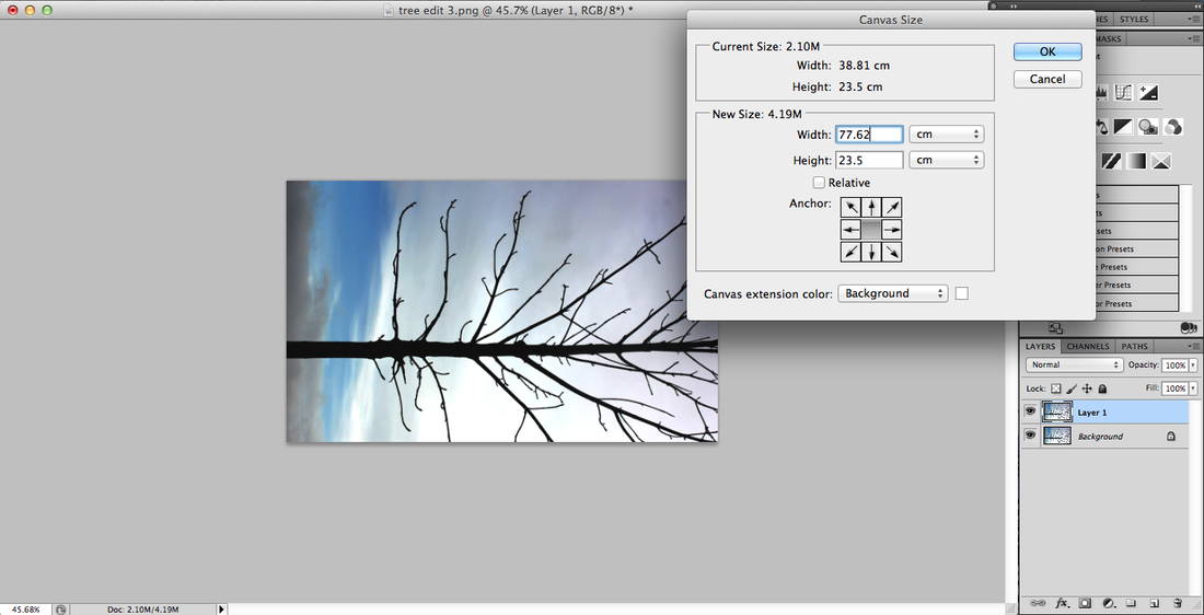
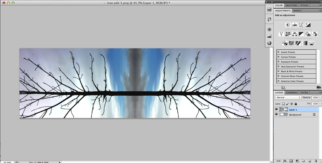
After that I made the width of the canvas size double because I want to copy and flip the image.
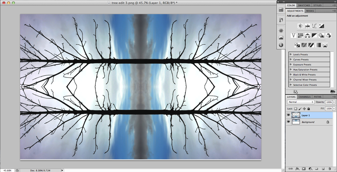
After flipping I had to make the images exact, because there were a few problems; such as there was always a line going down the middle.
Making the canvas size even bigger I again, coped and paste the image I made before, then I decided to do this multiple times for my final piece to see how it comes out.
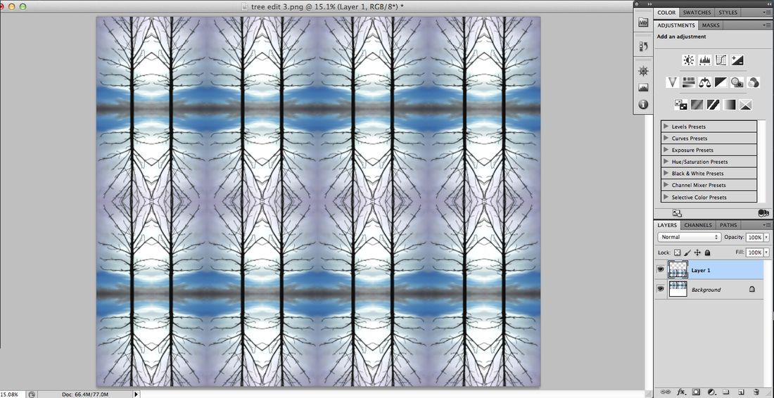

WWWI think that the final piece looks very interesting because you can't tell that it started off as a tree. I also like how the way I had edited this image, you can see the sky colours in the background a lot better because it is more brighter and bolder.
|
EBII could improve this final piece by doing something else with it; for example instead of repeatedly copying and pasting the tree I could add other natural plants such as flowers, leaves, twigs etc.
|
Gadd Aims
Aims was interested in how humans connect to the environment, by showing this she took images of someone in her images making a peaceful and calm connection to the environment. Her photos are pretty much portraits of the models she used and the surrounding beauty. - "I always pack a prop dress or outfit or some sort in my backpack so I can be ready for those moments when I decide a self- portrait in necessary." - Gadd Aims
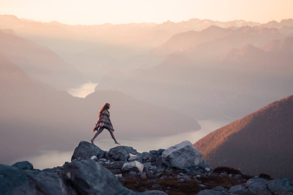
Fourth set of images
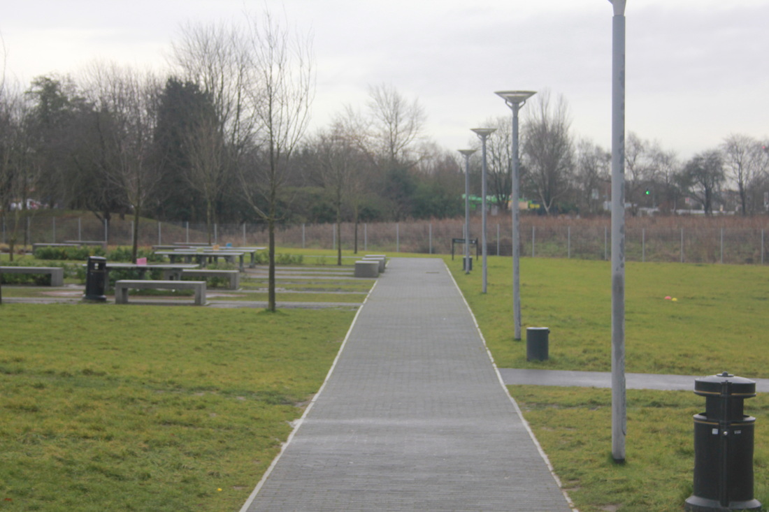
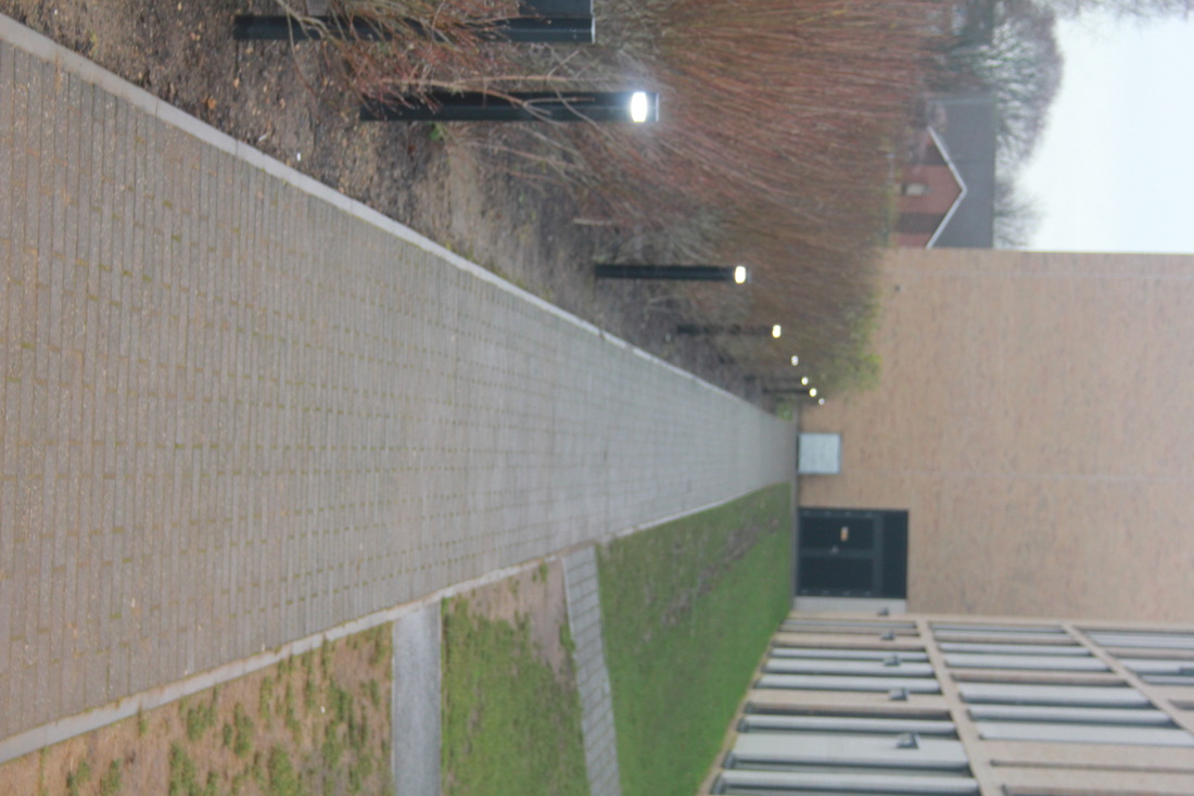
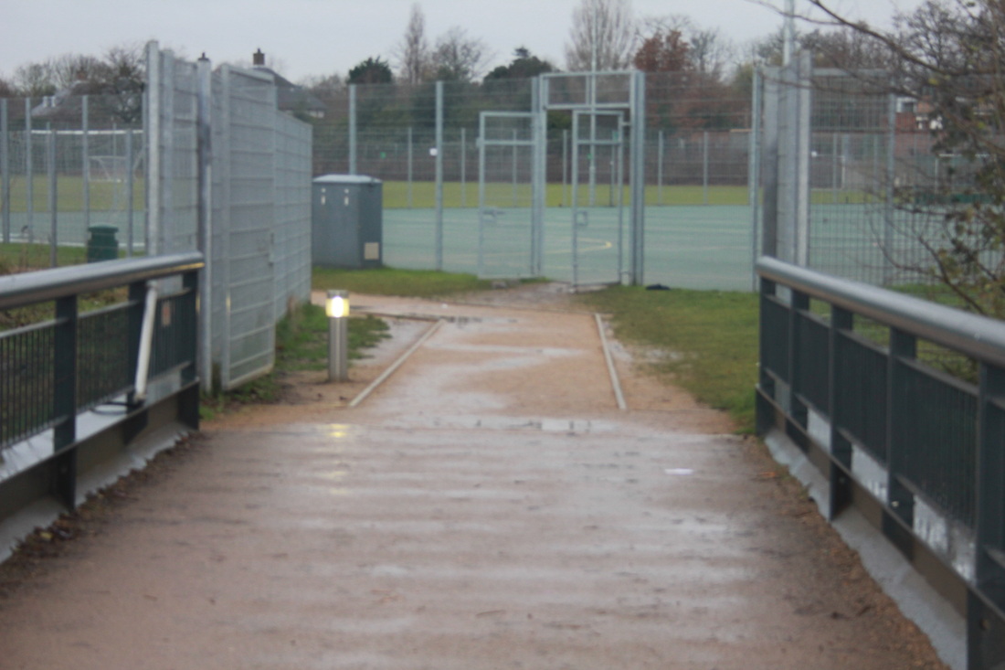
Aims inspired me to take images of a landscape or an area that is clear of pedestrians and has a natural vibe to it. To do this I went to Sutcliffe park around 4:30 to take photos. Mainly because it was getting dark early and the sun was setting therefore I chose to take it then, also because it was cold there wasn't anyone there.
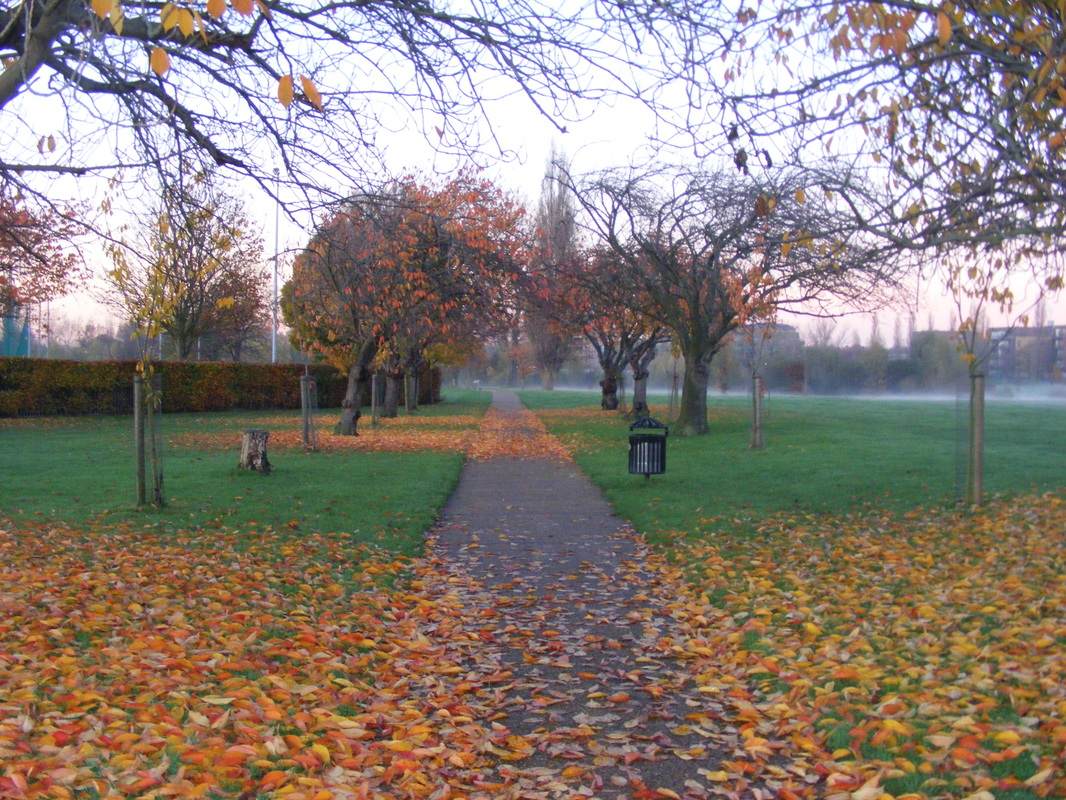
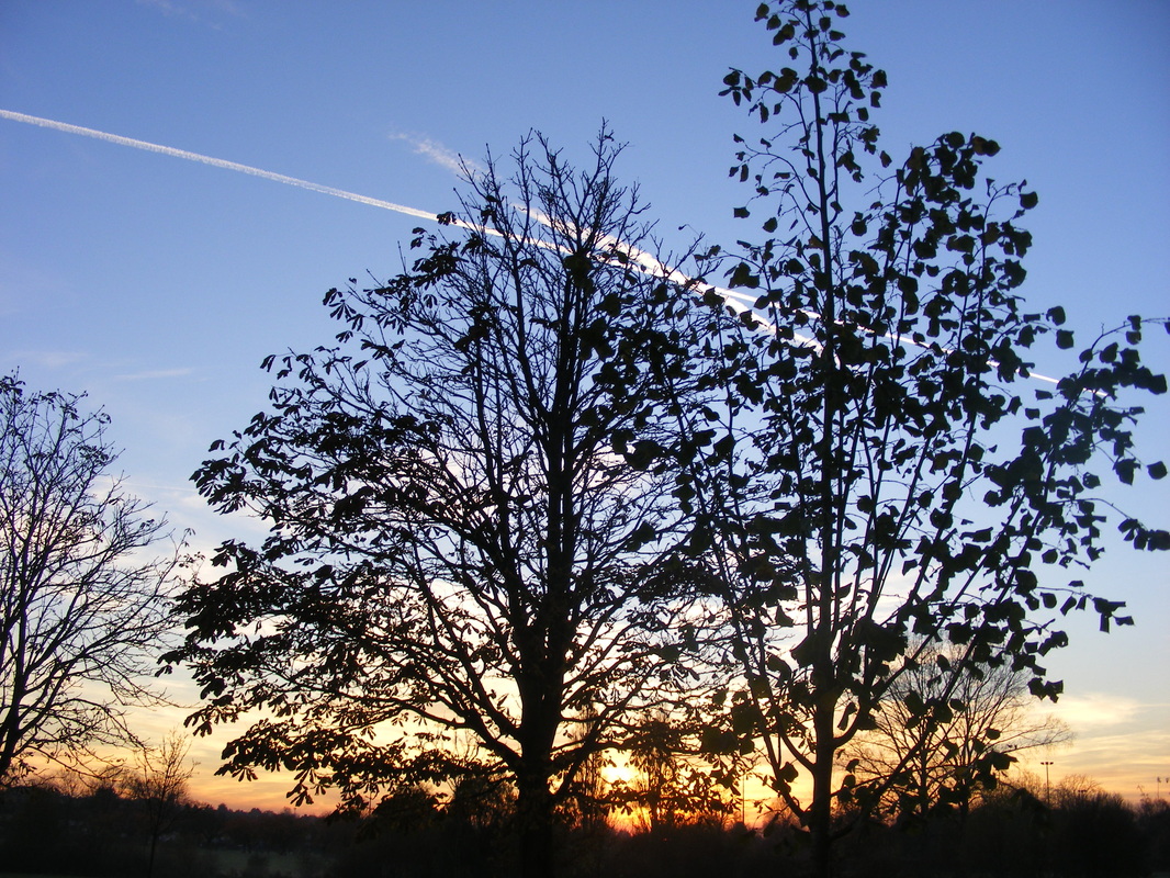
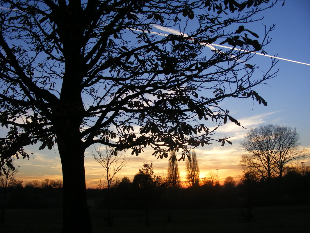
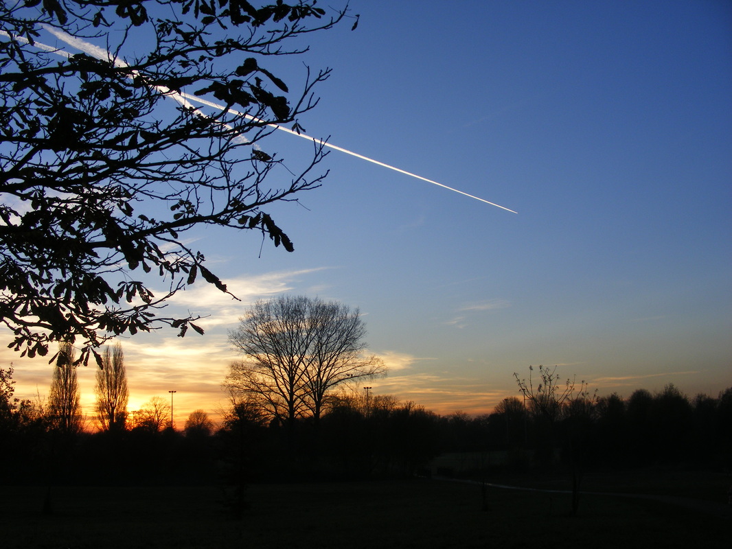
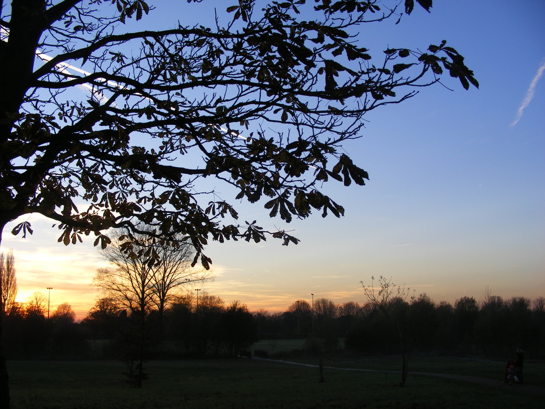
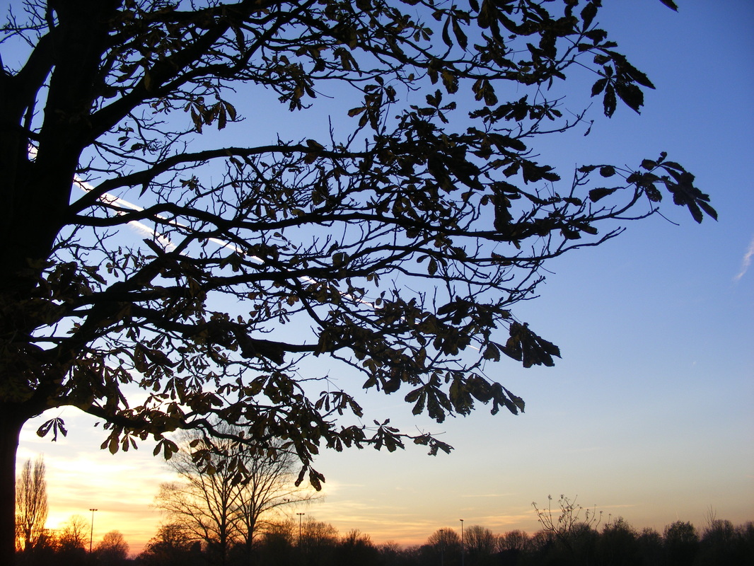
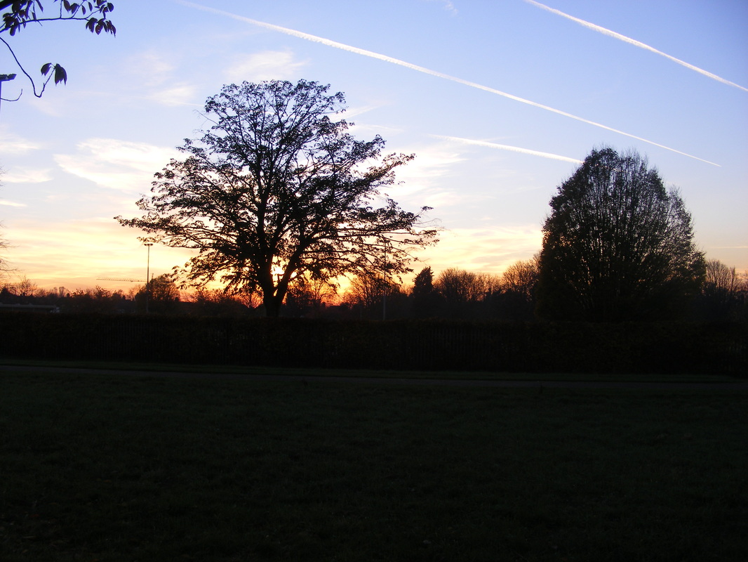
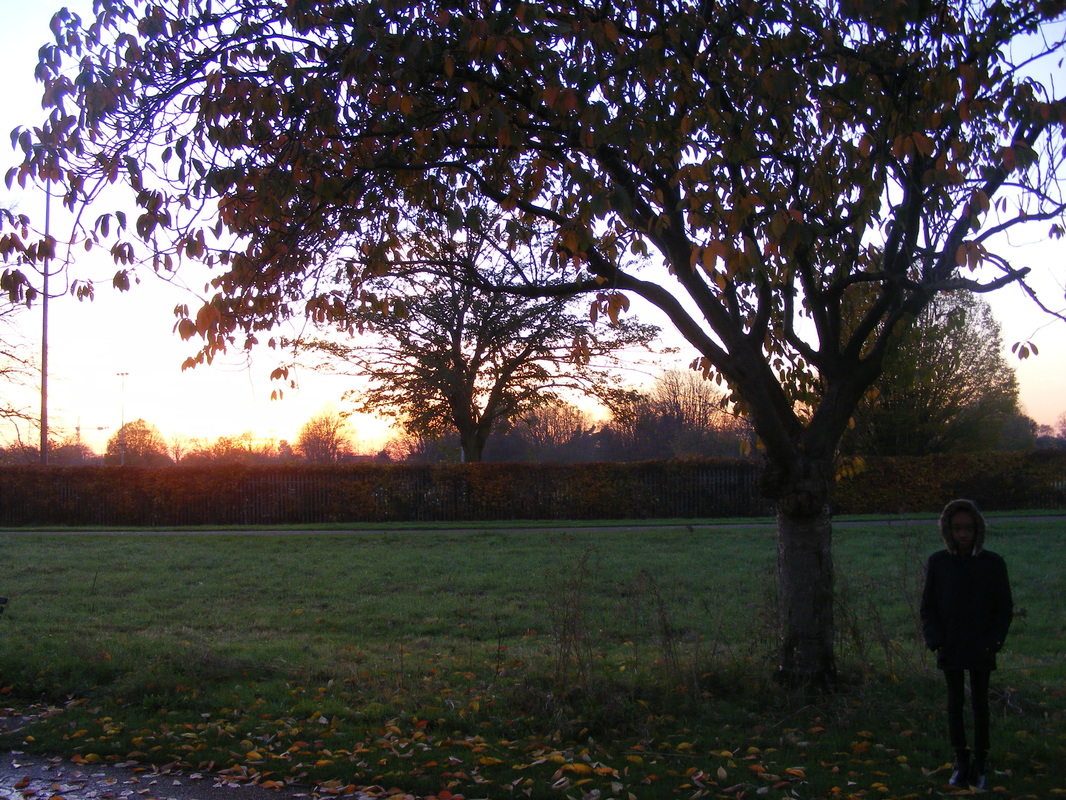
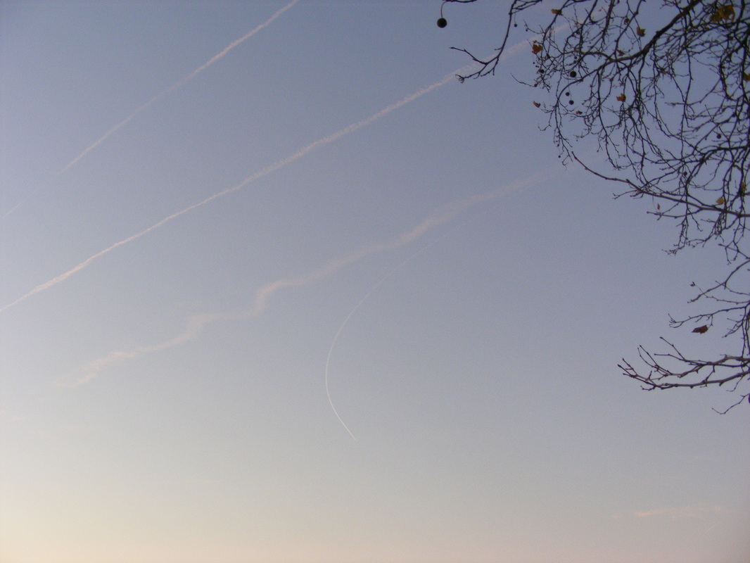
WWWI enjoyed taking images of the sun setting in the park because I got multiple shots of the sky at various times, although most of them have the same background they are in different areas. I also am happy with the different colours throughout the set of images from the sky.
|
EBII could improve these by getting better angles, for example I feel like I was too low to the ground when I too the images of the sun set because you can see a path in the background and a few odd trees. I could have also taken them around different areas of the park rather than the same spot.
|
Fifth set of images
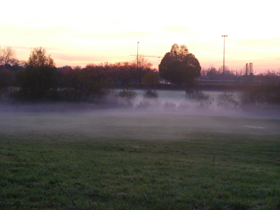
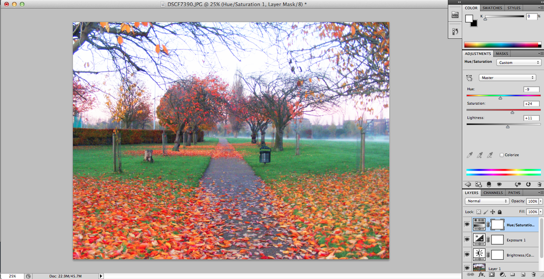
I chose this image because it looks very interesting from the path and the foggy mist in the distance. I started by changing the brightness to 21 and the contrast to 36, this made the trees look a lot dark and made the grass a little more greener.
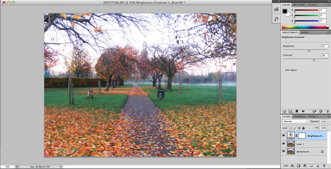
I then increased the offset to -0.0079 and the gamma correction to 0.38, this made a huge difference because the fog in the background is a lot more visible and the leaves look a little more bolder.

I then change the hue of the image to -9 which made the grass a lighter green and changed the colour of the leaves to a more redish, orange colour, including the ones on the trees and the bush on the far left.
Then I increased the vibrance to +100 and the saturation to +13, the enhanced the whole image by changing all the colours in the image to look brighter and bolder, and all the least obvious objects stand out the most, such as the fog the bin and two thin trees on either side of the image.
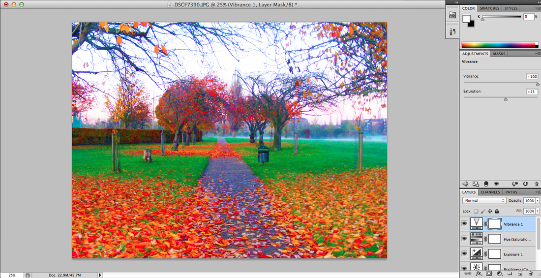
I then added a warming filter, which gave the image a warm tone, making the sky look more pink and the leaves more mixed orange and red.


WWWI think this is one of my best final pieces because you can see a drastic change in the edited image. I think that one of the reasons it looks good is because there is a path going down the entire image.. and that instead of it being plain and clear there are leaves surround it.
|
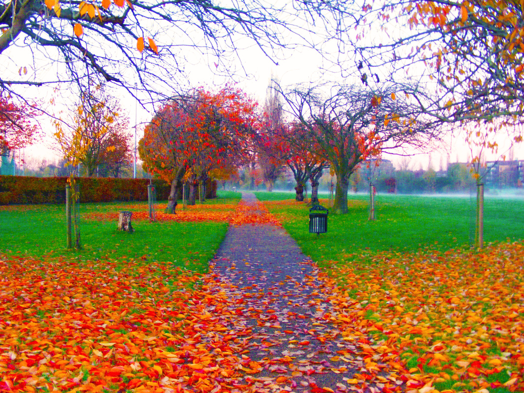
EBII could improve on this image by straightening the image a bit because the path is a little on the right and is slightly crooked. It could also be improved by having it more closer to the fog so it looks more mysterious because the fog isn't as bold and clear as I want it to be.
|
